08.02.18 — Design
Down a Typographic Rabbit Hole
It’s been a good few years since I unwittingly began my tumble into the world of typeface design, as way back in 2012 I began to wonder why even the most geometric of fonts I could think of (at that time Avant Garde) wasn’t actually geometrically perfect.
After a frantic web search for any fonts which fit the style I had in mind – perfect circles and zero contrast (meaning all lines would be the same width) – I gave up and decided to make my own.
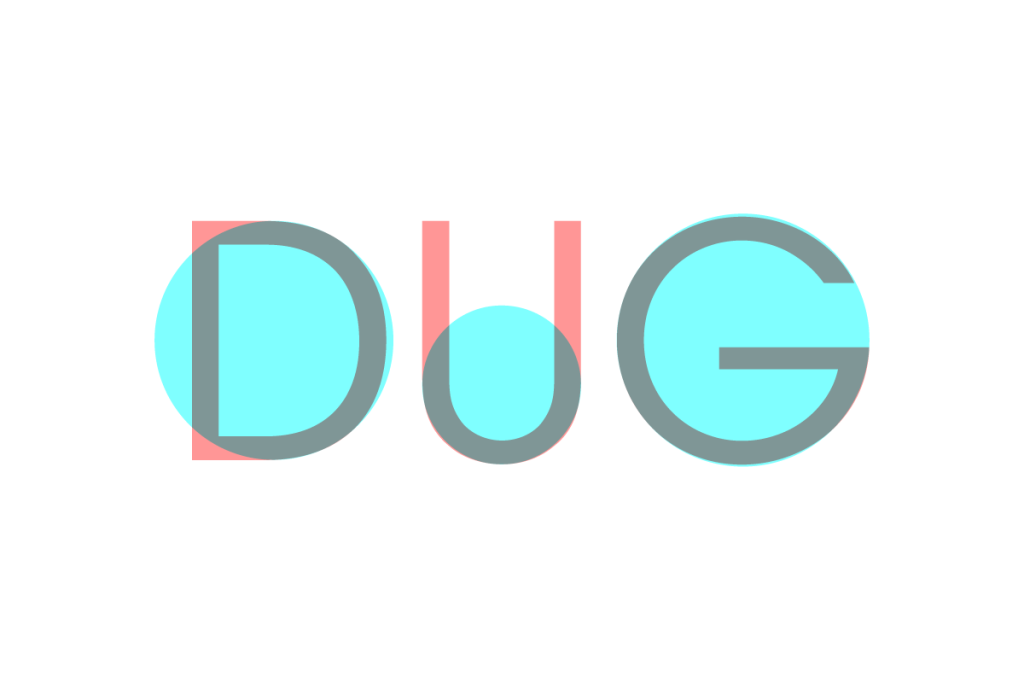
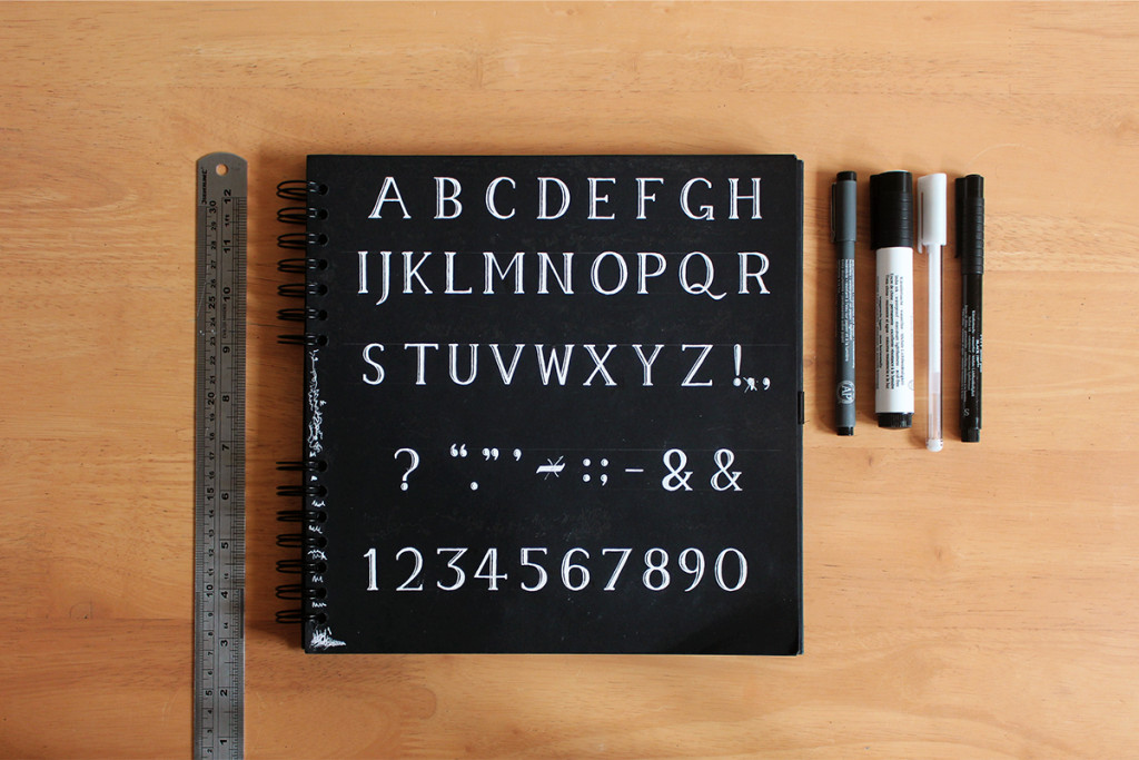
The resultant typeface was pretty basic, with only capital letters, numbers and some basic punctuation included, but it did come in two weights – light and chunky. I only ever had the patience to male the bold variant into a font file, as my mastery of the software was at that time somewhat nonexistent. I named the resultant typeface “Fries”, and you can check out a sample of it in all its glory below.
At the time I was quite pleased with it, as it adhered to my then purist principles of perfect shapes and minimal styling – and I even used it on a website prototype I was building. Looking back at it now though, I see that it’s only real use is as an example of why nobody makes fonts which are geometrically perfect – they look awful.
I shan’t go wittering on in great detail about the intricacies of typeface design, as there’s already plenty of brilliant articles and books which have all that covered, buy what I shall go over however is how the two features I insisted on including – perfectly geometric shapes and a uniform line width – are actually the ultimate downfall of the typeface.
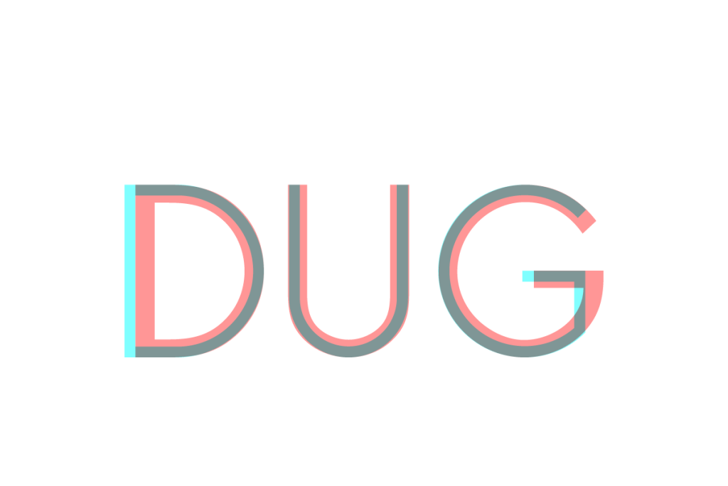
Firstly there’s the use of perfectly geometric shapes, most notably how I used perfectly round circles for letters like O and C, something which is very rarely done by type designers – and for a good reason. Perfect circles in text look like they’re wider than they are tall, and so the majority of typefaces use slightly oblong shapes to counter this optical illusion. You can see the slight offset when I compare Fries to Avant Garde below:
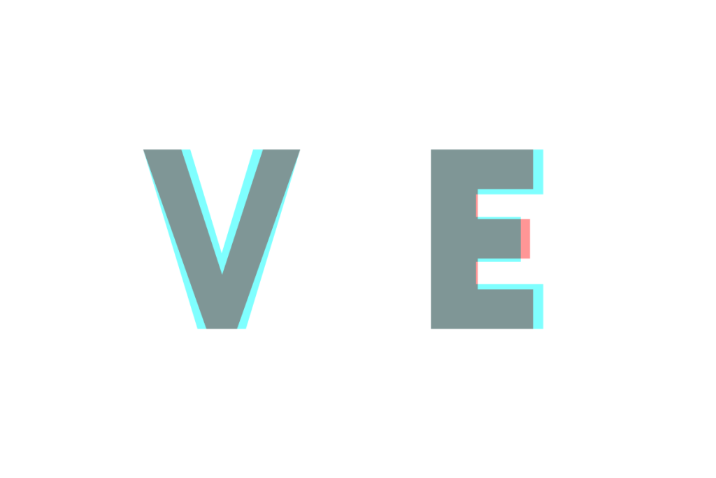
Secondly there’s the use of the consistent stroke width, which is also avoided by designers as another optical trick causes certain lines to look thicker and others to look thinner even though they are all actually equal. Take a V for example, where the lines become thinner where they join in order to avoid the point of intersection looking too heavy. Then there’s also the effect of horizontal lines seeming thicker than vertical ones (some people think this is because of the shape of the human eyeball), and so the horizontal lines of letters such as E have to be slightly narrower than any vertical ones.
Needless to say that after this, and with college and university to be completed, I didn’t exactly rush into trying to make another font.
An interest in typography still hung around at the back of my mind though, and so whilst completing an optional university module on typographic theory in 2015, one evening I had the idea to just sit and draw the entire alphabet, numbers and some essential punctuation entirely from memory. This was scanned and converted into the free experimental typeface which I eventually released as Memory, which is still available to download today.
Soon I was whisked away to Spain for my year in industry, soon I was back for my final year of university and I had realised that I could be more playful with design, and thus decided to incorporate experimental typography into my final year projects.
My third attempt at a typeface came as part of my Pearson project, where quite late on I decided to develop a quick geometric typeface which I could use for the project. I called it Celebration to fit the project’s concept, and although it was built on a geometric grid a bit like Fries was, it was much more carefully considered. Circular elements are slightly taller to account for visual trickery, there’s no entirely round circles, and the equal line width is justified by an “inline” style which can be layered on top.
Once the project was over and submitted I began to tinker with Celebration once again, seeing the opportunity for another experimental typeface release. I changed the style of a couple of the letters from the original, added a fill and shadow variant, and then wrangled with my font software to align everything and release it as a separate project on my website. It’s now available for free for personal use, and if you fancy using it for something else then feel free to get in touch.
With this project wrapped up I found myself in the early stages of preparing my new portfolio for graduate job applications, and I decided that I’d use the opportunity to develop my own font for my personal brand. Inspired by the sketches of the famous (sometimes for the wrong reasons) type designer Eric Gill, I set about sketching a typeface called Goddess in earnest – I was so confident that I’d get it done that I even wrote a blog post on it.
The long and short of that story is that I digitised it, it looked a lot worse on screen than it did on paper, I got mad, I had a sulk about it, and then I shelved it indefinitely.
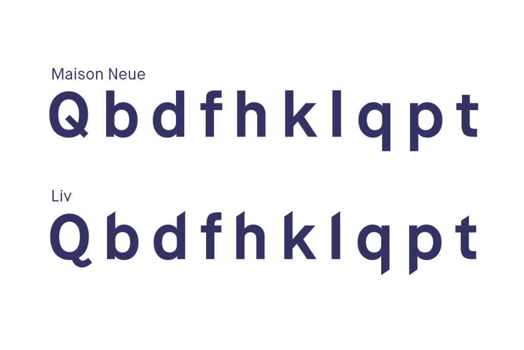
I was busy back then and I am only human so I can forgive myself for giving up so easily, but at the end of the day I still needed a typeface to use for my personal branding. I’d fallen quite in love with Maison Neue around that time, and so a quick fix solution was to simply add the sharpened angles of the ascenders and descenders (the key feature of Goddess) to Maison Neue.
A few hours of tinkering in my font software later and I had my custom copy of it ready, which I named Liv, a name which my friends and family often call me by. You can see how I made some adjustments to the original font in the letters below.
Things really started to pick up once I had finished all my university work but was still living in Leeds, and so had the time and space to do some design for pleasure. I had been wanting to try something with cut sponges for a while, and once I’d had the idea to experiment with the typographic “weights” (usually referring to how bold the font is) to mean the amount of ink used, I began stamping in earnest.
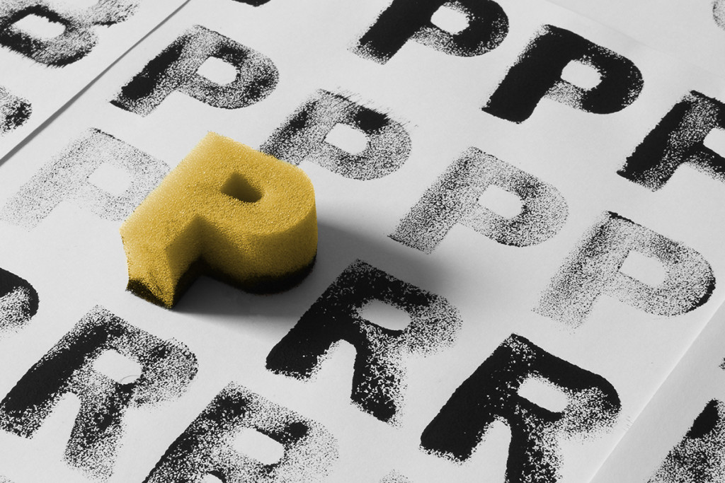
With a fully fledged character set and two variations of each letter for each of the three weights, this typeface was eventually released as Kitchen Sink. It’s original name was much more fun – Spongefont Sanspants – but I didn’t want to be landed with a lawsuit from Nickelodeon…
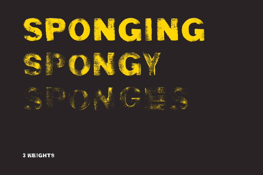
It’s proven to be the most popular experimental font I’ve done thus far, having been featured on various design blogs, acquired plenty of attention on Behance, and even been licensed multiple times for commercial use – not bad for an afternoon of painting with sponges like a three year old! It’s also available free for personal use, and if you want to license it for commercial use feel free to get in touch.
After university I had all the stress of job hunting to get through, and eventfully the task of moving my life over to Madrid and settling into a new job. After returning from a Christmas spent at home and now pretty settled into my routine, in my spare time I have recently fallen further down the typographic rabbit hole.
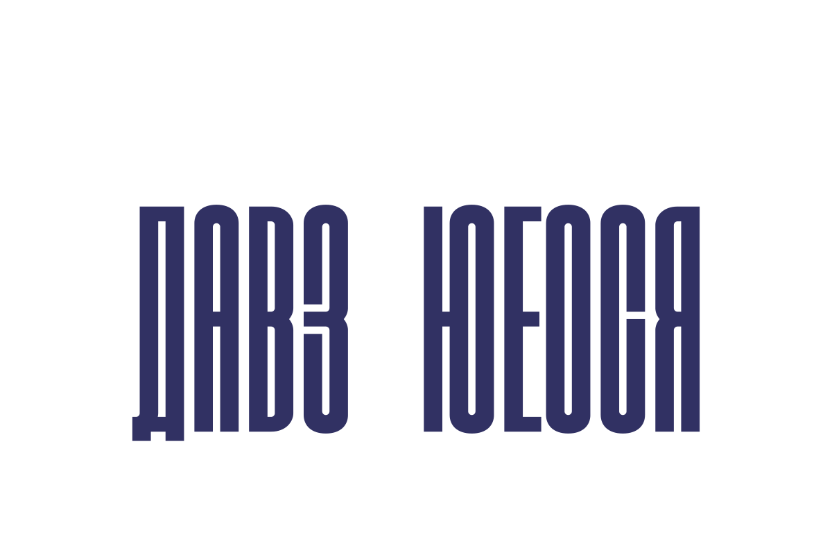
As someone interested in visual communication, I’ve always been intrigued by other writing systems and codes, and so one day for an experiment I turned east and studied the letters of the Cyrillic alphabet. This alphabet is most well known for being used as for the Russian language, and although there are similarities to the Latin alphabet (i.e. the one used for English), most of its letters don’t mean anything to an English speaker.
I combined this study of Cyrillic with a love for ultra-condensed typefaces, and created a silly experimental typeface which I called Responsive Cyrillic. In separating each letter into three sections, I was able to expand or contract the midsection of each at will, changing the height of each letter without distorting any curves or lines.
Although for my next stop along my journey I’ll be sticking with the theme of alternative alphabets, I have to preface this next one with a bit of a backstory…
A few years ago I was writing down some thoughts in my notebook whilst on a train, but I could feel the guy sat next to me was cheekily reading every word I wrote over my shoulder. At that very moment I decided to create my own code, a very simple letter-for-letter substitution, which was easy to remember as it was based on the absolute simplification of the shapes of each letter of the Latin alphabet. I invented it as I wrote, and since then I’ve been gradually adjusting it. As such I am now able to write it pretty quickly, although reading it with any speed is still quite a challenge.
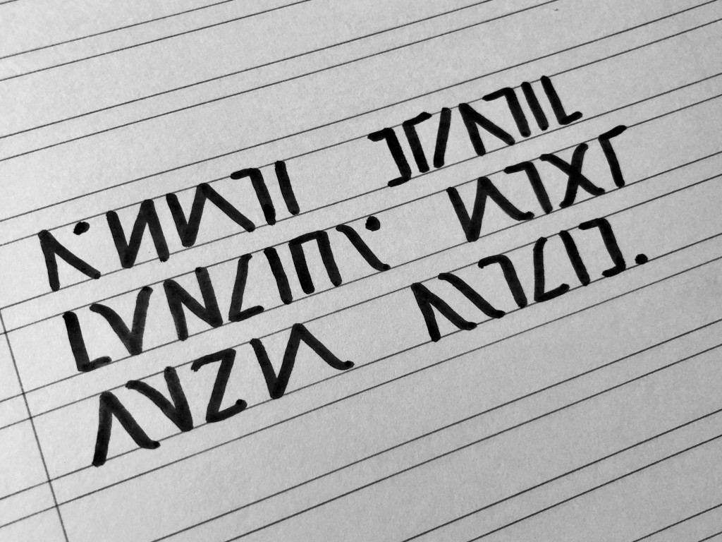
In order to get myself quicker at reading the system, I decided to create a typeface so that I can quickly “translate” typed text into the coded system. Adding small serifs to the otherwise simple straight-line symbols aims to help me distinguish between similar shapes as I begin to read faster.
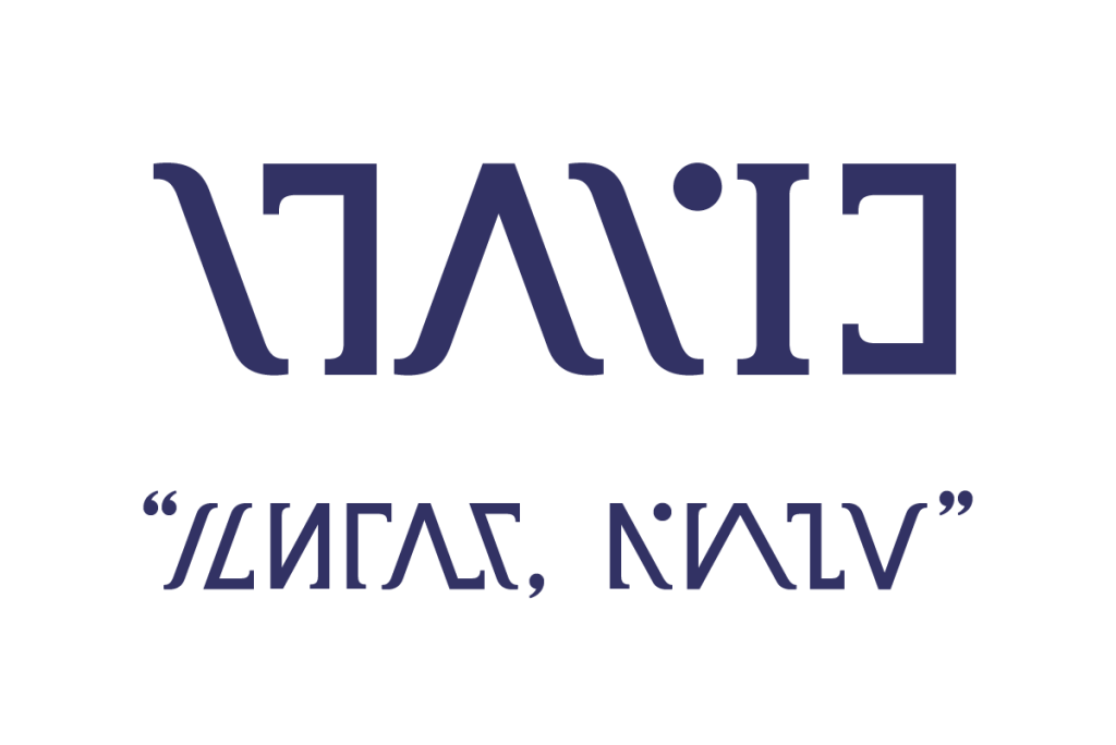
As I’m keeping the coded system just for my own personal use for now, the text above is just jibberish, a random jumble of symbols. I say this so that you don’t waste any time trying to read what it says – not that anyone would bother…
This all leads me to where I am currently tumbling deeper into a typographic obsession, and that’s my attempt to create my first viable ‘standard’ typeface, with ‘standard’ here meaning not experimental or overly decorative like all the previous.
Once again it’s an attempt to create a font which somehow captures an essence of my identity, much like I attempted with Goddess, and so for now its working title is the rather unimaginative “Goddess Version 2.” Please try to not pass judgement on the messiness or terrible curves just yet, it is very much an early work in process!
With this font I am attempting to create a nicely legible typeface inspired by my rather illegible handwriting. Often mocked for its pointless extravagance, my handwriting can be distinguished by lengthy curls on the end of most letters. As I work over my initial sketches, I’m trying to incorporate these fancy flicks in a more subtle manner, adding a slight curved ear to the letters which feature such a curl in my handwriting.
It’s still very much a work in progress as I struggle to find the ideal shapes for certain letters, a good balance of minimalism and decorativeness, and the visual balance of the letters and the spacing between them, but I’m hoping to get a first version done over the coming months. I am well aware that it won’t be anywhere near the standard of work done by the many amazing type foundries out there, but typography is something I’d like to get more involved in – and I know that there’s plenty more of that metaphorical rabbit hole to fall down after this…