29.03.15 — Design
Words As Images
During my traversing of the internet in search of the latest in design research and semiotics, I stumbled across a recently published finding by the Georgetown University Medical Centre in the Journal of Neuroscience, whose principal discovery was that the brain recognises whole words as images rather than processing each individual letter.
For me, this latest discovery challenges many areas within graphic design and typography. Erik Spiekermann recently very publicly denounced Apple’s decision to switch OSX’s system font from Lucida Grande to Helvetica, however with Helvetica’s widespread popularity, maybe this change is actually a move in the right direction? For if our brain is used to processing words as particular forms (arguably most likely set in Helvetica with it’s adoption for iOS), surely it makes sense for other systems to copy the style, so that our brains may quicker recognise a given word in Helvetica’s distinctive form?
I do understand that the above hypothesis completely disregards typographic considerations such as distinguishability between different glyphs (see Spiekermann’s analysis using the word “millimetre” here) and issues regarding the reproduction of lighter fonts on lower screen resolutions, but it’s just a suggestion.
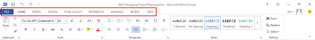
It also pulls Microsoft’s choice of all-uppercase and all-lowercase typesetting for it’s latest office products and Windows Phone OS (respectively) into question. If our minds are accustomed to recognising text set with standard English capitalisation, it makes little sense to make them work harder, especially when we are subconsciously trying to select menu items such as is the case with the menu bar in Microsoft Office 2013…
The recent trend of bloating the screen sizes and pixel densities of devices also presents interesting arguments for and against the avoidance of older typefaces which have not been designed for screen use. With screen resolutions edging ever closer to the point by which pixel screens are undistinguishable from printed material, is (or will) the production of typefaces constructed specifically for on-screen use even be necessitated any more?
Here I am reminded of Susan Kare’s “Graphical User Interface Icons”, completed for Apple in 1982, which I saw at MoMA in New York last week, and am hence reminded how far we have come since the boxy restrictions of the low-resolution screens of yore. Will modern day pixel-fitting, an art reserved for perfectionist designers such as myself, be necessary for much longer in a world of HiDPI (high pixel density) displays?
And then, with the ever-expending screen sizes of both portable devices (see: mobiles) and fixed devices (see: TVs/desktop PCs), must we worry anymore about typefaces having to work at such small sizes? Some of the most beautiful examples of typesetting I have stumbled across on the web, such as Medium, embrace much larger font sizes, in the case of Medium’s Article Pages (example here) almost doubling from the standard paragraph font size of 12pt (unformatted HTML) up to 22pt.
And so as years pass and larger, HiDPI displays become the norm, will we be waving goodbye to the need for screen optimised typefaces? And with this latest discovery questioning what we know about semiotics and typography, will it even matter? Can Apple be justified in it’s thorough and liberal implementation of Helvetica everywhere, and can we all now be justified in using our favourite print typefaces on screen?
We will see.