How ironic that I should be writing this post on the train on the way back from Leeds! I thought I’d take a quick look over some of my adventures around my new home, Leeds!
First up there’s me and Rhea’s couple of trips down to the market, where the fruit and vegetables are both irresistibly good and ridiculously cheap! Picked up a huge bag of my favourite apples (Pink Ladies) for just a quid! I didn’t manage to get a photo inside the amazing market but I shall do now I have a phone which actually responds when I click something.
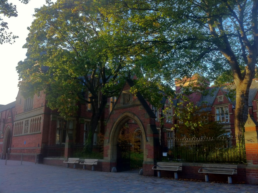
Then there’s our campus – here’s the entrance to the Graphics building during a lovely stint of weather we’ve been having!
Anyway for now I’m heading back to Burnley for the weekend to pop into work at Burnley Youth Theatre and catch up with my family. It’ll be nice to eat a full meal and have a glass of nice cool cordial again! No rest for the wicked however, I’ve still to be getting on with my first two graphics briefs and an Art History essay – ah, the joys of student life…
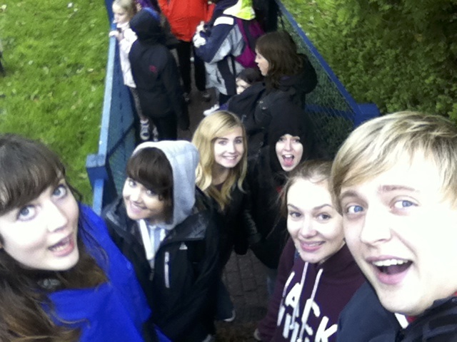
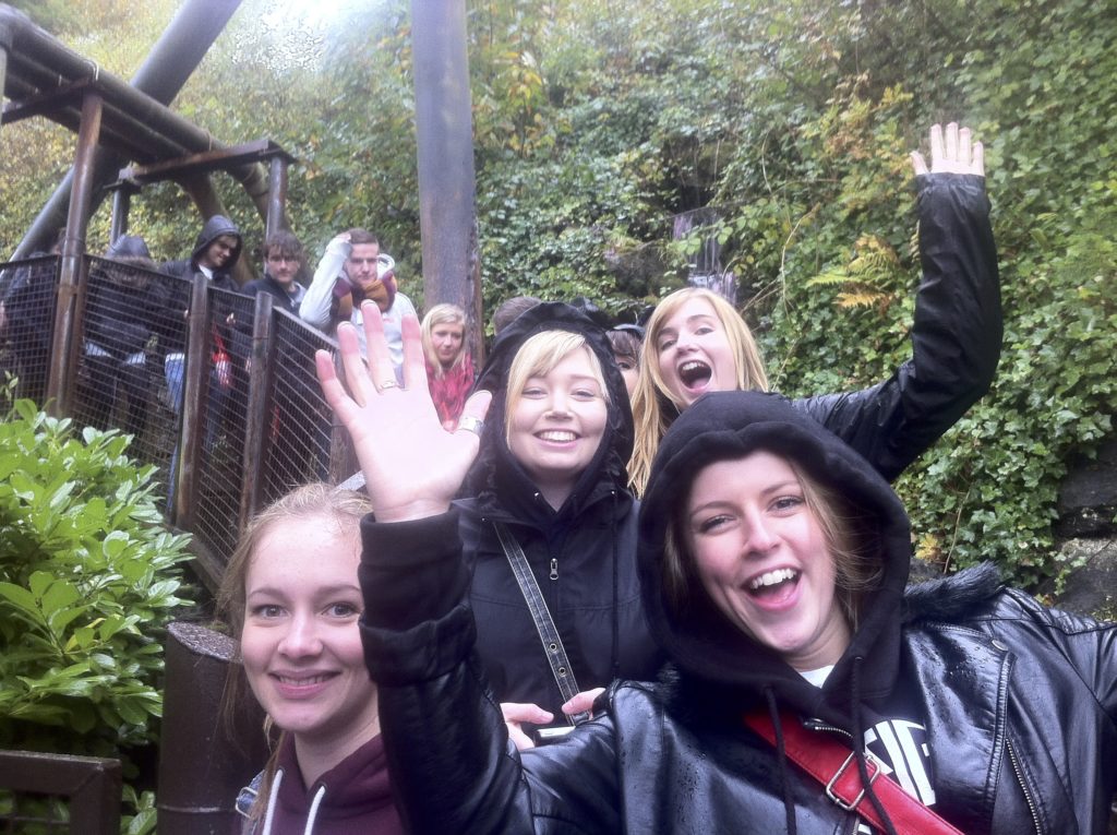
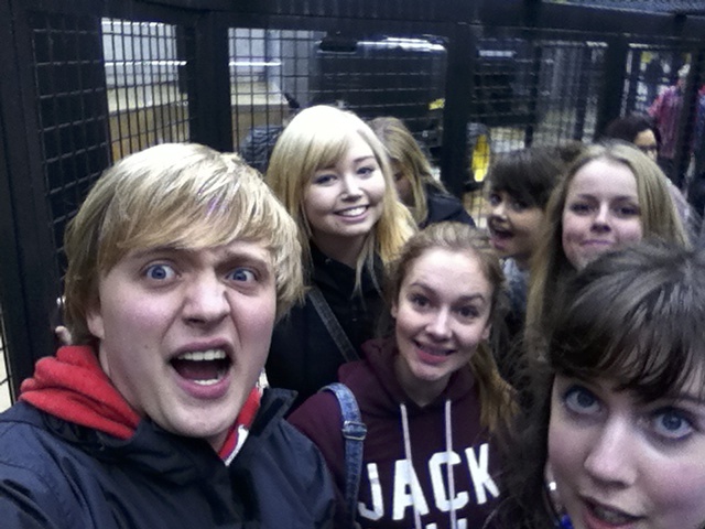
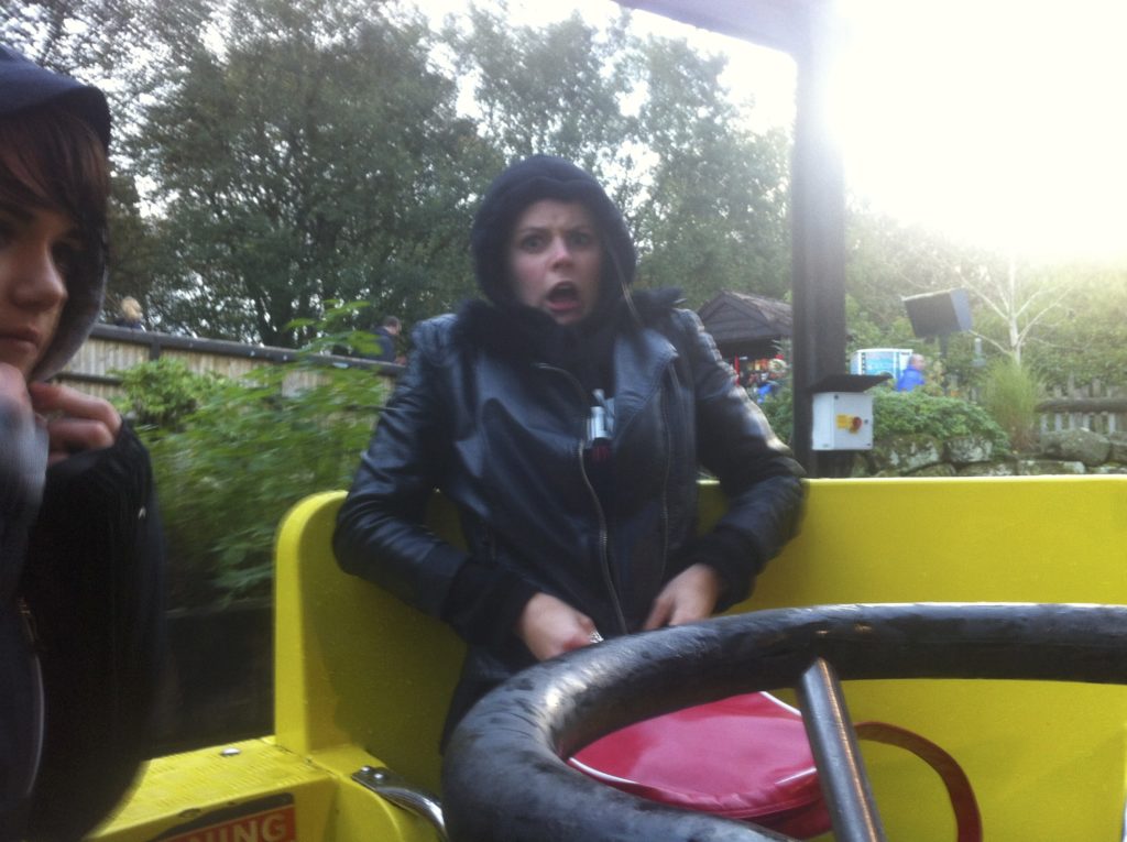
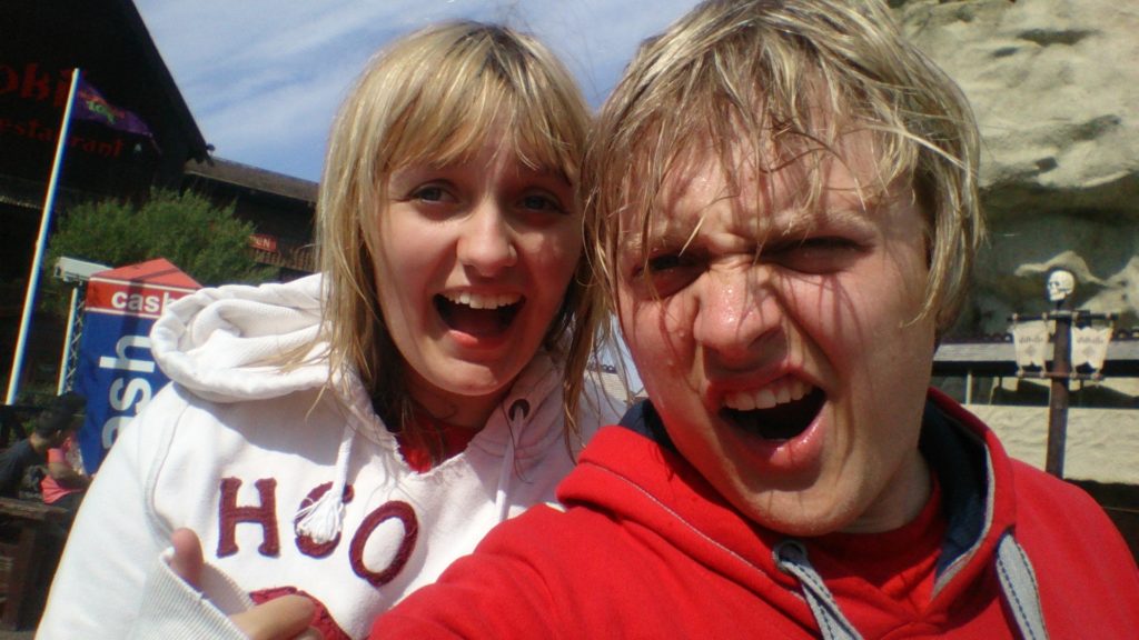
I know it’s been a while since my last post, but once again the whirlpool that is university life has had me tangled up for the past few days – mainly since I spent all of Sunday at Alton Towers with some friends from Graphics and the School of Design Society (or SODS).
We managed to sneak onto two rides in the first twenty minutes – Air and Nemesis – which is quite an achievement seeing as though they’re two of the larger coasters whose queue times tend to exceed an hour!
But then it all seemed to go wrong – we queued up for 45 minutes or so to get on their newest and supposedly greatest ride, “The Smiler”…
Just to be told that it had broken down and was closed. To cheer ourselves up we went for burgers and then headed to Rita, a ride which I assured everyone would not break down.
It did.
We then decided to get on some rides which had next to no queue – the log flume and then the rapids! Which Rena had a really good time on…
All before heading off to Oblivion – which we managed to get on within five minutes! It was a great end to the day. Somehow we managed to walk onto half the rides and the other half we managed to break with our mere presence.
But all in all it was a great day with some great people. Nothing much productive occurred (as you can probably gather) but it was great to take some time out with people of a similar mindset. All geared up for the Graphics ‘disco’ later in November in Leeds city centre – even if I do still have the creepy music from The Smiler stuck in my head. Listen at your peril.
Today I thought I’d take a look back at one of the projects that I finished just before uni – this time a branding/visual identity job assigned to me by Lancashire County Council. The brief was to create a logo and visual identity guidelines for The Crib @ Burnley Library, a space which opened in 2005 which the council wanted to promote as a venue for creative workshops.
The project was an intensive week long job and consisted of me working alongside library staff and young people who use The Crib to create the general look and feel of the logo and brand. On the first day I set about sketching some ideas for colours, shapes and logos which represented the space…
Admittedly, the first attempts at some logo mockups were a bit dated and cliché. The first used the idea of a ‘ring’, a circular space with a gap for people to enter, which reflected the actual interior design of the space.
The second one was an idea taken from my sketchbook, which made the word ‘Crib’ the prominent feature using some simple yet tacky 3D effects.
I even sunk to the lowly depths of considering an ‘indie’ style logo design.
This may have been a disgrace, but it birthed a new idea which I soon started to hone in on – simply putting text in a circle. I started to experiment with colours, fonts, layouts and extra decoration and came up with a few slightly varied prototypes.
Soon enough the shadow had been simplified to a solid, semi-opaque drop shadow at 45°, but then I began to consider putting it on an angle. Naturally it took a lot of careful consideration before I chose which angle at which to set the logo…
I ended up setting the logo at a 7.5° angle, and eventually settled on the shade of purple to convey creativity and to stand out in the red, yellow and green colour of the space.
And I also put together a set of Visual Identity Guidelines. I hope you enjoyed reading in on my work – be sure to leave a comment, no matter whether you think it’s terrific or terrible.
Guidebook, which is always an interesting insight into how much thought I poured into something as trivial as my website – and you might even notice that this blog is set in my specified red/coral colour. The guidelines are now totally outdated (except perhaps the five main colours which have remained the same), but you might be interested to see how I constrained myself.
Today’s been a hectic day of running around and catching up with the Monday morning workshop I missed just this week – I needed to get my skates on and work on Brief Number 2: to create a poster promoting a font that we’d been assigned. I (thankfully) ended up with Optima, and so I got to work on some research and sketching…
Then after another full page of research which I won’t trouble you with, I sketched three quick ideas for possible poster copy, layout and design, and then, using my favourite go-to program for super quick mockups, Adobe Fireworks, I haphazardly threw the three ideas together and made them into digital prototypes.
If you’re wondering why they’re so dull both in terms of colour choice and general form, we’ve been restricted to using only the assigned font to create the design, and a colour palette of black and white with one shade of grey. Hopefully I’ve been inventive enough with the composition and use of glyphs as structural elements that they don’t look like complete tat.
In other news, I went down to Apple today with the intention of buying a new phone, only to be told that they had none in stock and had no clue when the next shipment of them would arrive. They’ve told me to go and order one offline – but a quick look reveals that there’s still a 2-3 week wait before they even ship. Not happy. Maybe they’ll inspire me at their iPad event on Tuesday…
Okay – so I missed another day again (for which you can blame Rhea for chatting away with me until the early hours of the morning) but I do promise that I will improve. I must do better. Anyway…
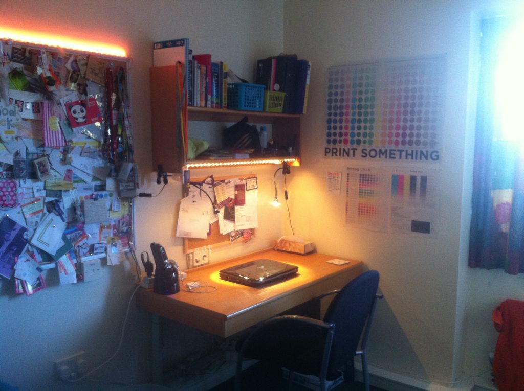
In between catching up on uni lecture notes and the sorts, today’s task has been to rewire my LED-heavy and poster-ridden university bedroom. First up – my desk. It used to have a couple of spotlights over it, but I wanted a more natural ‘daylight’ glow, so I’ve wired up some warm white and some blue LED strips over it and now it basks in a nice cool ambience.
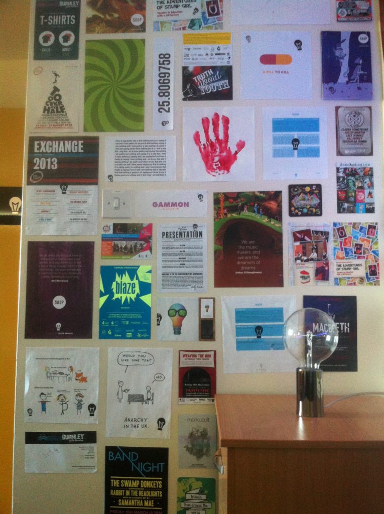
Also, my walls of posters got a bit of TLC – I’ve put all the ones back up which fell down and now I’ve a collection that looks something like this. The posters are a random mix of work I’ve done, work I’m currently doing and work that I wish I had done.
I know you might be wondering why there’s so many LED lights around – it’s because I really hate the fluorescent tube lights that we all have in our rooms. They’re noisy, they take ages to turn on and the light they give off makes the whole place feel like it’s about 100 years old.
You may also question why this uni room is so chaotic when my room at home is clearly minimal through and through – and it’s because I like to swing from one extreme to the other. Sometimes I want to be living in a pure white box and sometimes I want to be living in a Salvador Dalí painting – it just so happens that I’ve decided my uni room should be the latter.
The LED lighting is what makes my uni room feel my own, and it’s only temporary so I can shift it all around – I used IKEA’s Dioder sets and a lot of extension leads to create the setup. Being the control freak that I readily acknowledge that I am, I had to have all the switches and controls in one place – next to my bed (so that I don’t have to get up to turn it all off), so I mounted them all on the side of my bedside drawers.
And so to conclude, I’m afraid to say that because I’ve been so enthralled in this little spot of amateur electronics that I have nothing else really to report back on. Today all graphics work has had to take a back seat whilst I channel my creativity into designing lighting systems – but I’m now happy with my little creative hovel and I’m ready to tackle the mountain of work that I’ve collected for the weekend…
I join you after another busy day of work and play! To clear up any confusion – this is today’s post, the one I posted earlier was yesterday’s belated post. Anyway, I’ve been busily continuing my work for Blaze using the icons I created yesterday – and I’ve just wrapped up the designs for the Blaze Festival Crew’s t-shirts!
Apart from this work, we all sat down as a flat and watched the genius that is Sacha Baron Cohen in “Brüno” – a film which continues to render me happily speechless with it’s daring stunts and total disregard for traditional preconceptions of what is socially acceptable. I’m on a bit of a film marathon at the moment, first “V For Vendetta” and now “Brüno”. I promise I’ve been doing some work amongst all this – I’ve been set the challenge of reading a Spanish novel by my fab Spanish professor, Ricardo! It’ll be a challenge but it should be fun.
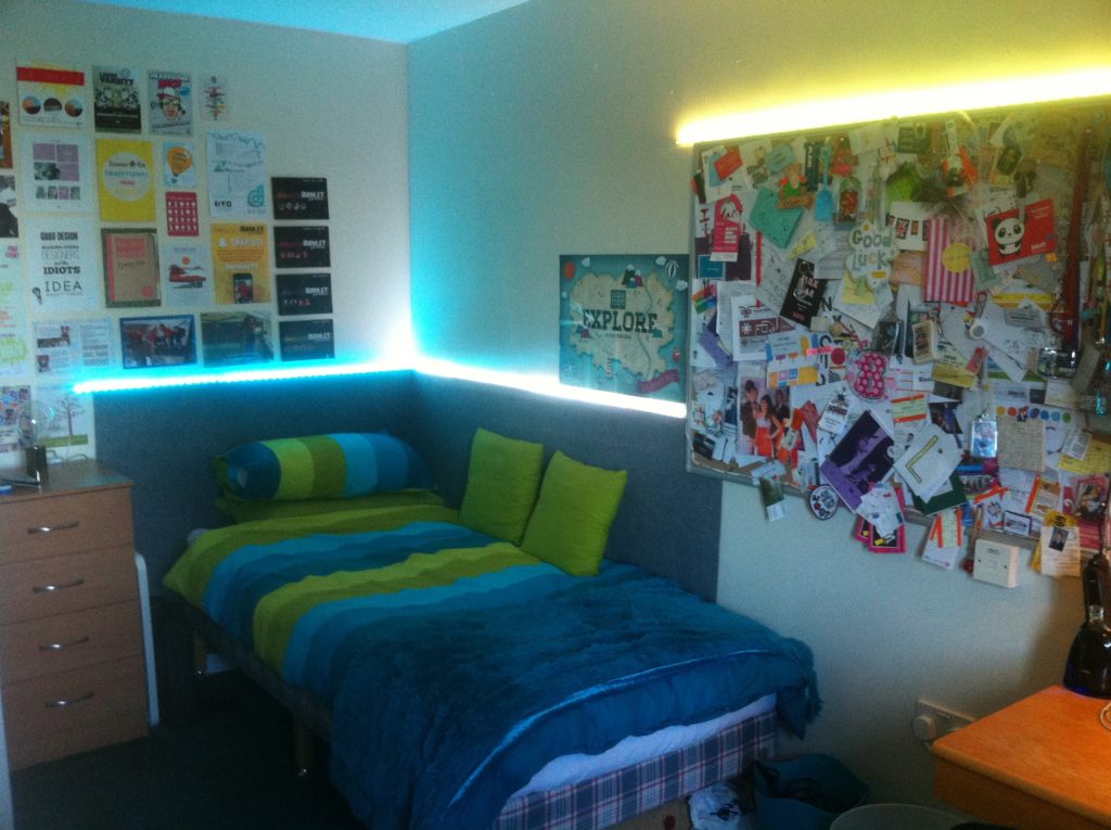
So this evening I’m sitting down to redesign the look of my uni room and shift all my LED lighting around once more. Here’s a pic of my room which I took after the first week:
But now I feel as though I’ve read so much Spanish, eaten so much toast and done so much Illustrator work today that I deserve another packet of wine gums and a brew. One day I’ll get round to going to the library and chewing through some more of my reading list – but today is not that day. I’m too ill.
Also, I do apologise for being sporadic with the posts, I will resume normal practice soon – but do be sure to check out my good friend Rhea’s blog, she posts some amazing designs and a great commentary of what’s going down in Leeds!
It’s Sunday, I’ve managed to miss another day of writing my blog, and I’m still ill. I should be back in Leeds right now but I’m going to take the Monday off and travel back tomorrow evening to give myself another 24 hours to recover a bit more. I’m going to miss my beloved Monday morning graphics workshop but I’m sure I can catch up, at least I can now these monograms are finally done!
The ‘studio‘ subtitles all need work, but they were added in yesterday morning over the space of 15 minutes and whilst I was recoiling after less than two hours sleep, so I think the dodgy kerning and lame typeface choices can be excused for now. No doubt I’ll be dragged up on them anyway!
In other news, it’s nice to be back at home in the ‘green room’ and spending some time with my family – even if most of my time has been spent with my head in my hands suffering coughing fits. We went out for a coffee and an ice cream at Slater’s this afternoon which was nice, and I spent some time on the Microsoft Surface, which I’m considering buying.
Also, I’ve finally decided which new phone to buy myself – an iPhone 5C in white. I took a good look at the iPhone 5S but I don’t like the way the ‘space grey’ model scratches easily, and the white glass front on the other models has always, and will always, look tacky and out of place whilst detracting from the vibrance of the screen. Additionally, I feel like the design of the 5C has been given a lot more thought than that of the 5S, the latter device feels over complicated and distant from the design of the software – even Ive himself seems a lot more passionate about the 5C than the 5S.
Oh dear – I missed a day! My bad, but I’ve been feeling so ill over the past few days that I’ve only had the energy to do the bare essentials like homework, eating and sleeping. I’ve had to cancel my long awaited trip to the Royal Exchange in Manchester tonight and I’m going to have to return home at about four so that I can throw myself in bed and feel sorry for myself. Not a great end to my second week!
I thought I’d put a post in now whilst my throat isn’t on fire and my head is relatively clear (I shall still have to check this post for unforgivable typos when I’m a bit less fuzzy-headed), and then I can keep you updated. I promise not to whine about feeling ill – well not too much anyway.
I’ve decided to make the work-in-progress version of my website live for all to see, warts and all, and you can find that just by visiting this link. (Dead link removed 17/12/14) At the time of writing it’s just a menu, but I’ll be updating it regularly with the latest design tweaks and content – hell, it may even change colour.
So today I’ll just be working on finishing off my collection of 10 monograms for my first Graphic & Communication Design brief whilst sitting here listening to this catchy Spanish song that Ricardo, our Spanish tutor, put in our module handbook. Hoy puede ser un gran día…
Lastly I’m gutted to say that I didn’t get the chance to meet up with my best friend Danni last night for a night out – we’re both too sick to do anything! So for now I’ll leave you with a picture of us riding Valhalla, the wettest water ride in the world at Blackpool Pleasure Beach…
You are currently browsing the Ollie Briggs blog archives for October, 2013.