Monthly Archives: January 2015

31.01.15 — Journal

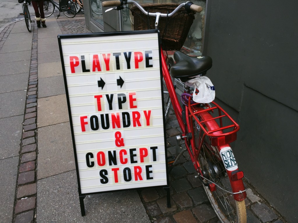
Leeds Print Festival 2015

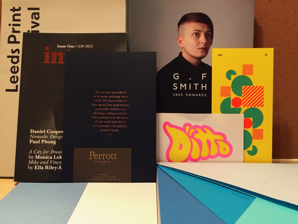
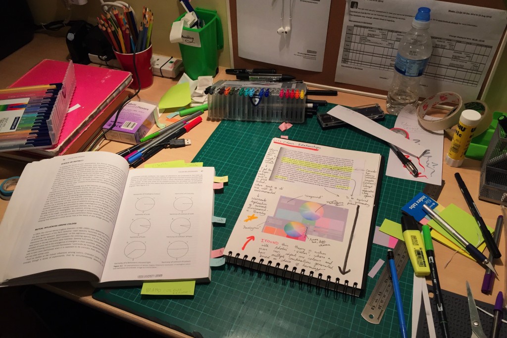
So after being stranded in Leeds on Thursday after planning to go to Burnley to conduct some research for my Pantone D&AD Brief, which is to “reimagine your hometown through the language of colour”, myself and a bunch of other designer friends headed down to Leeds College of Music for the Leeds Print Festival (#LPF2015) talks.

A dusting of snow over Hyde Park
Sketching and research for my brief

After wandering round the foyer and picking up my invite and a tonne of free print goodies, we took our seats and the first speaker was up: Alec Dudson, editor and creator of Intern magazine. He made a strong case for the retention of print as a medium and also as a craft, with points such as:

  1. Print presents a unique method of discovery, free of algorithms and associations as found online.
  2. Print is an art form, as you are creating and working with physical materials.
  3. Print is permanent.
  4. Print forces you to consider ideas more carefully, as mistakes cannot be rectified later on.
  5. You can interact with print, it is an object that you can take, lend and want back.

The points he made (which were more numerous than the select few above) really made me consider focusing more on print in my work, and treating the process as more of a fine craft, rather than just taking for granted my handy little inkjet. The talks continued with two speakers from Counterpress, a letterpress studio in East London.

They also made further compelling points – noting how that print, rather than dying out, is just becoming more of a specialised process. This idea that print is becoming a specialist craft, rather than just a standard method of mass-producing environmentally unfriendly copies of something, was an optimistic new take on print’s seeming decline which I agree with.

Counterpress take the stage

After a quick break, Paul Heys, a senior lecturer of Graphic Design at Sheffield Hallam University took the stage. He had an interesting story to share on a project he embarked on with the Stanley Kubrick Archive at UAL, and also some other wisdom, my personal favourite being “find what you love and let it kill you.”

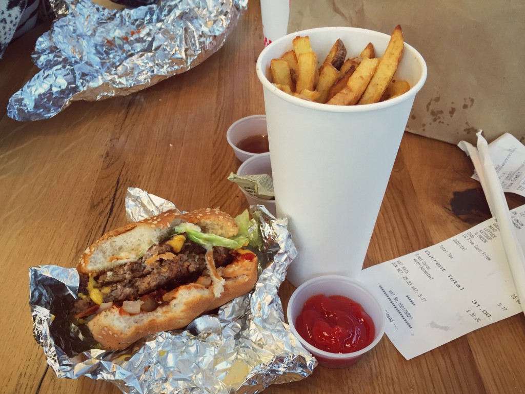
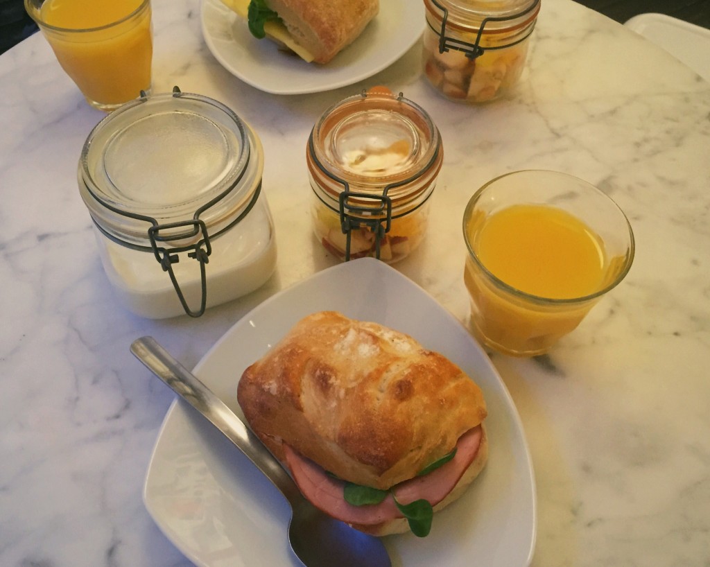
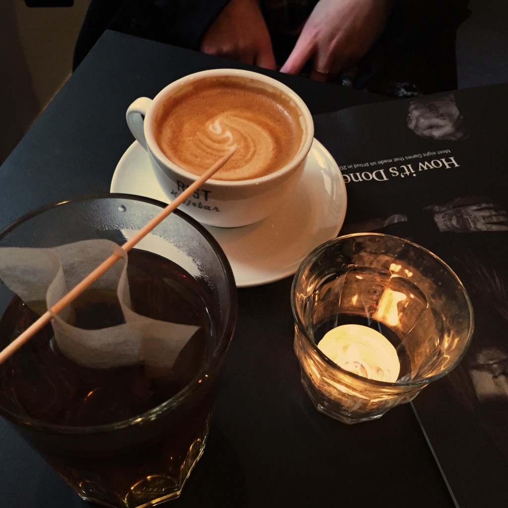
We then took some time for lunch, where we headed just across the street to Café 164 for a delicious chicken and chilli sandwich. Situated just next to Colours May Vary, it’s a lovely spot to stop by for a snack and a coffee if you’ve treated yourself to a lovely new book.

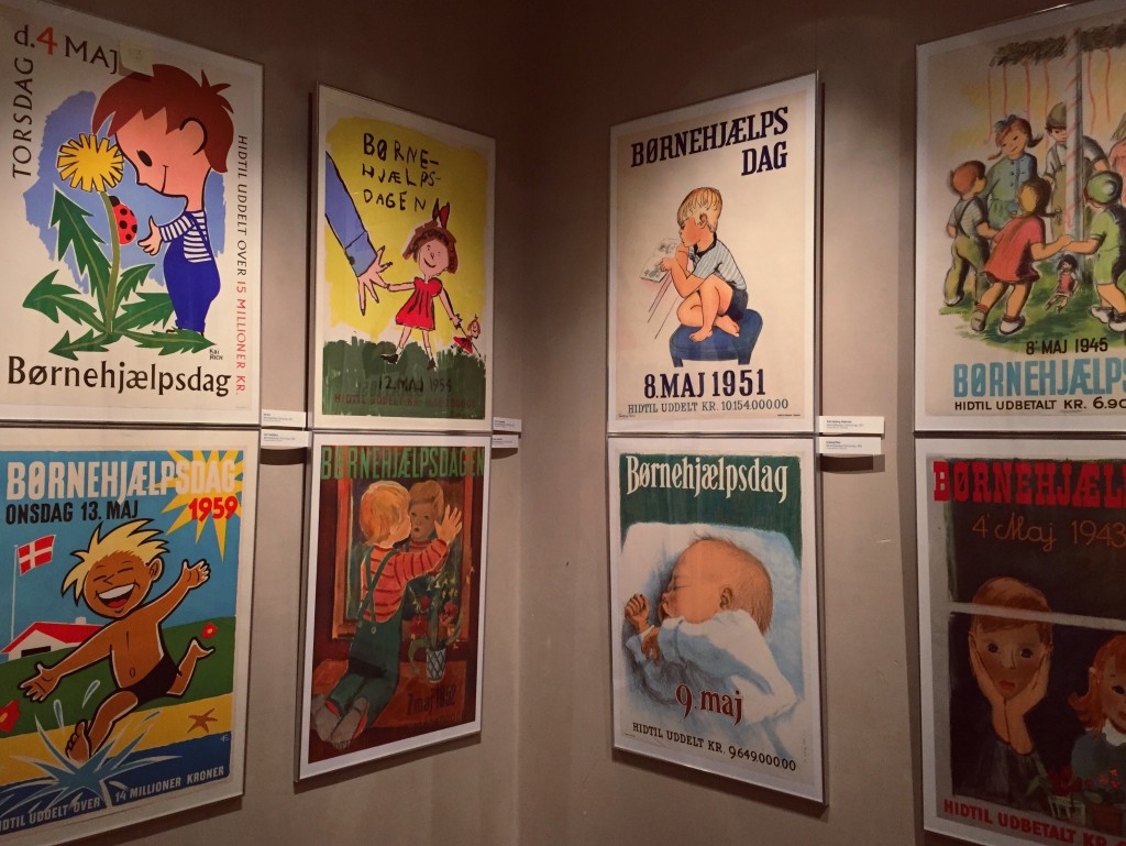
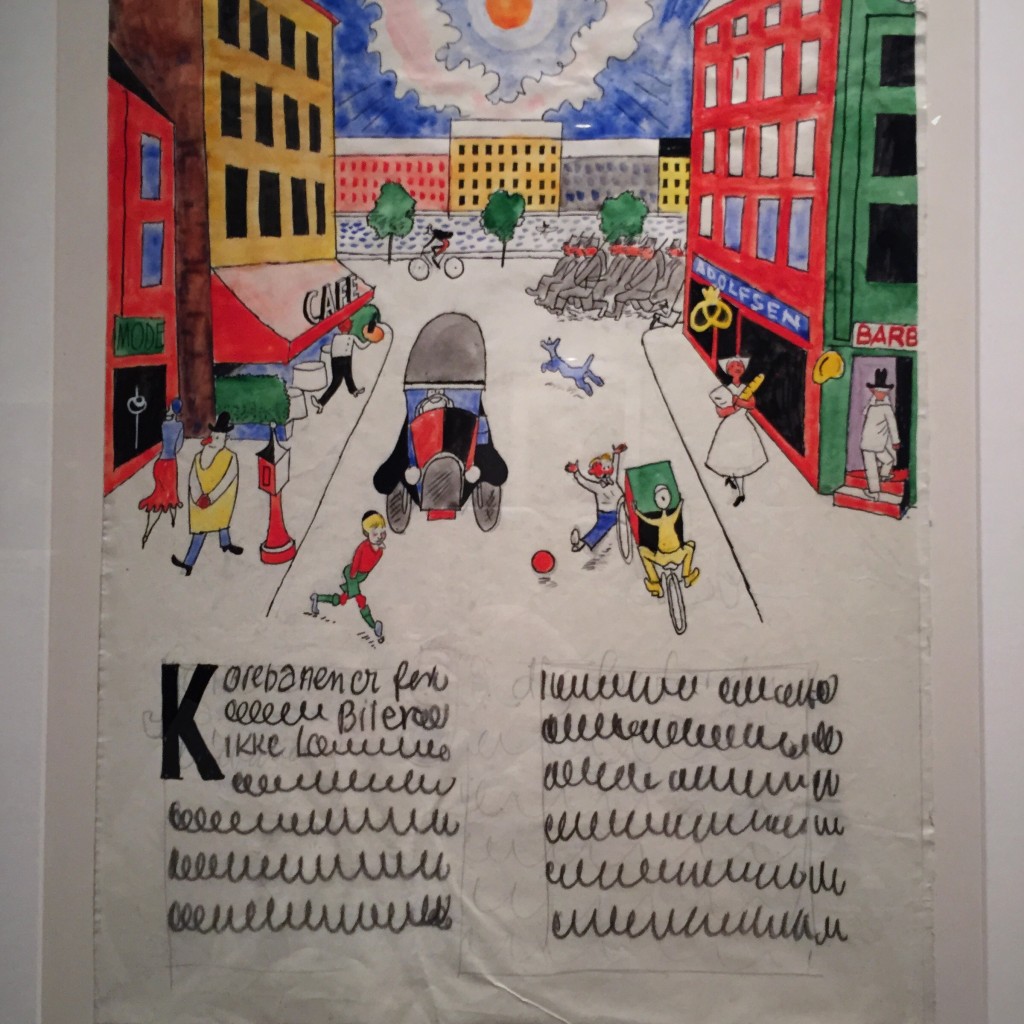
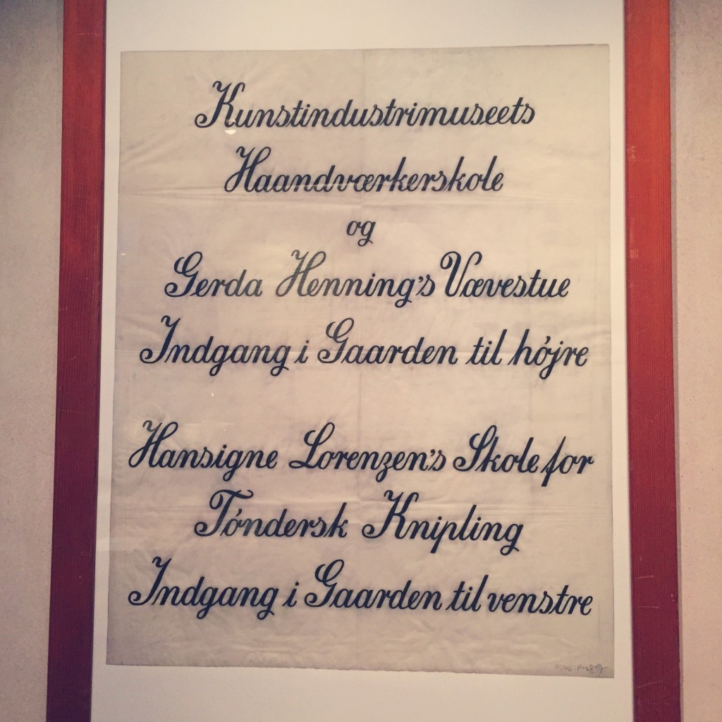
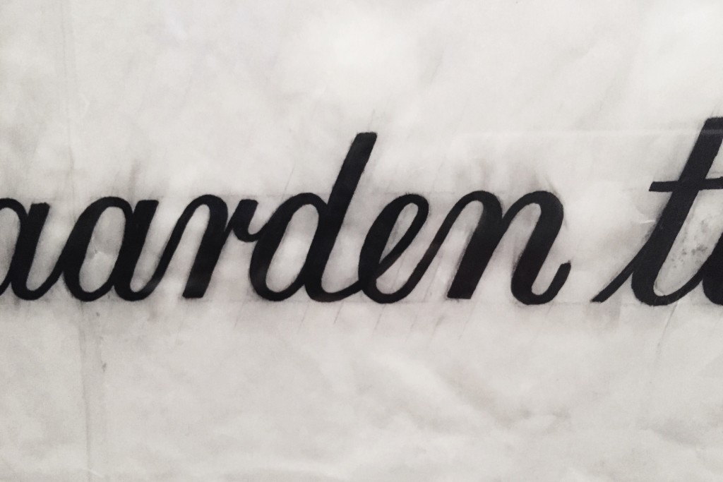
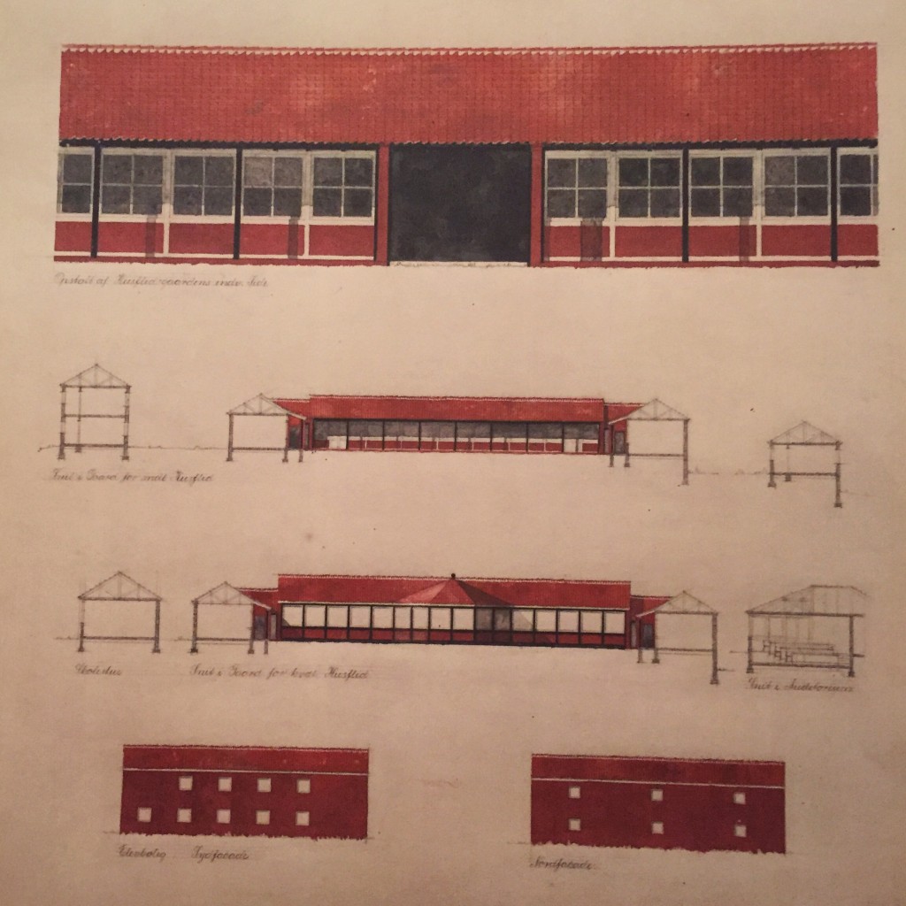
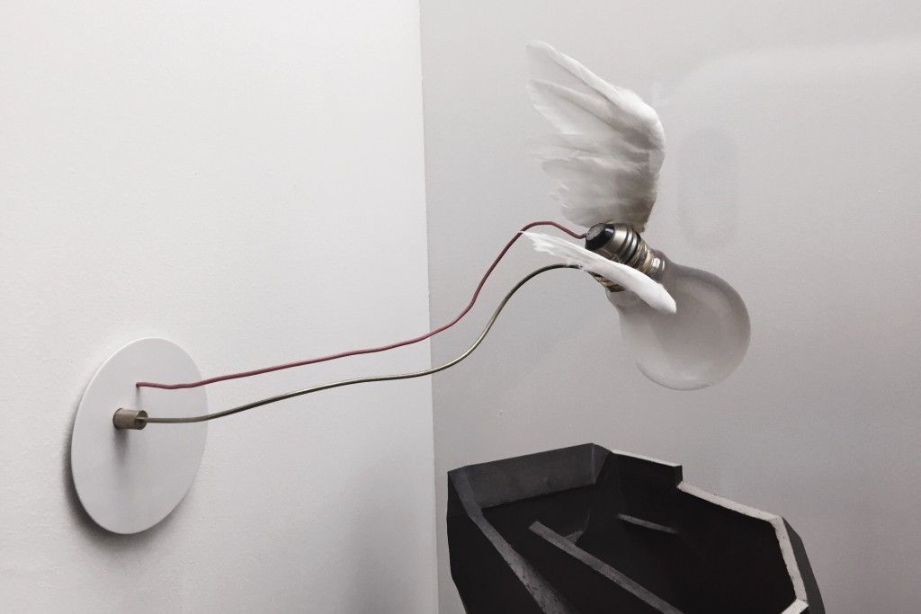
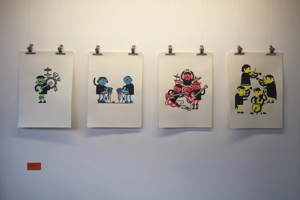
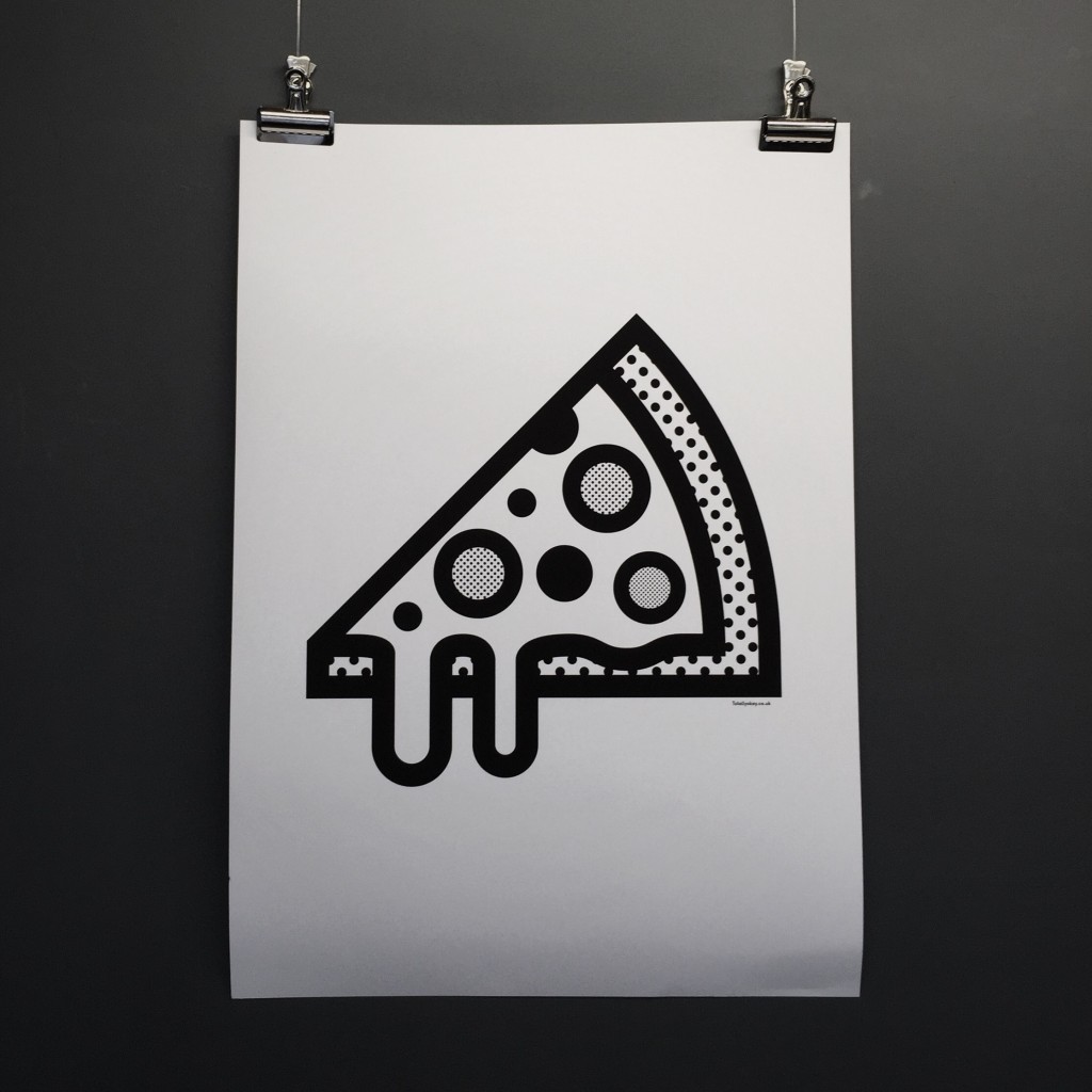
As part of the Print Festival events, the exhibition space by the café was housing a selection of beautiful prints from a variety of designers and artists. Two of my favourites are below…

I love the colours in this set
I love this because I love pizza, and the style is beautiful

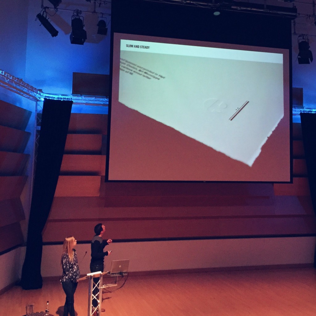
Before too long it was time to head back to the auditorium to recommence with the talks. Patrick Burgoyne, editor of Creative Review was there to greet us (as he did last year), and he introduced the next two specialists to deliver their talk: a father and daughter duo who run Perrot Bespoke Printing, a print studio down in London.

Having been featured in a video during last year’s festival, it was great to have them there to deliver a speech, which they began by reshowing the original video. It’s a beautiful piece of filmmaking showing the equally beautiful work that the workshop produces, and you should definitely go and give it a watch.

Next up we had Ben Freeman from Ditto Press on stage to give a talk on the work he does at his London studio, where he seemingly pioneered the introduction of the risograph printing process for decorative work rather than simply batch copying of boring ol’ documents. One of there most famous pieces of print work is the Ninja Turtle Porn Museum (check it out here, it’s quite obviously NSFW, however).

To finish of a long day of talks, a design legend Ken Garland took the stage, to present a talk entitled “Protest Graphics: Professional & Amateur”. Ken had us all in stitches as he talked us through some gabel end art in Derry, the use of amateur and professional designs in signage used during protests, and other pieces of famous graphic designs protesting against issues such as nuclear war (including some of his own!).

The talks ended with a panel discussion, where the audience were invited to ask questions of a panel including Ken, Patrick Burgoyne, Paul Heys and the guys from Counterpress. It was here where Ken dropped another pearl of wisdom, which I am very much tempted to print out and stick on my wall: “What we need is less graphics. Graphics can be a pain in the ass. There are too many signs everywhere. I love it here. I don’t see a single sign. Lovely. Wonderful.”

I have since made it home from the festival and unpacked my backpack full of delicious print loot, including a copy of Intern Magazine which I picked up for just £5. I had another amazing day at the Print Festival and would strongly urge that anyone with any interest in graphic design, art or just the medium in general heads down there next year for what I am sure will be another wonderfully informative day!

Some print goodies from the festival
27.01.15 — Design

Some Typography Reading

To kick off my new module option, Principles of Typography, I thought I’d make a quick overview of some reading I’m currently working my way through which has sparked and advanced an interest in typography thus far. For anyone who is interested in type, this may provide some useful recommendations for some reading to get you started!

1 The Elements of Typographic Style by Robert Binghurst

I treat this as my typographic Bible, which means that it’s not really ideal for people with a passive interest, however it does deal with nearly every single possible detail and area within typography. Making a lot of recommendations throughout, but also leaving much down to a reader’s personal preference, Bringhurst strikes the delicate balance of advice giving without being too forceful.

2 Just My Type by Simon Garfield

A lovely light-hearted look at typography and fonts, great for a bit of light reading and humour or some basic background history on specific typefaces for those interested.

3 Die Neue Typographie by Jan Tschichold

Quite an interesting document outlining the early thoughts and ideology of the revolutionary German typographer. Leans heavily towards ideological indoctrination with it’s advice and ideas, so should be approached with a neutral passive stance (Tschichold himself later condemned it as too extreme), however it does provide a very interesting insight into some of Tschichold’s earlier ideas.

4 An Essay on Typography by Eric Gill

Another interesting essay which I have (admittedly) not finished reading yet, but which came in a really nifty small Penguin edition so I just had to buy it.

5 Typography Sketchbooks by Steven Heller & Lita Talari

A stunning book to flick through and engage with how others progress through the type design process. Not very text-heavy or informative in a tradition sense, but a lovely addition to my bookshelf nonetheless!

6 The Hand Job by Michael Perry

Another catalogue of hand drawn type which spans an array of designers and styles, a great source of inspiration for any design project, with its array of styles, colours and ideas. To be enjoyed as another piece of visual indulgence.

There are countless many more books out there on type, many of which feature in the module’s reading lists, but here’s a few that I already own and my quick thoughts on them. At the moment I have my sights set on acquiring Jason Santa Maria’s “On Web Typography“, as this intersection of typography and digital design is somewhere I am very interested in exploring.

26.01.15 — Journal

Year 2, Semester 2

A mere day after landing back in England from Copenhagen and Stockholm, I found myself back on a train with Izzy to Leeds for a marketing exam. A few days later, I’m now back in Leeds permanently once again!

Once again, as with the beginning of last semester, I was amused by the decorations which adorn Hyde Park. This ironic piece of graffiti, which I found a few blocks from my house, made me laugh.

Hyde Park strikes again

When my dad kindly drove me over with a car full of my stuff, we picked up Luisa from our house and decided to grab some food from Five Guys after a quick shop around Aldi. Having seen many Five Guys outlets dotted around America during my trip to Florida, I had’t thought much of them, with their pretty bland red and white colour scheme and industrial.

But the food we had their was delicious! Luisa got a hamburger, my dad a cheeseburger, and I went very over-the-top in true American style and ordered a bacon cheeseburger. What we didn’t realise was that every burger they sell is a double!

With unlimited peanuts, a huge cup of chips fried in peanut oil and a soft drinks machine which dispensed approximately a million different drinks, we were well fed! Also, as the reviews adorning the walls of the eatery testified, it was all delicious.

Bacon cheeseburger and chips from Five Guys

But as of today we are all back to the grindstone that is daily uni life. Bring on afternoons spent in the design school, curly fries in Old Bar and hours spent lost in the maze that is the Roger Stevens building.

Today we all sat in the Design Common Room to begin some light work, and our programme leader came over and dropped us a copy of the D&AD Winners Annual from last year (2014). This semester we will all be completing D&AD briefs for our core graphic design module, and it was great to have a look over past successful entries.

D&AD New Blood 2014

Today I also began my elective module for this semester – ‘Principles of Typography’. For this module I will be researching, analysing and comparing examples of typography, and I will be keeping my blog updated with my findings and outcomes, which I will also collate on this page of my site.

For now it is time to do some work on my Behance, read over my chosen D&AD brief (all to be revealed soon), and get an early night in ready for the first workshop of the year tomorrow. Ah – it’s good to be back!

21.01.15 — Travel

Stockholm

So after our four days of adventuring around Copenhagen (read my blog post on that half of our trip here), me and Izzy hopped aboard a plane to Stockholm! We arrived, jumped on a coach to the city centre and then made ourselves comfortable in our new home for three nights, the cool little City Backpackers Hostel.

Arriving late in the evening, we opted to leave the majority of the exploring for the next morning, which began with another lovely Scandinavian breakfast of muesli, yoghurt, fruit and a delicious sandwich.

Breakfast in Sweden

We then promptly headed out to see what we could see across the many islands of Sweden’s sprawling capital. We headed over to an area of the city called Södermalm, a quirky island to the south full of bars, little independent shops and places to eat. We took a tour of the island, learning of it’s history, and befriended a fellow traveller from Holland named Arjan, who had taken a train to the city from another city in Sweden where he was studying for a semester.

Buildings on the trip to Södermalm
More architecture in a city square
Lots of bright yellow and green in the buildings here

Södermalm proved a very hilly, quirky and interesting place, steeped in a lot of gory history and rebellion. Towards the end of the tour, our guide pointed out a couple of great spots to take some photos of the island and views back over the city centre, so here are some of those…

A panorama of the city
The four-leafed clover junction connecting Södermalm to the main island

Our guide, Peter, had also suggested that we visit a food truck in the main square to try a wrap with fried herring, mashed potato and salad. Dubious, we wandered down and bought one – and it was delicious!

My herring and mashed potato wrap

We also paid a visit to Fotografiska, a world-famous photography museum, which was showcasing beautiful exhibitions from Adi Nes, Jimmy Nelson and Herb Ritts. We spent a good time wandering round the exhibitions, which were beautifully considered, arranged and lit.

Fotografiska, along the waterfront on Södermalm

Ari Nes’ “Narratives” caught my attention in particular, as a homosexual Israeli he captured scenes which seem to encapsulate themes of political unrest, religion and homoeroticism whilst demonstrating strong influences from art history. These clashing influences made for an interesting collection, which seemed to complement the other two exhibits, both of which also focused on people.

Herb Ritts’ collection “In Full Light” seemed inspired by the human form whilst still striving to capture the essence of how the subject of the image would like to be remembered. The series of black and white images took up an entire floor of the museum and included celebrities such as Michael Jackson and famous works such as “Stephanie, Cindy, Christy, Tatjana, Naomi“.

Jimmy Nelson’s collection, entitled “Before They Pass Away” was a series which captured indigenous cultures, with the aim of preserving their essence before their cultures are lost. The rationale provided by the collection’s curator was particularly interesting, as it spurred the debate over whether the fact that Nelson had staged the photographs really captured a honest and true essence of the subjects and their cultures. Rather refreshingly, however, the curator had not tried to defend nor attack Nelson’s choice – only to open it up for discussion.

After browsing through the three exhibitions, me and Izzy headed up to the café on the top of the building for a Sewdish ‘fika’, meaning time out with coffee and a snack. The café had been said to be worth a visit purely for it’s views – and it was!

A brew with a view, a coffee over the water and the city

That night we headed back to Södermalm with Arjan to try out an Italian restaurant one of his friends had recommended, Vapiano. The restaurant works on an efficient and interesting concept, whereby you sit down, choose your dish and then take an electronic card to the counter. Your food is cooked there and then in front of you, and the dish is billed to your card, the balance of which you pay on exiting the restaurant.

I had a delicious carbonara cooked by this fine fellow!

Our chef looking enthusiastic

On the way back to the hostel we discovered the first of what would be many open and free outdoor ice skating rinks! We headed on in our shoes and slid around for a while, suddenly realising why the hostel had a case full of free ice skates which you could borrow.

Izzy on the ice

The next and final full day was spent on another tour, this time of the main city, during which we ran into people who we’d been on a tour with in Copenhagen! The tour was once again great, and having discovered much about the city and it’s history, we winded up atop a huge snow pile where an England vs. Holland snowball fight broke out…

Izzy takes on the huge pile of snow in the King's Square
A view across the water in Stockholm

From here we boarded a ferry for a sixty second ride over to another of Stockholm’s many islands, to visit the large outdoor museum named Skansen. As Sweden’s first and largest outdoor museum, the museum’s creator had deconstructed various buildings from across Sweden and throughout history and re-erected them in Skansen, forming a vortex of time and space.

Upon our arrival we were tired, cold and hungry, and so we stopped for a delicious egg sandwich in a restaurant which housed a reconstructed room called the Ottoman Room. We then headed out into the vast expanse of the park, and not everything was as it seemed…

My egg sandwich
The Ottoman room in Skansen

As we wandered through the snow, it soon became apparent that there were hardly any other human souls in the park, and that the reduced entry fee was due to most exhibits being either closed or, in the case of the rose garden, dead. It was crazily surreal to walk through what felt like an abandoned theme park, but we found some interesting exhibits such as monkeys (which we watched being fed), some huge blocks of ice, and an array of cannons. Izzy in particular appreciated the cannons.

Izzy atop a cannon
A panoramic view out from Skansen

That evening we headed down to try some traditional Swedish food, after a heartbreaking revelation by our tour guide that meatballs are in fact considered a children’s food there. We were advised instead to try a potato and meat hash from a local restaurant, which we did.

My sausage, beef and potato hash with egg, pickled vegetables and more mustard sauce

The dish was delicious, and it was lovely to end with another true taste of Sweden. However, in our final morning, things got decidedly even more Swedish when we woke up to see a thick blanked of snow had enveloped the city!

A lovely winter scene from the hostel's main entrance

Worth a mention also was a strange venue which we opted to visit to kill a few hours before our coach in the morning, which was the Kulturhuset in the city centre. This multi-use cultural venue housed a theatre, exhibition space, a library and many cafés, one in which me and Izzy opted to stop for another fika to use up our remaining Swedish kroner.

But all good things must come to an end; and so, after browsing the design section of an open library in Kulturhuset, we headed back to pick up our bags and head off through the snow to catch our airport transfer coach.

Very cold backpackers prepare to leave Stockholm

To summarise, Stockholm was another gorgeous city, albeit slightly more modern and industrial than Copenhagen. Once again, I would definitely recommend a visit if any of you guys get the chance. Just be sure to fully explore all the islands, and try out their coffee, pastries and anything with lingonberries in it. Delicious.

Don’t forget to check out my blog post on Copenhagen, as part of me and Izzy’s Scandinavia trip, and also my overview of the Danish Design Museum which we took a trip to whilst we were there.

18.01.15 — Journal

Danish Design Museum

As part of me and Izzy’s trip to Copenhagen we stopped by the Danish Design Museum for a tour through some of history’s greatest Scandinavian design.

The museum building
Design Museum Denmark (Danmark)

The museum began by showcasing the visual history of children’s books (all in Danish of course) which pleased my graphic designer sensibilities.

Issues of Børnehjælpsdag line the walls

The installation focused on a publication called “Børnehjælpsdag”, and was intriguing in that it showcased various techniques through different styles. From traditional pencil illustrations to blocky nearly-constructivist screen printed compositions, it made me wonder – had the change in Danish style necessitated the change in technique, or was the inverse true? Did emerging and increasingly cheap and more common techniques push designers to adopt these new modernist styles?

Watercolour page design

In a city surrounded by an abundance of great design, I was apprehensive as to whether a design museum was necessary – in this beautiful city one only has to look around to see countless examples of architecture and design in all its forms dating from the 18th century right up to the modern day.

However the museum proved to be well worthy the wander down, as it was free to enter for students (under 26) and hosted a wealth of design history: covering fields from industrial to fashion to graphic design.

Chairs, chairs, chairs

The most prominent and recurring installation was, of course, the designer’s favourite: the chair. Chairs from all periods of history were on display throughout the museum, including a Danish favourite: the egg chair. This old timeline suggesting the future development of the chair made me chuckle – cynicism of minimalism at its best.

First Bauhaus, what craziness comes next?!

I am reminded here to defend the minimalist attitude, with a quote from one of my personal design heroes, Dieter Rams: “Good design is as little design as possible.”

Some beautiful type composition

The museum was split into themed sections, dealing with either fields of design, specific designers or design eras/styles. One section which caught my imagination was this futuristic house and design philosophy by Arne Jacobsen, the former of which consisted of a circular construction with an abundance of pure white, described by the museum curators as a “utopia of movement and lightness.”

"The House Of The Future" by Arne Jacobsen and Flemming Larsen
“The House Of The Future” by Arne Jacobsen and Flemming Larsen

A section which also caught my interest was one which transported me straight back to Leeds – the textiles and fashion design section. With the University of Leeds’ International Textile Archive right on campus, I have already been exposed to and taken interest in the patterns and shapes used in textile design through the ages and across cultures. It was very interesting to be able to see such beautifully intricate designs, some of which were even woven with silver and gold threads.

A beautiful calligraphy-style poster
The underlying pencil grid still just about visible

Something which I noticed as we wandered through the industrial/furniture design section towards the end of the museum was the intricacy of the work and the overlapping of layers for both structural and ease-of-working purposes. As mentioned above, the grids behind seemingly freehand script type were visible upon closer inspection, reinstalling an appreciation for this precise craft.

An architect's plans
An architect’s plans

Seeing the many perspective views of a structure or product around each other made me appreciate that there was a time where photocopying wasn’t viable, and the fineness of the details in these plans was awe inspiring.

The museum concluded with the oldest trick in the tourist-trap book – a gift shop. Excuse my scepticism there, it was actually a really great shop full of some beautiful Danish designs. Being as skint as we were though, me and Izzy opted to sit down and drink our bottled water instead. The life, eh?

A funky (but seemingly unsafe) lamp

To conclude the Design Museum was more than just a few examples of graphic design, it provided a fascinating look back on the history of all areas and facets of design as a practice. I thoroughly enjoyed spending a good couple of hours browsing through the collections, and would suggest that any design-minded people passing through Copenhagen make sure to give it a visit.

Travel

Copenhagen

Having landed at Copenhagen Kastrup airport mid-afternoon, Izzy and I made quick progress in finding the way out towards the metro, and with our 36 kroner tickets in hand we were soon flying through subterranean Denmark en route to our hostel.

After a breeze of a check in and dropping off our bags, we headed out for a spot of exploration and to find something for dinner. Little did we know we’d find our way straight to Nyhavn, the infamous old dock with colourful buildings adorning it’s length, all steeped in history and rather beautiful.

Izzy taking in the view
The buildings along Nyhavn
From the mouth of the dock

From there we managed to get totally lost looking for the recommended eating area, and ended up stopping by for a burger at an American themed eatery. It was lovely, and gave us the chance to get used to the strange currency and realise that everyone we met spoke perfect English. We made it back to the hostel before too late and got an early night in.

We woke up pretty early and enjoyed the delights of Generator Copenhagen’s buffet breakfast, with a plan to meet a tour guide in reception at 10am to head off on a free walking tour around the city. We hoped to get a feel for the history of the beautiful city and also orientate ourselves a bit better!

Enjoying the breakfast

Wandering out with Magnus, a tour guide for Free Walking Tours Copenhagen, we were soon on our way through the city. First thing’s first – it was cold. Very cold.

Super impressed by the temperature

We visited some beautiful places on the tour, including the Royal Palaces, the courts, the Town Hall and many more. One of my personal favourites was the final stop of the tour at the Marble Church, a breathtaking round building constructed entirely from marble…

The marble church in Copenhagen

The tour was brilliant and Magnus did an amazing job of immersing us all in Danish history and teaching us all about the culture. He made a very beguiling case as for why we should either live or study there, and with such a safe and pretty city with such nice people I see no reason why I shouldn’t seriously consider it!

Anyway, excuse my gushing, I’ll continue. That night me and Izzy decided to join Magnus and another tour guide, Luis, on a pub crawl, both to sample the city by night and to meet and socialise with other travellers who we’d met on the tour. It was a lovely evening, with free popcorn all round, and we met people from Canada, London, Bristol, Australia, Germany and more! We even got talking to some of the Danish Royal Guard!

The next day we were up early once again, headed out to visit a rather niche store, the Playtype concept store. Playtype are a Copenhagen based type foundry, and their concept store stocks various products and prints bearing typefaces they have crafted. We passed by Tivoli on the way, a compact amusement park in the heart of the city which was sadly closed for the winter season. Magnus had mentioned that this is where Disney apparently got his inspiration to begin designing Disneyworld.

The entrance to Tivoli

Anyway – back to Platype. As over-excited graphic designers, we arrived half an hour before the shop opened, so we opted to stop next door for some tea and coffee.

Tried out some liquorice tea

After this we could finally step inside, and an array of beautiful gifts and keepsakes greeted us.

The Playtype concept store signage
Various products line the shelves
A collection of striking prints

I winded up eyeing up the above set of prints, picking out the “O” one with such gusto and admiration that the lovely lady running the shop said I could have it free of charge. We then conversed with her for a while and racked up some local recommendations on where to eat and visit whilst we were there.

My new print

After eating cookies in bed and an early night, we headed off early once again for a visit to the Danish Design Museum (click here to read my blog post on this, it was too much to fit into one!) and for a tour of an area of the city called Christianshavn, which ended in a more interesting ‘city within a city’ called Christiania (or Freetown Christiania). This kooky little area, formerly a restricted military zone, was reclaimed and repopulated by hippies in the 1970s and has since become a haven for creatives and those who prefer an offbeat lifestyle.

Heading over the water to Christianshavn

It was a strikingly different place, but equally as fascinating and beautiful as the rest of the surrounding city. As photography is restricted in certain areas of the town, I only managed to get a few photos, but I would highly recommend a visit if any of you just happen to be passing through Copenhagen.

A quirky colourful building near one of the town’s entrances
Me and Izzy outside the main entrance to Christainia

Another structure I found particularly interesting on Christianshavn was the Church Of Our Saviour (or ‘Vor Frelsers Kirke’ if you’re our tour guide), with it’s counter-clockwise spiral staircase spire and funky carillon (a series of many church bells that can play any number of melodies) which rang out every hour on the hour. Unfortunately I didn’t manage to get any decent photos of the church but a quick visit to Wikipedia won’t leave you disappointed.

Another part of Christainshavn

Throughout our trip, of course, we tried to make a point of stopping to sample the local cuisine. I had a ‘smørrebrød’ (open sandwich) with beef, homemade horseradish, onions, pickled cucumbers and ‘sennepssovsen’ (a Danish sauce made with mustard), and also a dish akin to the Danish national dish, ‘stegt flæsk med persillesovs’ (fried pork steak with potatoes and parsley sauce).

My smørrebrød

On our last day in Copenhagen, me and Izzy visited the Rundetaarn, a round tower which offered beautiful views over the city. Naturally we stopped for photos!

A panorama of the city

What stuck me the most though was the method via which one ascended to the top – a spiral ramp! I found this wide spiral incline very fascinating, as I’ve never seen anything like it. I went to the tower expecting a daunting climb up a grimy stone spiral stairwell, not a slowly curving floor, which you can make out in the photos below.

Me on the spiral ramp
The spiral ramp at Rundtaarn

We also took some time afterwards to track back through the city, nipping back down to the docks to see the modern architecture of the Opera House and National Theatre before taking one last stroll down the docks of Nyhavn.

The National Theatre
Looking back down Nyhavn
A decorative building near Nyhavn

For our final evening we opted to head north and visit Nørrebro, another district within the city, where we stopped for a traditional Danish hot dog (which is topped with mustard, ketchup, sennepssovsen, pickled cucumber, onions and fried onions) and a drink.

Looking over to Nørrebro

So that was our four days in Copenhagen, a beautiful city full of lovely people, where the hygge (feeling of being comfortable, click here to read more about this beguiling concept) flowed in abundance. We then moved on to Stockholm, which you can read about in my next blog post here. Also remember to check out my blog post on the Danish Design Museum (the link will open in a separate window).

I would absolutely recommend the city to anybody who is considering a visit, and I will definitely be back to Denmark, be it for another holiday, (hopefully) for a placement later this year or maybe more permanently…

Update: I’ve recently (September 2015) visited Copenhagen once again! Click here to view some scenes from my latest visit…

12.01.15 — Journal

Welcome Back

Hello and welcome back to my sparkly new site which integrates my newly overhauled blog!

Unfortunately when my old blog went down, I lost the majority of my posts and images, but due to a lucky glitch I’ve been able to recover most of my text posts. If I get a spare moment I shall begin to re upload them here, where they will sit back in the archives where they once did.

Since my blog went down I have amassed some exciting updates to share with you, here’s a few highlights!

  1. I won an internship at Sky Sports
  2. The Burnley Arts Centre site has gone live
  3. My website has launched
  4. I’m off to Denmark and Sweden

I hope you enjoy having a good poke around my site. As I am on holiday as of Wednesday I shall not be bringing many updates or responding to any messages, but please do still get in touch if there’s anything you’d like to say or ask!

07.01.15 — Journal

Burnley Arts Centre Site Launches

It’s true – after over five months of work and a lot of blood, sweat and square eyes, the Burnley Arts Centre site has finally gone live!

IMG_2176.PNG

The site, which is split into two, is designed to work across desktops, mobiles, tablets and all the crazy new electronic devices in between. Why not give it a go?

If you’re from Pennine Lancashire you may also be interested in the content as well as the design, as the Burnley Youth Theatre charity does some amazing work for children and young people across the region.

And with that I regret to inform you that I’m currently feeling quite ill, which is hindering my progress with pulling together my CV and portfolio. Damn. But do not fear, for the empty mugs of peppermint tea are stacking up, testament to my ongoing battle with this throat infection. I will rest when I die!

03.01.15 — Journal

Warm Milkshake

Today I was working away on some design tasks and was suddenly hit by a wave of cabin fever, after having spent a good few weeks in my home office slaving away over projects such as the Burnley Arts Centre Site and this very site.

I decided to jump in the car and drive myself and my dad (my parents have kindly put me on their insurance policy) to Hebden Bridge, one of my favourite places to escape to.

A house on a hill

It was lovely and refreshing to get out and about, wandering up and down the valley and visiting all the niche independent shops that Hebden Bridge has to offer. I made my habitual stops at the traditional sweet shop and at the Innoventions shop in the mill, for some vanilla fudge and incense sticks respectively.

Some creepy foliage in the valley

My dad took me on a wander to an area through which I haven’t been before, and I spied a couple of cool things, the first being this lovely piece of hand type on an old garage door:

Hand typography in Hebden Bridge

The second being this quirky little terrace which the owner has blitzed with plant pots (and a hanging bicycle!)…

A terrace bustling with plant life

I had wanted to sit down in a cool little cafe and have some vegetarian lunch, but my dad insisted that we didn’t have time to spare, and so I settled for a shared portion fish and chips accompanied by my, umm, interesting milkshake.

I had visited my usual haunt, the Milk Bar, a great place where they’ll blitz any type of chocolate or confectionary into an ice cream, and ordered something a bit different (I usually get bubblegum Millions sweets liquified into a shake) – a peanut butter shake. I was then, however, asked if I wanted it hot or cold… Huh?

I asked for hot, wondering what it would entail, and was soon presented with a delicious smelling shake which was, sure enough, hot to touch. Dubious, I took a sip, and it was absolutely delicious! It had been made by mixing steamed milk with the peanut butter and ice cream mix, and tasted like a peanut butter hot chocolate without the chocolate – it was perfect for the decidedly cool weather.

I’m now home, it’s 9pm, and I’m in bed. Weeks of work and then a full day on my feet have drained me, and so an early night it is. I have to be all good and well for Monday when I’m doing a presentation on Social Media and Branding to the entire staff cohort at Burnley Arts Centre – eek!

02.01.15 — Journal

Sky Sports Internship

If the title of this post didn’t already give the game away, I’ve recently been offered an internship to work with the design team at Sky Sports early next year!

The process of securing a placement was a lot of work but a lot of fun. This academic year I chose Web Design as one of my elective university modules, in which we were told that we were to embark on a live brief set by Sky Sports.

The brief, it transpired, was to redesign the video section of the Sky Sports website. We had ten weeks in which to come up with a solution, with eight out of thirty of us being chosen to pitch our ideas to Sky in the final week.

I procured a design which was very simple in comparison to some of the other innovative ideas I saw flying around, but I refused to deviate from my usual utilitarian approach. I did, however, imbue my designs with some innovative features, such as incorporating new interaction through gestures, refining minor features such as the copy used in the time stamps, and adding a “buffer zone” of active area around buttons on touchscreen devices.

I’m super pumped to have won this opportunity to work with one of the leaders in media and broadcasting, and I am very grateful of Sky for allowing me the opportunity to work on a live brief and present my work to them. I have already had the chance to ask for some really useful feedback from the team.

All in all good start to 2015! Now on with the final push to launch this Burnley Arts Centre site…