Monthly Archives: February 2015

27.02.15 — Journal

Eating Food & Catching Trains

So let’s begin the most important thing: food. The other day, as many of you will know, was Pancake Day, and so I decided to eat nothing but pancakes after midday. After about six pancakes, however, I decided to wave a white flag and invite my housemates to join in and help.
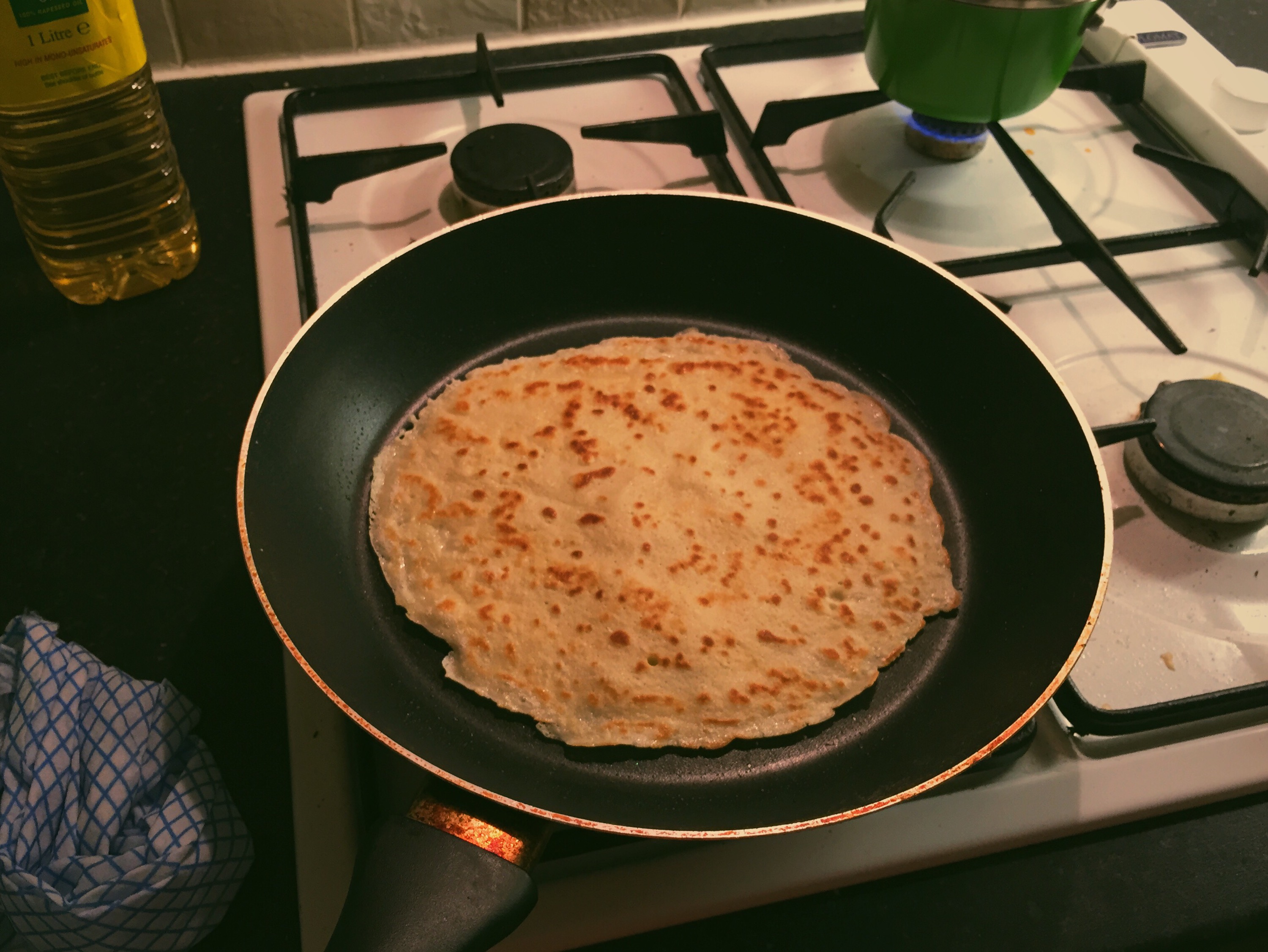
Cookin' a pancake

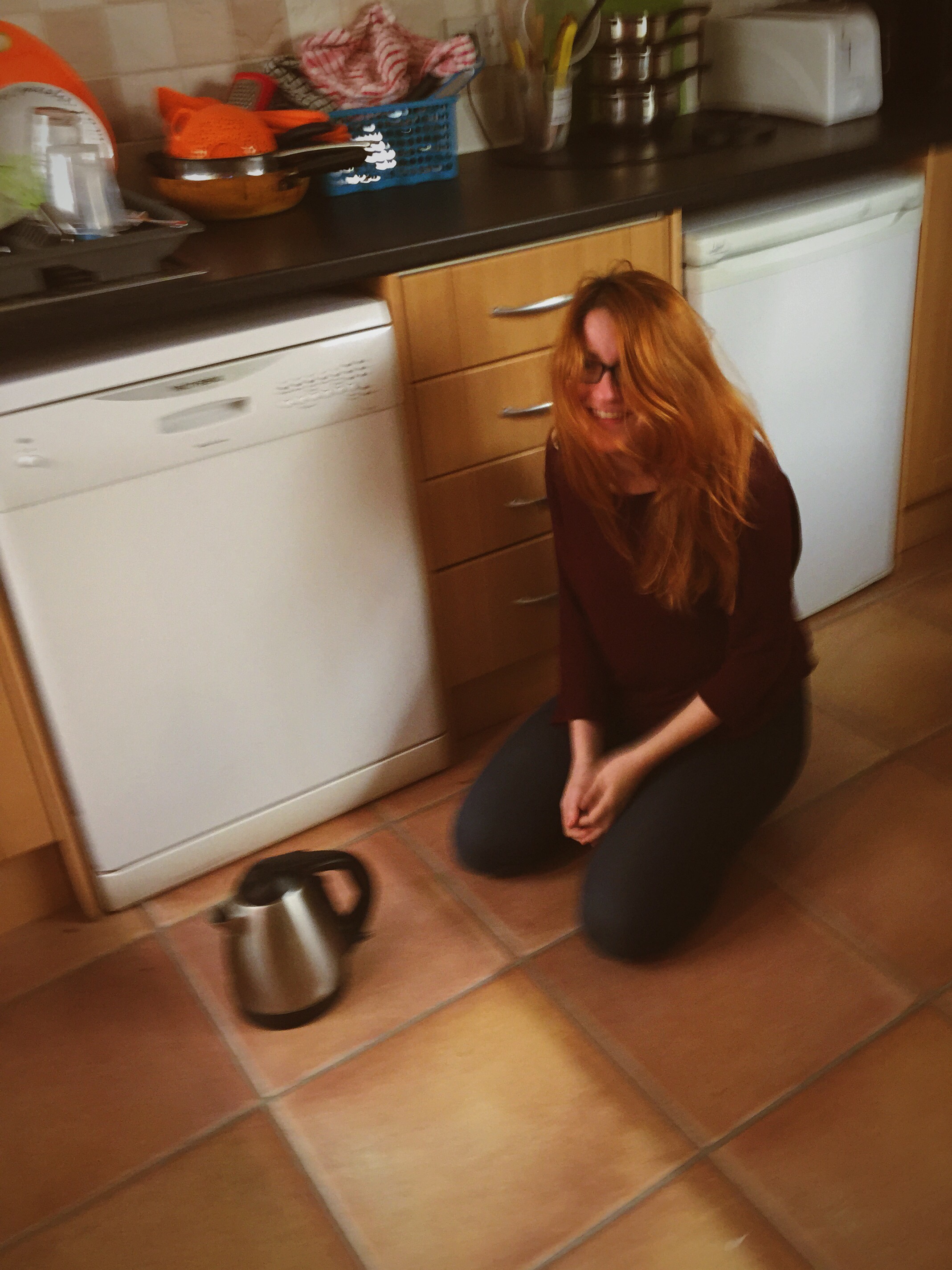
Luisa, meanwhile, was delivered some obviously hilarious news, and ended up on the floor alongside the kettle she was using. I only mention this as I found the resulting picture to be a work of art. Check it out:

What was so hilarious that this happened?
This week in uni I have been finishing off and submitting my Principles Of Typography essay plan as well as creating a series of stripe designs for my Design Theory module. As obscure as some found this task, I understood it’s importance in the exploration of design theory, which I am sure to bear in mind whilst I create designs.

Anyway, after a lecture in the infamous Roger Stevens building, I wandered out the wrong door and found myself on a balcony I’d never encountered before, but which offered a lovely view back towards the city.
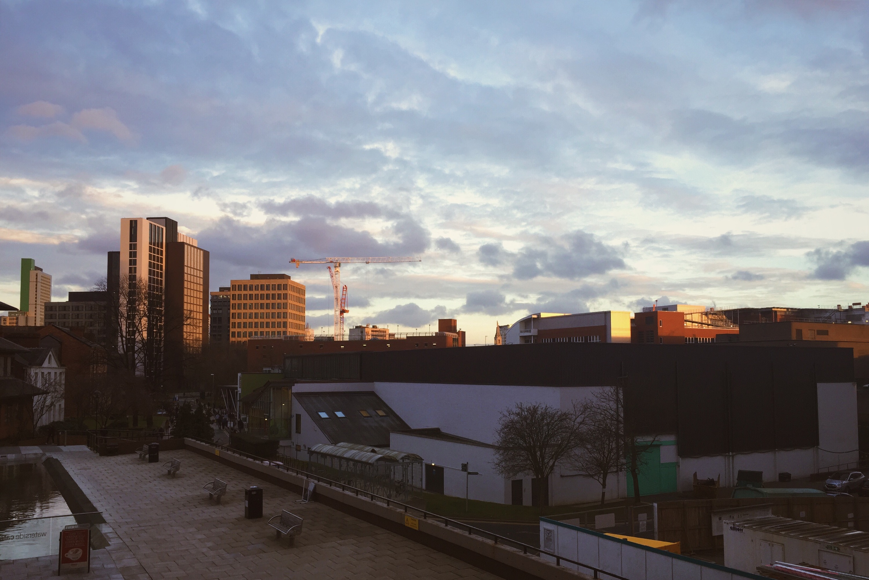
A view from Roger Stevens.

In less academically demanding news, me and Danni met up for a Laynes Espresso and a lunch date at Trinity Kitchen, and I opted for something a little different – vegetarian steamed buns. These had shiitake mushrooms, cheese and spinach in them, and were served with noodles and tonnes of delicious vegetables. They were delicious. Just take a look how colourful it was!

Steamed buns from Trinity Kitchen.

In a feeble attempt to replicate the deliciousness of this exotic food, I decided to use up some of my taco shells and lettuce, and cooked up a batch of vegetarian chilli using Quorn. Stuffed with this chilli, I added cheese, onion, lettuce and sour cream to create a couple of crunchy tacos.

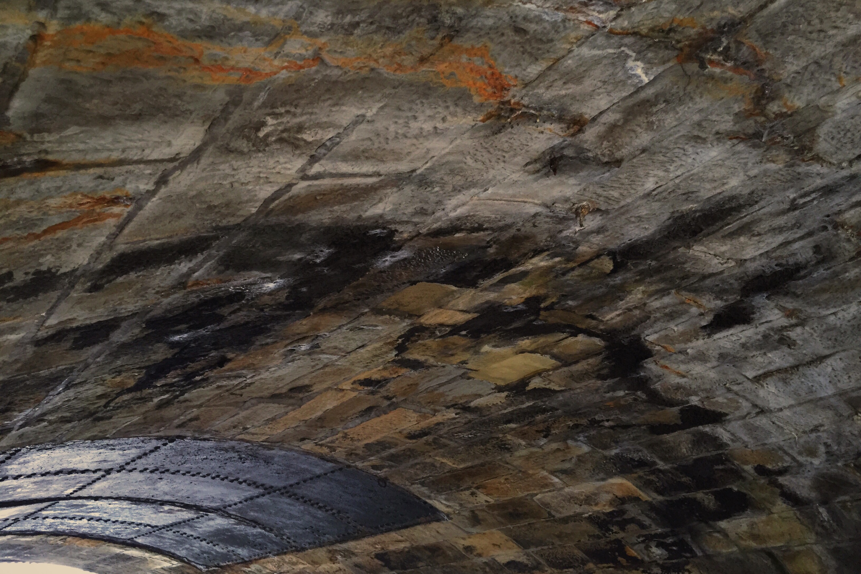
Okay – so as you have probably gathered I have been eating many things as of late, but I am still keeping to my pescatarian diet. But that’s not all I’ve been up to – I also headed back to Burnley for another research trip (see my first here) to take some more photos to be used in my final outcomes. I’ll leave you with a triad of photos of my town…
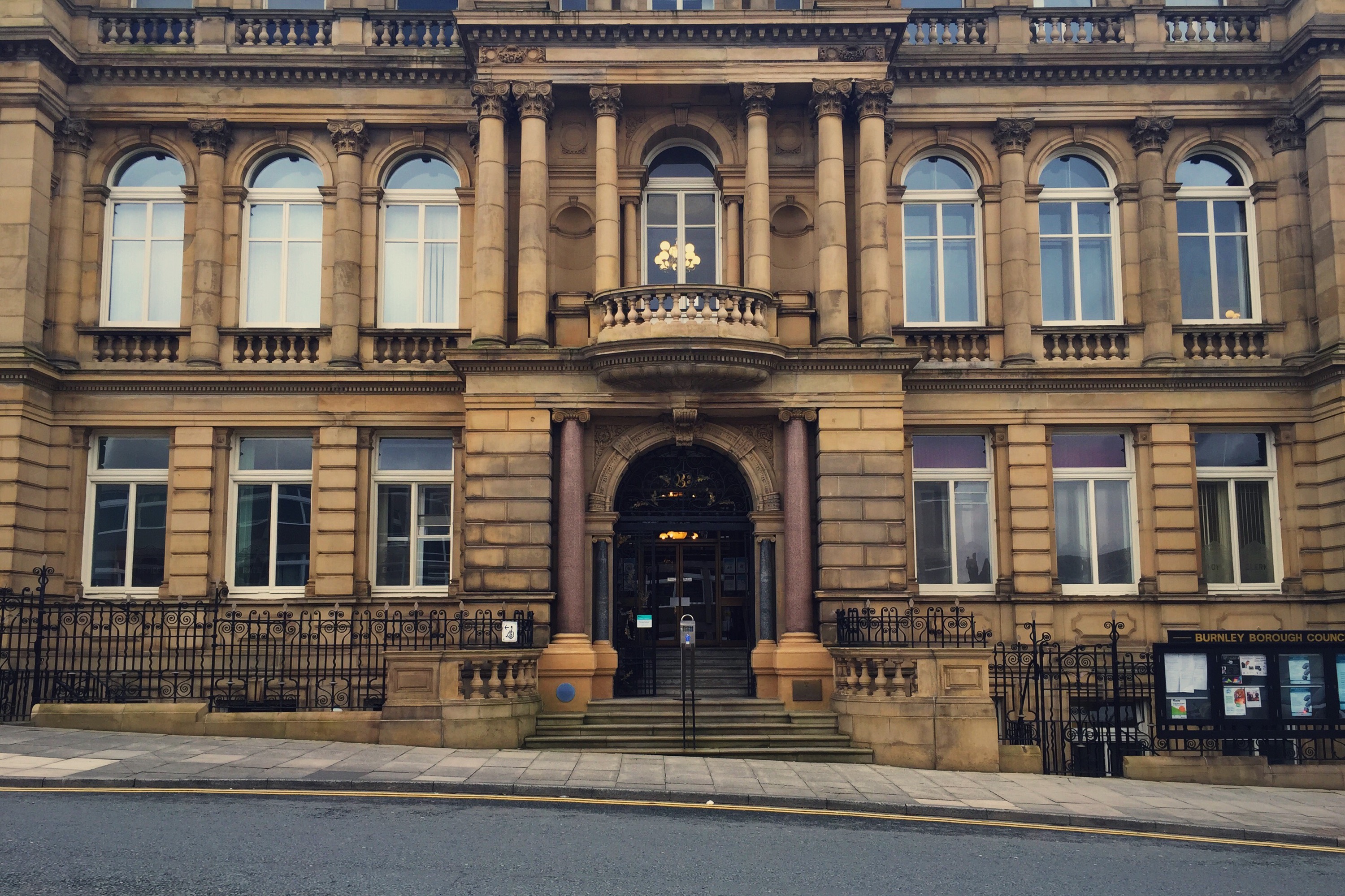
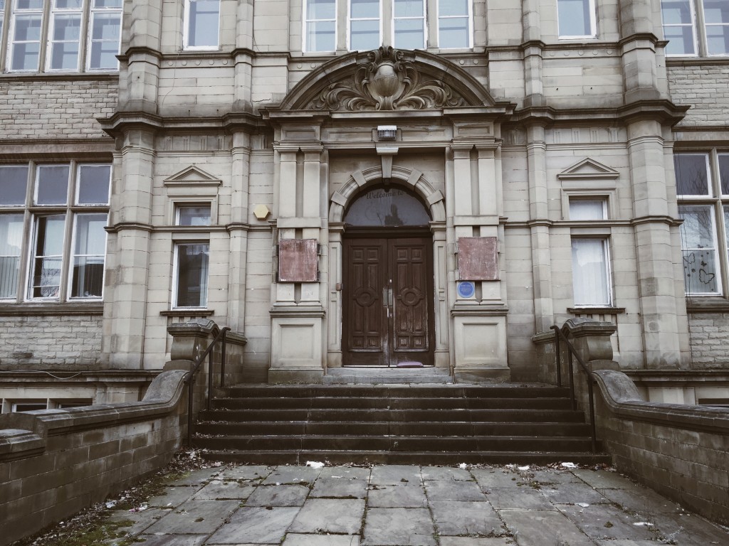
Burnley Town Hall.
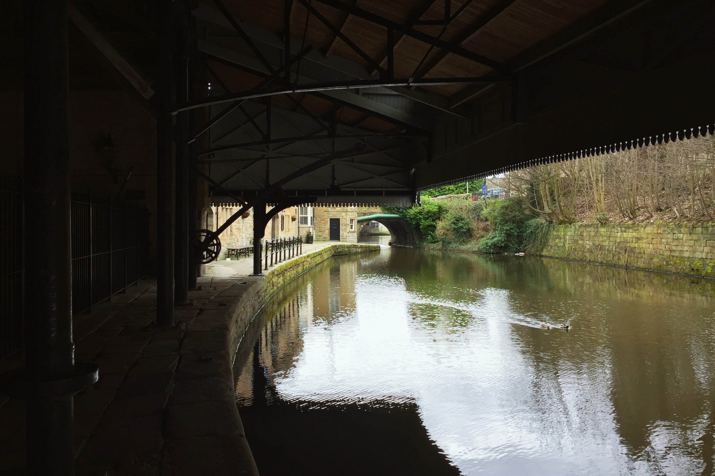
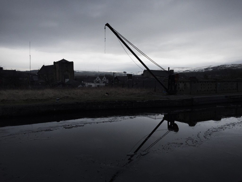
The underside of a canal bridge.
22.02.15 — Journal

Galentines & Other Adventures

In between all this uni work and typography research, I believe it’s time to kick back, grab a mug of Horlicks and reflect on the more relaxed events of the past week or so.

First thing’s first – Galentines Day. Inspired by Parks & Recreation, Galentines Day is celebrated the day before Valentines Day, and is a chance for all us singletons to come together and celebrate being single. Some keen YouTuber has put together this beautifully concise video in which Amy Poehler explains the concept more eloquently than I ever could. I have a huge crush on Amy Poehler.

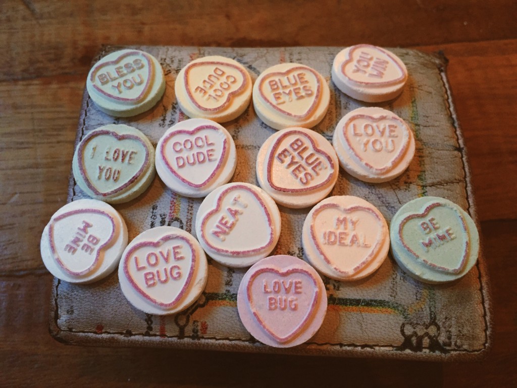
Getting away from the point, we headed down to Nation Of Shopkeepers and ordered a plethora of burgers. Beth had been so kind to bring along a Galentines Day gift for us all, which turned out to be tubes of Swizzles Matlow Love Hearts. We exchanged them, sending sarcastic messages to each other in the process…

Feeling the love

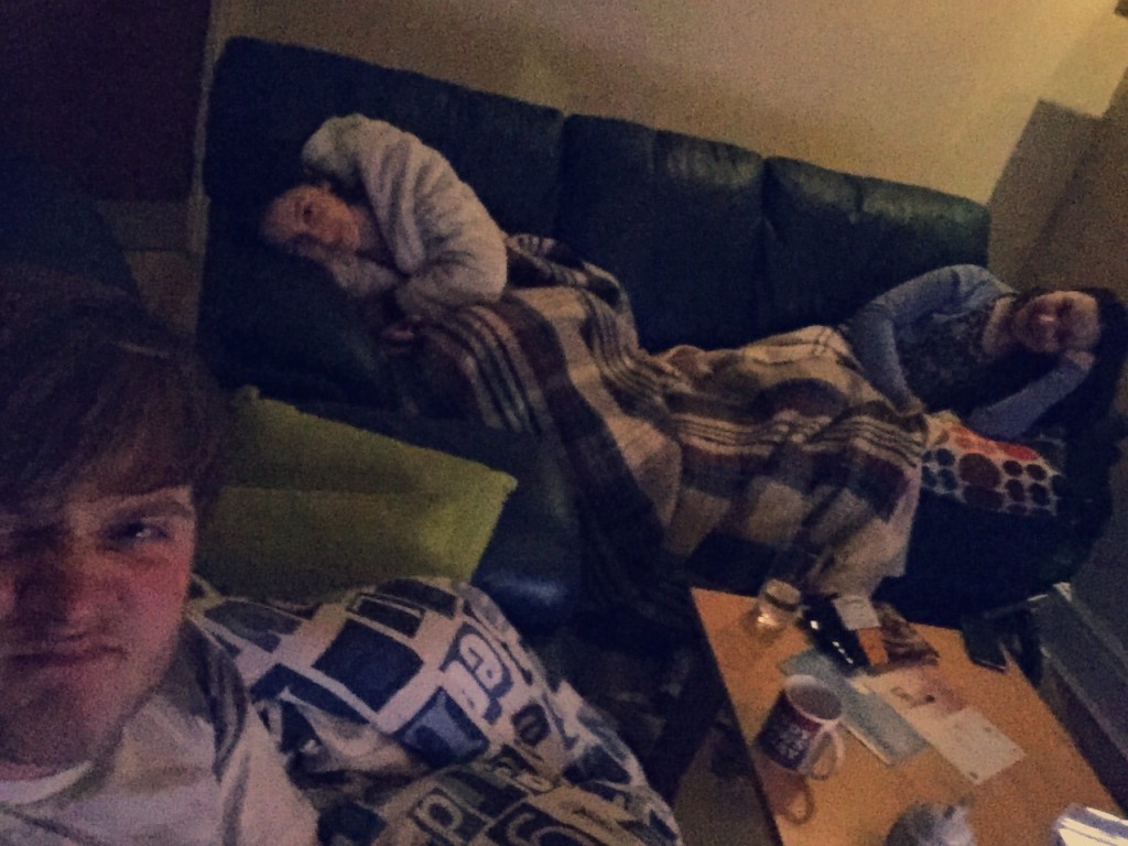
To my despair I awoke the next day to the prospect of a Valentines Day stuck in my room all day, but for the first time ever me and my housemates arranged to sit together in the living room (which we often forget that we actually have) and watch a film. The Notebook was suggested, and I agreed, presuming it would be a tacky rom com to lift our spirits.

It’s not.

This was before we all got upset

The day after I decided to finally address an issue which I had sat on since I returned to Leeds after Christmas, which is that the coldness of our uninhabited house had caused most of my posters/flyers/ephemera to fall off my wall. I took the opportunity to take them all down and give the walls a good scrub. I don’t know why I felt like I needed to clean my walls. I just did. I can’t explain. Leave me be.

My room looked weird and sad without walls full of examples of graphic design…

What has happened to my cosy room?

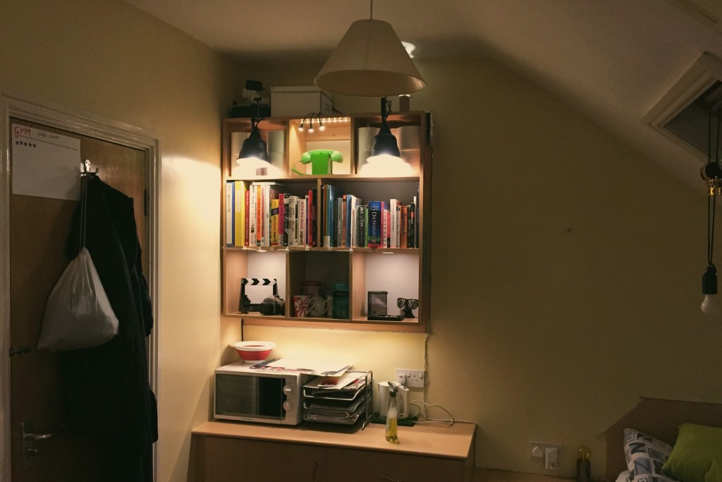
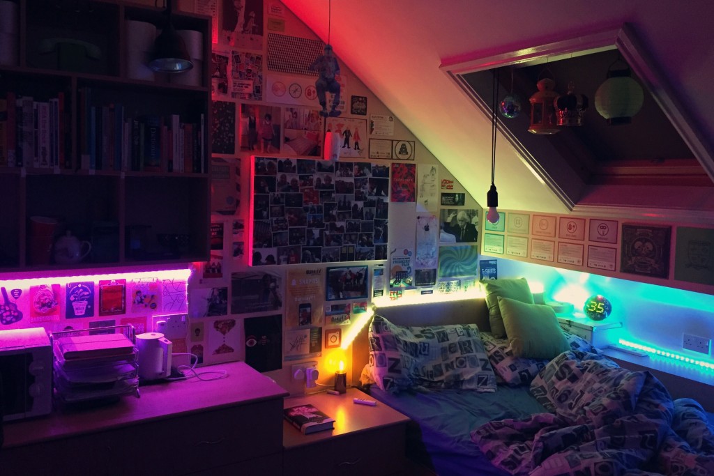
Before long, however, I had gotten all my stuff back up and now my room is back to it’s bright, colourful self. Check out this picture from a previous post.

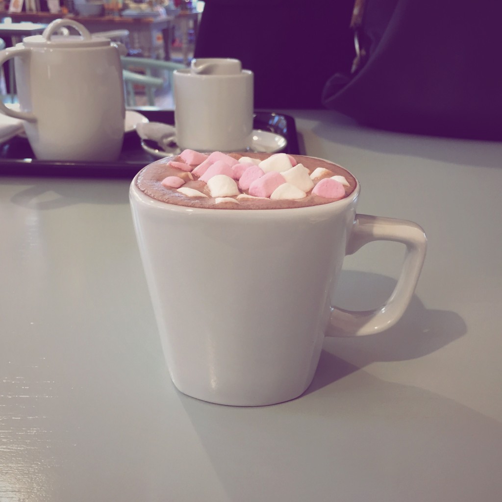
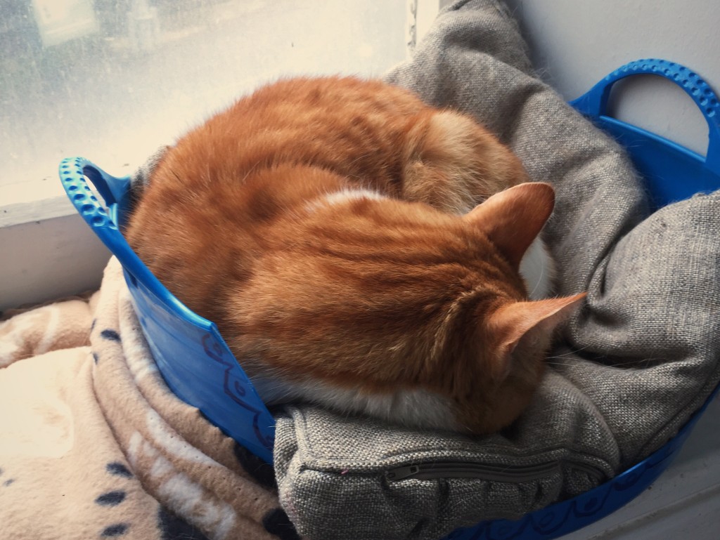
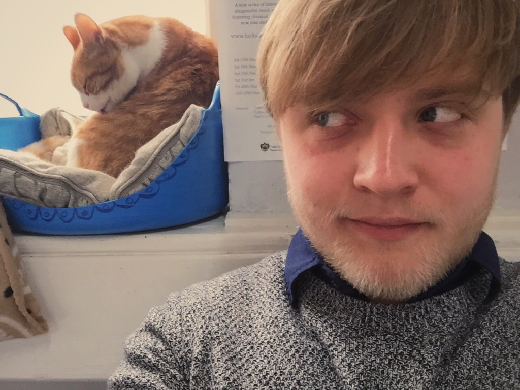
I also managed a trip back home to visit my doctors, but the most important part of the trip was naturally sitting for a hot chocolate with my mother and stroking the resident cat at Todmorden train station. He/she featured in a post from a while back, check it out here. Anyway, I leave you with photos of these two very important events.

Hot chocolate time
The beautiful cat at Todmorden train station
18.02.15 — Design

Crafting A Typography Essay

As I may have mentioned, I am currently working on an essay for my Principles of Typography essay. Today I engaged with some more reading for the module, and pulled out some interesting theories and quotes. For those uninterested in graphic design, now may be the time to skip this post for the next one.

Firstly I looked at Herbert Bayer with his essay On Type, where I found many teachings on the control of type. He notes how typography is a service art rather than a fine art, and how a reader’s eye will flitter haphazardly across a typographic piece unless the designer has taken due care to carefully guide the viewer’s eye. As he concluded, I picked up on his comment that controlling the contrast of the typeface and the background on which it sits can be used to good effect.

I secondly moved onto some wisdom from Rob Giampietro (of Lined & Unlined) on Default Systems in Graphic Design (read online here). This explores the idea that default settings (such as the Calibri typeface at 11pt in Word and Myriad in Adobe Illustrator) have a knock-on effect on graphic design, as the “system makes assumptions that, unchallenged, become truths.” It was an agreeable argument – oh, the amount of times I have received badly designed submissions set in Calibri!

Next up I read through The Philosophy of Modernism in Typography by Douglas McMurtie. In this evaluation of the modernist attitude in the field of typography, McMurtie notes how type’s primary function is clarity and how it must tell it’s story as directly as possible – succinctly encapsulating the modernist ethos.

Finally I moved on to read Beatrice Warde in her essay The Crystal Goblet, an argument that “printing should be invisible”. In this Warde makes the case for the adoption of modernist attitudes in typography, arguing that it is not how typography looks which is important; rather that the purpose of a piece should take precedence when typesetting. The essay is a pleasure to read, using beautiful metaphors to convey meaning, and I urge anyone reading interested in typography to source a copy. However, the following quote was my favourite, and I just couldn’t resist sharing it here:

It is mischievous to call any printed piece a work of art, especially fine art: because that would imply that its first purpose was to exist as an expression of beauty for its own sake and for the delectation of the senses.

Beatrice Warde

So from all this research (check out my full collection here) I have been debating and scribbling down ideas for the title of my upcoming essay. Here are a few of my main ideas so far…

  1. Can we apply Jan Tschichold’s Die Neue Typographie principles/teachings to new media? (i.e. websites, smartphones, UI/UX systems, etc.)
  2. Have the stages of typographic thinking, especially modernism, replayed themselves through the relatively short history of online typography?
  3. Can principles and/or theories used when composing printed type be transferred directly to type handling online?

I will be back soon with more updates on Leeds life in general, but for now I am drinking my new favourite drink (rose milk) and settling down to watch some Parks & Recreation. Stay tuned for news of my room redecoration, Galentines Day (you read that right) and my plans for Easter (including going pescetarian for Lent!)

Update: You can now view an ongoing copy of my report here. At the time of writing I have only finished my title and the abstract.

12.02.15 — Journal

UsTwo Etcetera

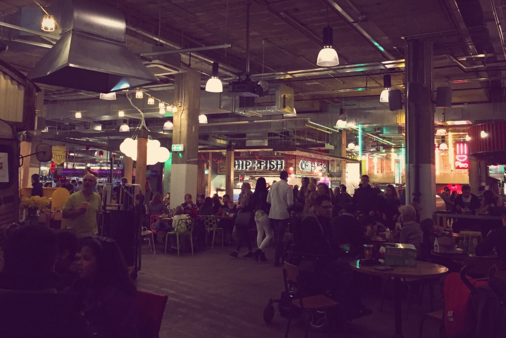
And now for a quick overview of recent events. Just last weekend me, Luisa, Izzy and Beth headed down to Trinity Kitchen where the Real Junk Food Project’s Pay As You Feel Café were finishing off their residency in style – they’d convinced all the other temporary vendors in the kitchen to go “pay as you feel” for the day too.

This meant that we could pay whatever we felt for all the food, so me and Luisa treated ourself to a delicious jerk chicken wrap. Of course we were sure to pick up some food from the PAYF ‘Ambulance’ (they were serving their food from a repurposed ambulance) and made a donation to the amazing charity, which has already been featured on nationwide news.

Trinity Kitchen during the PAYF event

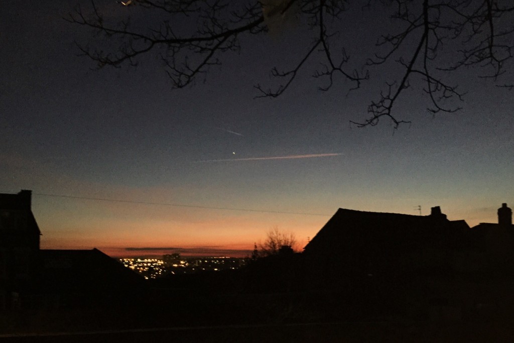
On the way home me and Luisa noticed that the sky was particularly pretty, and so we hopped down a side street and took a moment to stand on a wall and look out over Leeds and the sunset.

The sky over Leeds

But in design related news, we had two visiting speakers at uni today, both from the amazing digital studio UsTwo. They shared examples of their work, their studio culture, and then some tips for us all before we head off and apply to studios for our year in industry. I found much of their work fascinating and right up my street, such as their handbook on UI practice and projects such as UsTwo Auto and learn.ustwo.com. I have put them firmly on my list of agencies to check out!

Some of their advice was as follows:

  1. The product doesn’t have to be perfect, focus on the idea and the story of how you got there.
  2. Be keen to learn, and be versatile, be interesting.
  3. Show you can fit in with studio culture.
  4. Be up-to-date and show curiosity.
  5. Personal projects are a great way to learn and show interest.

I didn’t take any photos, but they did, so maybe I can track that down later and link you guys to it! I didn’t want to leave this post too sparse though so here (in order) are some photos of a cat I found in a train station, my room in all it’s multicolour glory, and an image which I feel encapsulates student life.

My new friend in the train station
My university room

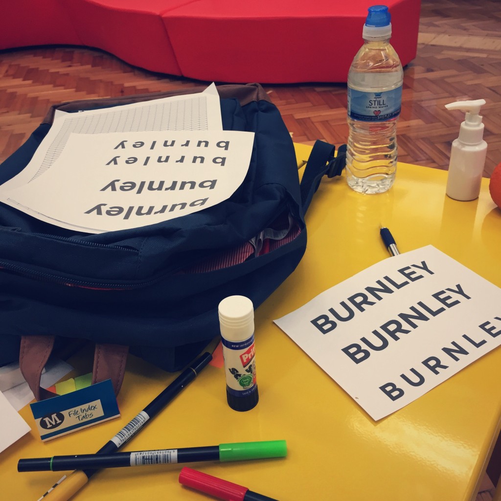
For now here’s a teaser of some random experimental type work I’m currently completing for my D&AD Pantone Burnley Brief. You can check out my trip around Burnley for a spot of research here, but for now it’s some reading for my module and an early night for me. ¡Adios!

Some work on the Burnley brief
08.02.15 — Journal

Burnley Research Trip

Just the other day I went on my strangest research trip to date, and boarded a train from Leeds to Burnley to take photos and hopefully some inspiration from my hometown.

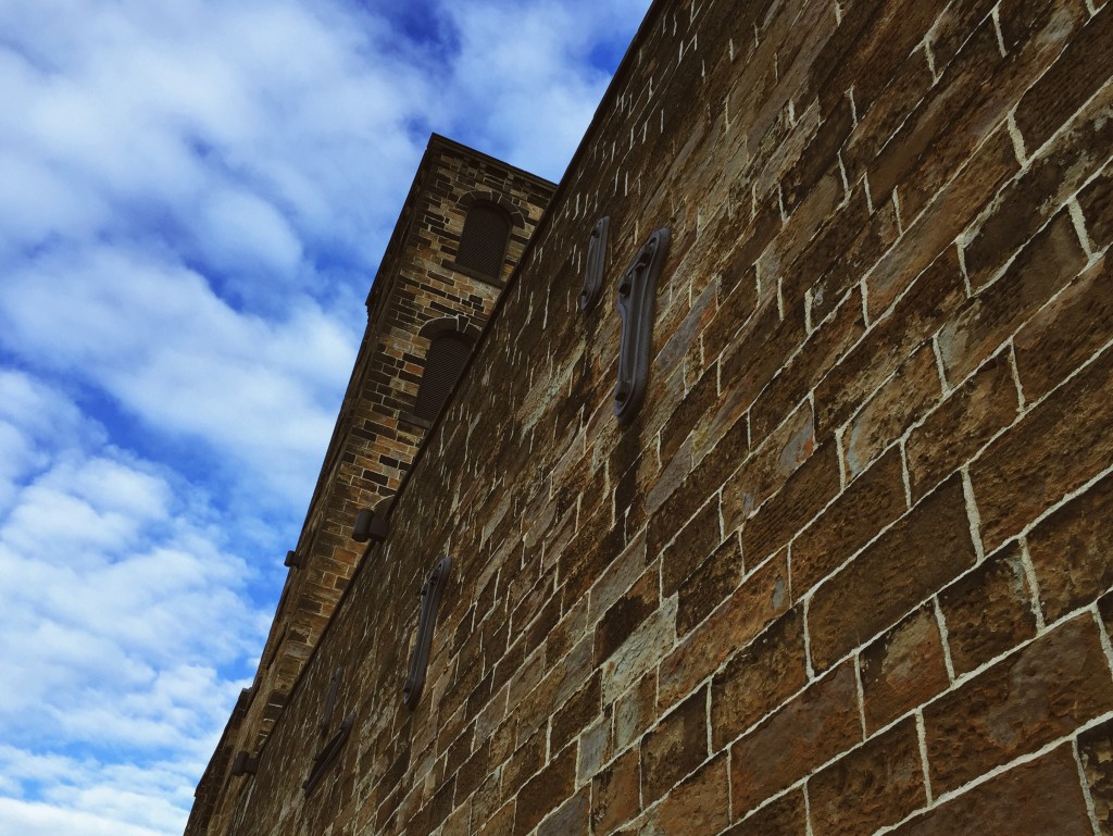
I landed at Burnley Manchester Road train station and headed downhill slightly before verging off down to check out the latest developments around the new Technical University Campus, the continued regeneration of the Trafalgar area and the Weaver’s Triangle.

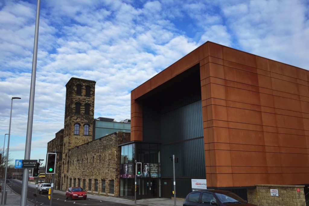
The new university building in the old mill
Looking up at the mill

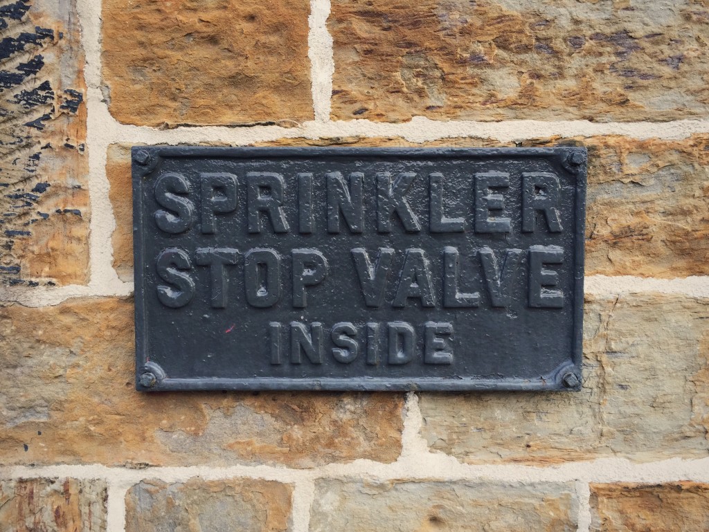
Naturally I was drawn to an example of ambient typography I found, and I was very happy that those in charge of the mill’s renovation had opted to maintain this old plaque, albeit painted in this cool new grey.

An old plaque in some irregular typE

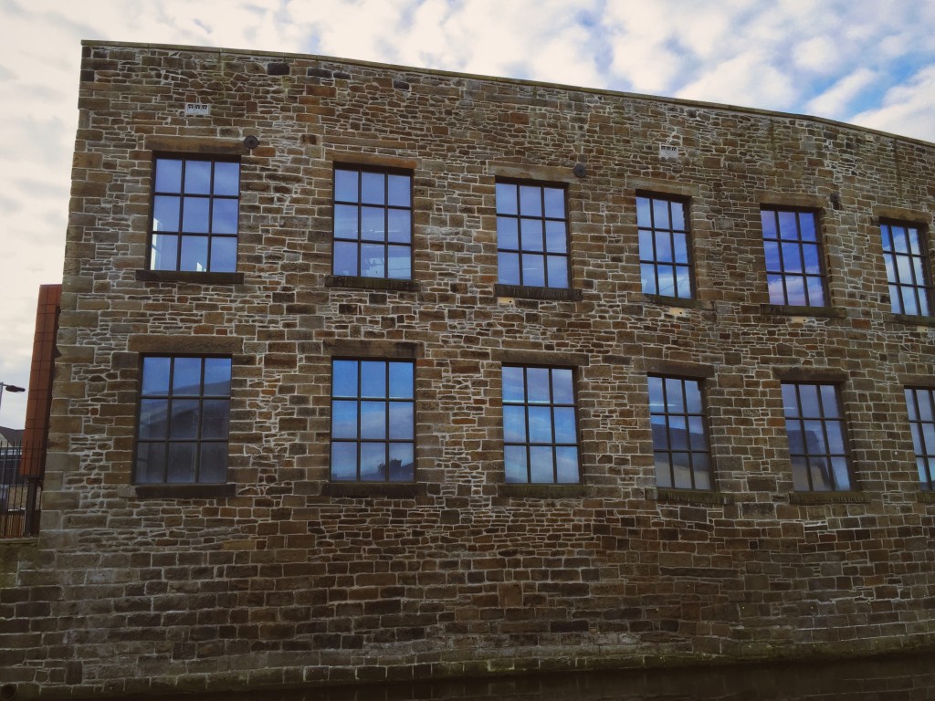
From there I found my way down to the canal, which offered some strange perspectives of the back of the old mill buildings. I was struck by the fact that the canal does form a major artery through the town, with all the grand old buildings backing into it.

From there I found my way down to the canal, which offered some strange perspectives of the back of the old mill buildings. I was struck by the fact that the canal does form a major artery through the town, with all the grand old buildings backing into it.

Some slightly lopsided windows there!

I soon left the canal, wandering down through the city centre, the markets and into my favourite park: Thompson Park. It was strangely beguiling in the winter sun, with it’s lake drained and a relaxing lack of people. I was joined only by the park rangers working away and another guy who sat chain smoking on a bench.

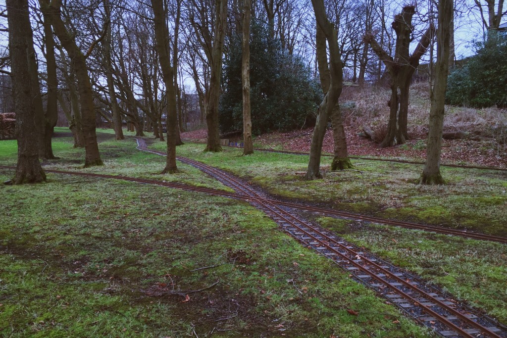
Train tracks cross through the trees

I was happy to see that the miniature railway has now be come a permanent fixture in the park, however naturally it was closed for the winter season. I took some time to wander along its tracks and take in the rather zen ambience.

After an hour or so of sketching and idea generation on a wall by the river running through the park, I left in search again of the canal. I took a moment to see what had happened to the grand old Burnley College building – which is now in a very sorry state.

The old college building

However the easiest way to the canal, I gauged, was to nip back into the park and hop onto its bank from there. I was soon, from entering under a bridge, seemingly on top of he whole town. It was very surreal and rather beautiful, and I have since decided that the canal should play a prominent role in my project.

A view from the canal

In my 19 years of living in Burnley I have never really taken the time to wander along and see the town from the canal, but I will definitely be doing so again, and would urge any residents to do the same. It was a refreshing break from the hustle and bustle of the town centre, and offers some lovely views as well as a look back at our rich heritage. The views here are taken from the ‘straight mile’, one of the “seven wonders of the British canal systems”, a 60ft high embankment which forms a mile of dead straight waterway through the town centre.

Overall my trip back to Burnley was strange. So why so strange? I shall explain. Normally when I go to Burnley, I avoid the town itself and head pretty much straight to where I actually live, in a small village just outside the main centre. Coupled with the fact that I went not for leisure but for purely research purposes, made for an alternative but thoroughly enjoyable trip.

Being a tourist in my own hometown definitely opened my eyes to how lovely my town can be, and has filled me with ideas for my D&AD + Pantone brief to reimagine my hometown through colour. Up the clarets!

(I did once go to a Burnley match and it was a tonne of fun. Evidence here.)

05.02.15 — Design

An Overview of Typographic Features of Text

Parts of a text are not mere objects of varying shapes and sizes to be arranged like ornaments on a mantelshelf or pictures on a wall.

Hartley & Burnhill

Maria dos Santos Lonsdale includes this very valid observation in the opening of her paper, “Typographic Features of Text: Outcomes from Research & Practice”. A typography specialist, graphic designer and researcher, Maria recently joined us to teach on our course at the University of Leeds after time spent teaching at the University of Hull, in Portugal and completing a PhD at the University of Reading.

Maria noted in her introductory speech to us that she had recently had this article published, and I immediately headed off to the library to source a copy, as this kind of research into typographic practices and legibility has become of increasing interest to me. I also decided to give it a read and quick review on here for my typography module, which I am blogging in between my usual posts, however you can access the collated typography related posts here.

An interesting point which Maria makes in the opening chapter of her paper is the claim that typeface choice, be it serif or sans-serif, is almost irrelevant (discounting decorative typefaces) and does not affect the legibility of a piece of type. Rather, the argument transpires, it is the construct and spacing of the set type which can serve to either hinder or aid legibility.

I was once again reminded of Jan Tschichold’s argument in “The New Typography” that sans-serif is the sole reasonable choice for the ‘new typography’, a point which Maria brings up by referencing one of Tschichold’s later works.

Another argument that seems to again call into question the way in which we approach type is that it is not the point size of the type which is important, rather the size of the x-height. By this logic, typefaces such as Futura with a relatively small x-height will need to be set at a slightly larger size to be as legible as typefaces such as Helvetica. I have always pondered this issue, but Maria here provides detailed study and explanation as to why this is the case, which was for me quite exciting to read.

The paper also provided me with unbeknownst tips and advice on setting type, such as suggesting that a typeface is set in a slighter thicker weight when it is to be set in white on a black background. Also of note was Maria’s choice to concentrate solely on legibility in printed typography, the reasoning behind which came apparent later in the paper, where the effect of typography on examination and educational papers is explored.

A concept which is prevalent throughout the paper is one which I have battled with on multiple occasions, and that is line length. Maria’s approach in the paper drew on sources which I have already read such as Bringhurst’s “The Elements of Typographic Style”, amongst others, to come to a conclusion (60-70 characters per line) which I have already adhered to for some time. However what I found the most interesting was the scientific reasoning behind why such line lengths are more suitable, namely the ‘visual span’ and the use of peripheral vision whilst reading, as well as the difficulty of making a ‘return sweep’ (returning to the left hand side of the page) when moving on to the next line of text.

As I read over the entire paper, a question which I kept asking myself was whether some of the theories and recommendations were transposable to web/screen-based typesetting. I was aware that Maria had chosen to omit such studies, however I believe that I may be interested in pursuing a research project/essay which challenges the use of conventional typesetting techniques on the internet.

References

  1. Hartley, J. and Burnhill, P. 1976. “Explorations in space: a critique of the typography of BPS publications.” Bulletin of the British Psychological Society, 29, 100.
  2. Lonsdale, M. dos S. 2014. “Typographic Features of Text: Outcomes from Research & Practice.” Visible language, 48(3), 28.
04.02.15 — Journal

Carmen

Yesterday evening myself, along with Izzy and Luisa, headed off to Leeds University Union to see our good friend Emily perform in LUU Opera Society’s performance of the French opera “Carmen” – and what a night it was! As is customary when I write a post about a performance, you are obliged to click here and play the official soundtrack to this blog entry.

Having seen Emily last year in another Opera Society performance, Gilbert & Sullivan’s “Ruddigore“, we were apprehensive as to weather Carmen would be as good, and as funny – seeing as Carmen is not a comedy like Ruddigore.

We were not disappointed! Although Emily had a smaller role than her main part in Ruddigore, it was great to see (and hear) her up on stage alongside what turned out to be another fabulous and incredibly strong cast – Carmen herself really stole the show (and not just because of her amazing outfits!)

The ending of the show in particular had us all in stitches – maybe rather strangely. I won’t reveal all on here, you’ll have to go and see it yourself!

Once again it was a really lovely evening, and a great opportunity to do something different with all my colleagues from the graphics course. I urge anyone who has not yet done so to go and see it, tickets are only a fiver for students from LUU and the show is running every nigh at 7:30pm until this Saturday evening.

PS: Sorry that this post has no images – I was so caught up in the action that I forgot to take any!

03.02.15 — Journal

Homebrew Stencil Type

So yesterday, somewhat inspired by the talks at Leeds Print Festival, I decided to try my hand at a spot of printing! As this was a spontaneous decision, and because I was confined to working in my student house, I had to get a bit creative with my techniques and materials…

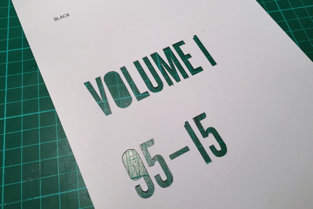
I decided to create a two-colour print using a rudimentary stencil technique. I firstly drew up my design (for a project I am working on in my spare time) and then split the document into a black layer and a colour layer. I then printed these two layers on two separate pieces of card before rather tediously cutting them out with a craft knife.

A cutout of one of the two stencils used

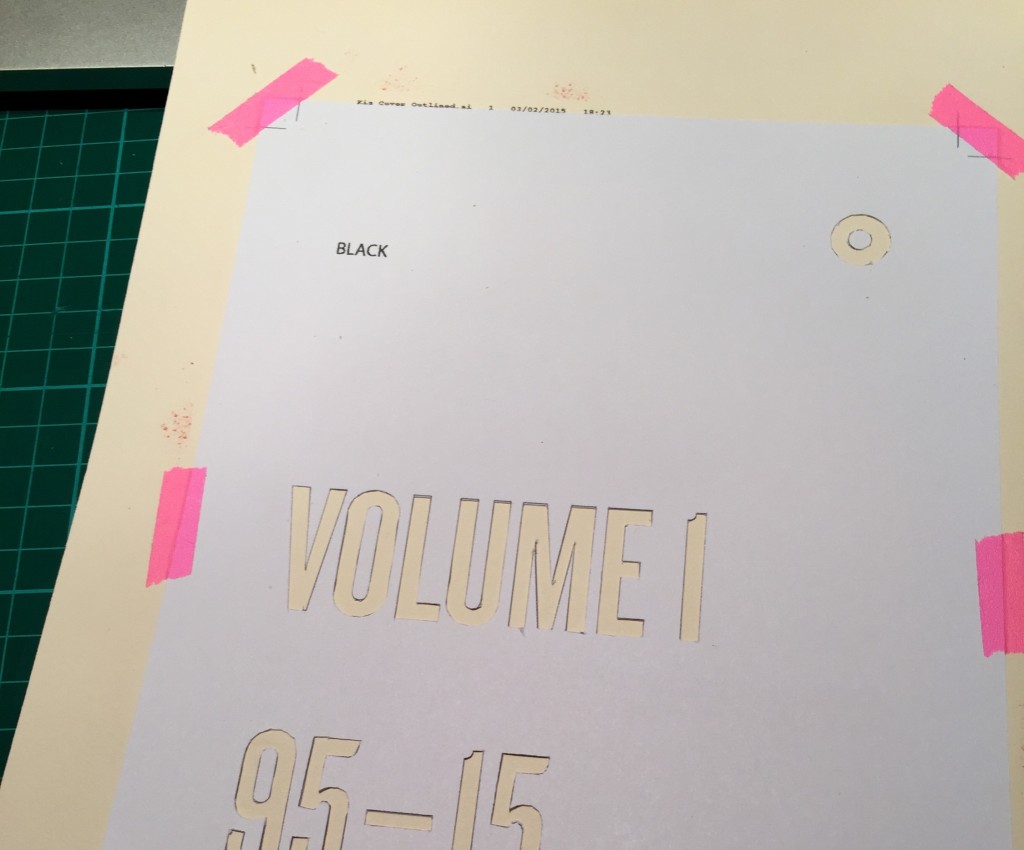
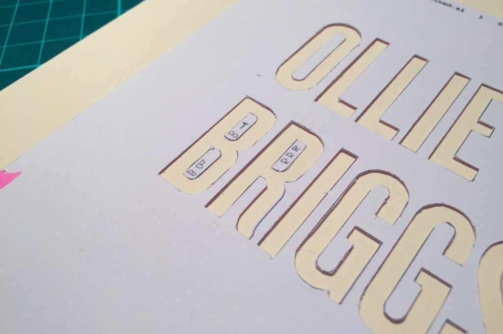
I had decided from the off to abandon my usual purist attitude and embrace any imperfections, so I wasn’t too bothered that the cutting was dodgy in certain areas. I did, however, want to retain the counters in the letterforms, so I cut those out also and then used some temporary glue to adhere them to the surface to be printed on before I put down the ink. I used crop marks printed on both the card to be printed on and the stencils themselves to align the stencils.

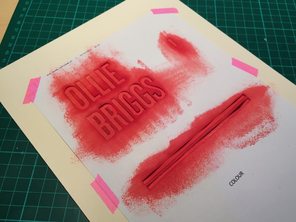
The stencil in place over the card to be printed on
The counters in place (note my notes on which is which)

I then had to get creative all over again. I had no proper acrylic print medium, so I rooted through my drawers to see what I could find. I winded up making use of a set of inkjet printer cartridge refill pots which had been laying dormant in my drawer. Using the sponge end of a scourer from my kitchen cupboard, I doused it with the ink and then brushed the excess off on some spare paper before dabbing it repeatedly over the stencil.

One of the stencils after the ink was applied

Again, I was aware that this kind of low viscosity ink wasn’t ideal for this method of printing, however I thought it’d add to the handmade appeal of the final outcome – and it was the only stuff I had lying around! I may rename this post “Stencil Type On A Shoestring.”

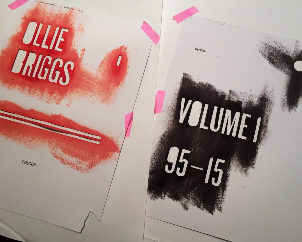
Anyway, those familiar with printing will know that there is no such thing as red inkjet ink, so the vibrant shade of red you see above is actually a custom mix of magenta and yellow ink.

The two stencils after use

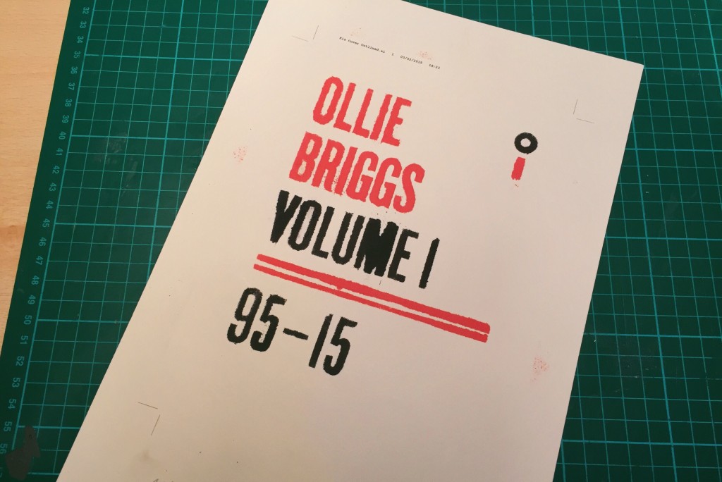
After applying the two colour prints and picking off the counters, I was presented with the final product! As I say, it’s not in any way perfect, but I do like how the ink has seeped beyond the boundaries of the stencils, most noticeably around sharp angles like those of the ‘V’ and the ‘M’.

The final print (before being trimmed)
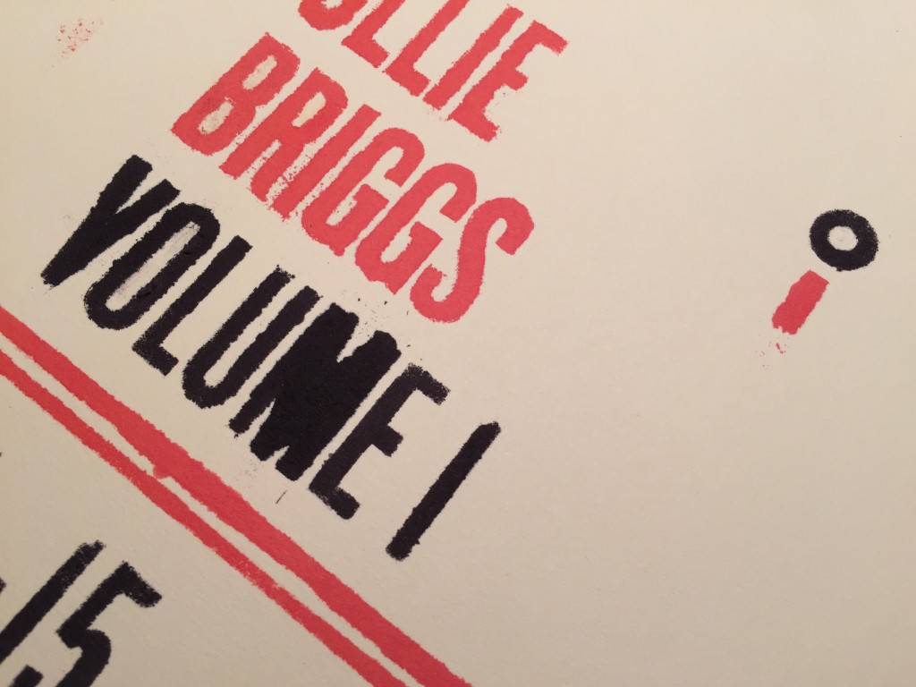
A close up look

So there you have it – an unconventional technique using unconventional materials which resulted in quite a messy but interesting outcome. I am unable to photograph this, but the absorption of the ink by the paper has actually raised it slightly on the letterforms, giving the print a slightly embossed feel. I didn’t plan this but it’s an intriguing side effect of using such a watery ink.

The messy process took about two hours (most of which was spent cutting the letters out by hand), but it was great fun to do some typographic work without being sat behind a computer. Moan as I do about cutting each of the letters by hand, it was actually a great learning curve, as it instilled a newfound appreciation for the delicate forms of even the simplest typefaces.