Monthly Archives: April 2016

06.04.16 — Journal

Here Comes the Sun

With the recent change of office at Erretres and the chaos that Semana Santa brought to the city, it’s been nice to kick back again once more (in a new flat, no less) and enjoy the mellow atmosphere of Madrid. I moved to my new flat about a week and a half ago, and I’m now living in a quaint little district called Quintana with my lovely new hosts, Pilar and Veronica.

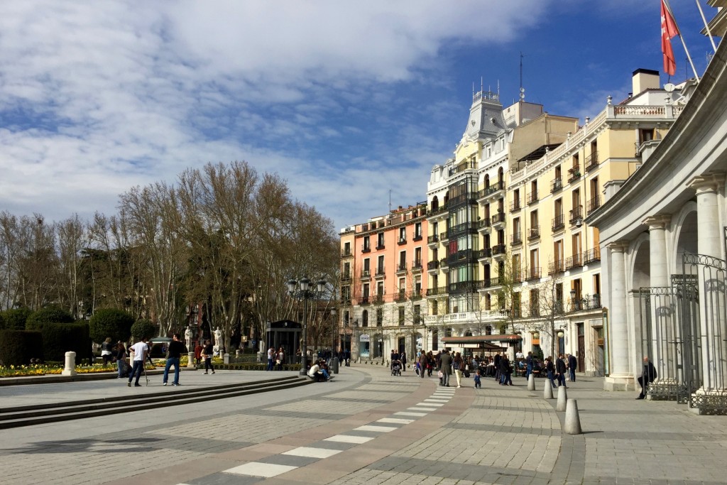
A new flat means a new route to work, and so now I alight the Metro at the almost annoyingly gorgeous area known as Ópera and Royal Madrid, and I have the laborious (ha!) task of wandering through the Oriental Gardens and past the Royal Palace en route to the studio.

Around the Oriental Gardens
Meeting time at Erretres
Returning from the studio

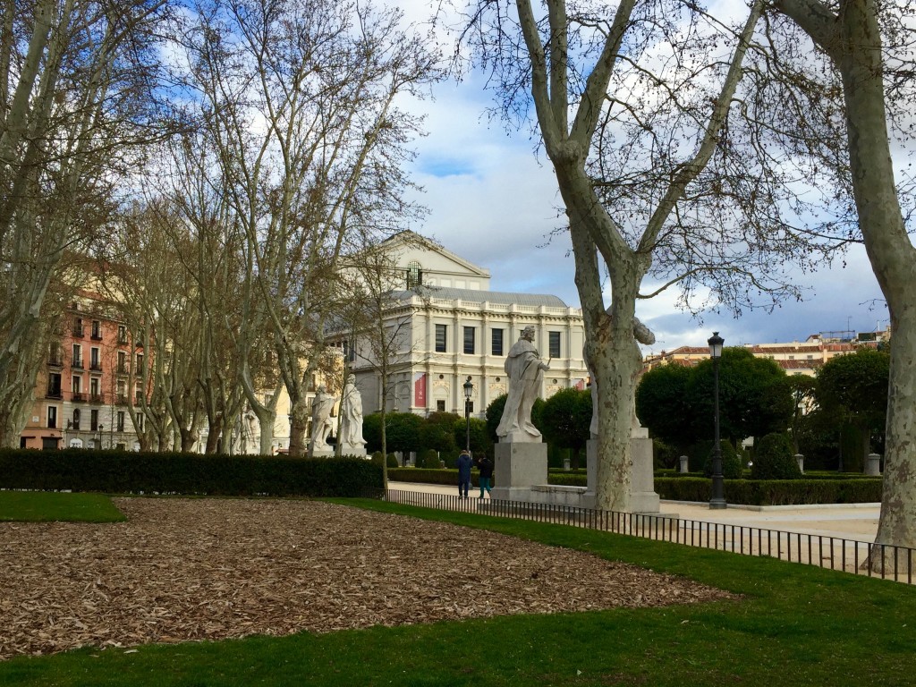
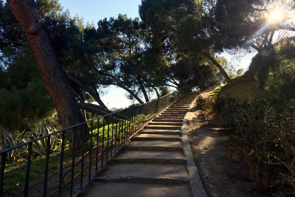
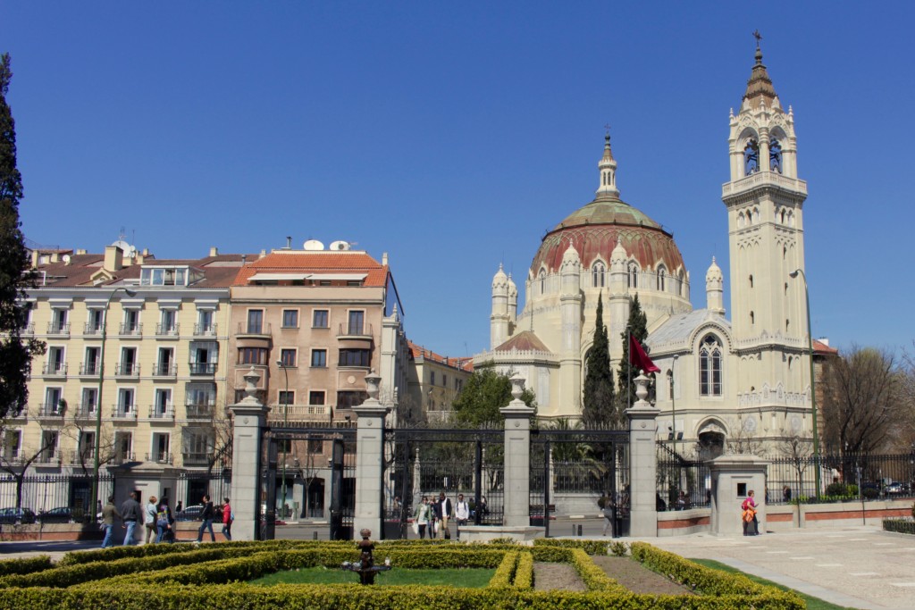
It also dawned upon me that my time in the city is sadly finite, and so I should probably relax a little and begin to enjoy the sights and things to do that it offers, instead of spending all my time washing and cleaning and doing menial cooking of my own (let’s be honest) mediocre food. To this end I have been taking the opportunity to pay a daily visit to the Temple of Debod, which is situated right next to the studio, and which offers tonnes of grassy space, a fountain, stunning views over the west of the city and the huge public park “Casa de Campo”, and most importantly: lots of dogs.

The walk from work to the temple
Relaxing (kind of) in the sun
The area

Whilst there I have been proofreading an essay for Danni, writing my previous blog post about Easter in Madrid, and generally doing other bits of design work, such as a PDF guide for my parents to use on their phone when they visit – I will post a feature on that at some point once it’s done – I spent ages designing a matrix of 20 windows for the front cover!

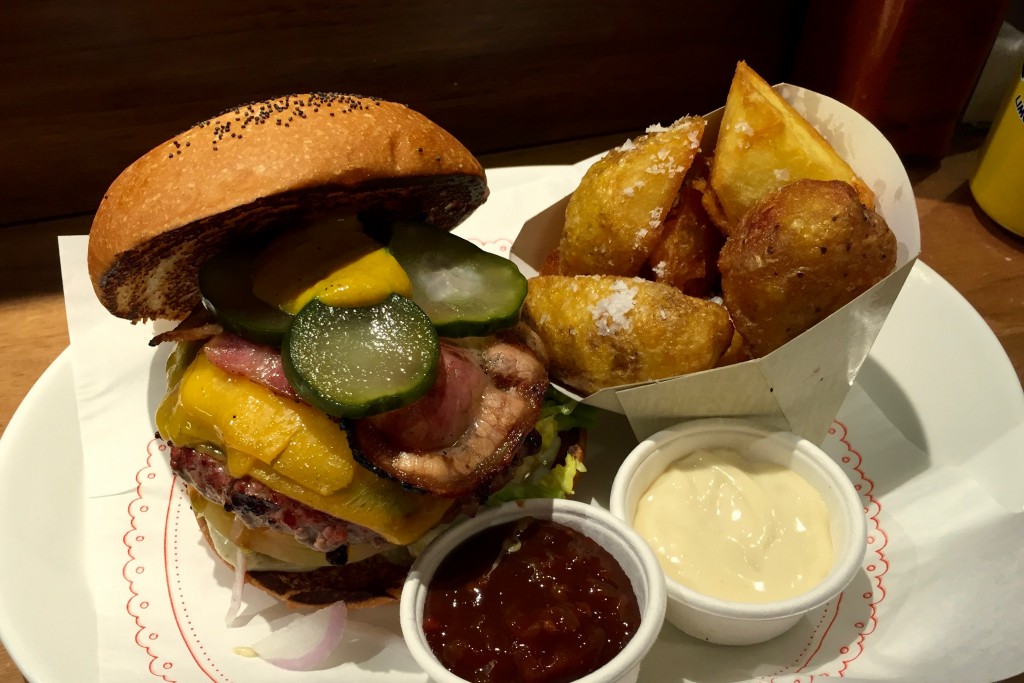
Anyway, back to the streets of Madrid. After work this past week or so I have also been taking the opportunity to go on a mini culinary tour of the city, which was kind of forced onto me as one night I realised I was an hour from home and it was 10pm and I hadn’t eaten a thing since lunch – so I headed straight for Sol in the centre of the city and to Bacoa, the burger joint I tried when I first got here. It was as delicious as I remembered, even if I had to  sit there for a while to digest…

A huge ass burger and patatas

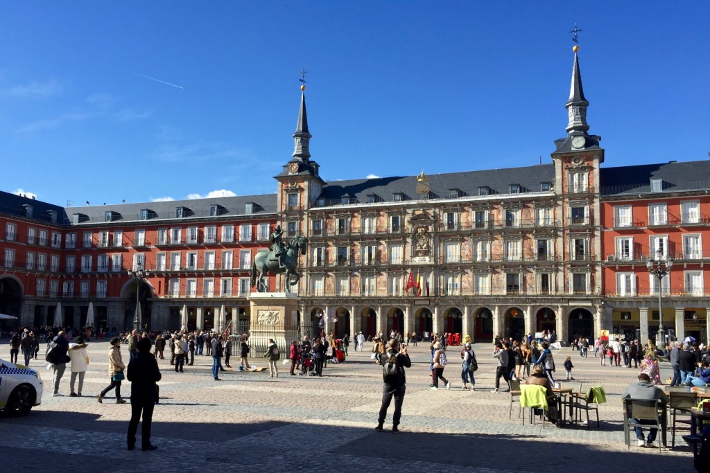
Another evening I asked for recommendations from the team in the studio, and I was pointed towards Plaza Mayor, which I was a little dubious of as it is one of the main tourist traps, encircled by bars charging 6€ for a small beer. I headed through the square and onto a street behind it, and found the place I’d been recommended, La Toná, where everything was surprisingly cheap and delicious! I treated myself to a squid montadito, or small sandwich, and a plate of patatas bravas, potatoes in a spicy tomato sauce.

Plaza Mayor on the way through
Tapas with a view

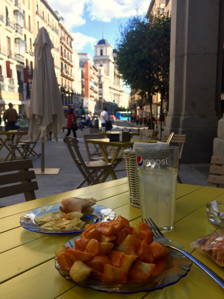
Life doesn’t get much better than tapas on a terrace with a lovely view.

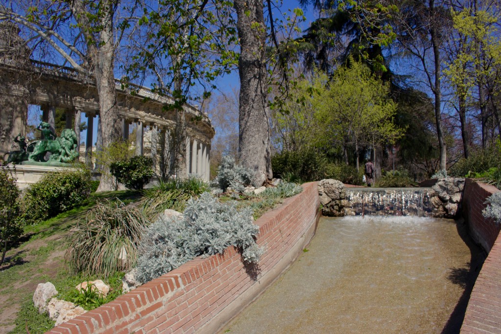
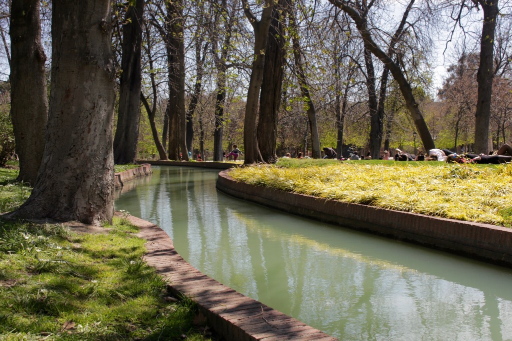
Pretty soon it was the weekend, and time to find something to do. Having been ill on-and-off for a while, I decided to take it easy and head to the city’s favourite chill out spot, Parque del Retiro. There, I found a beautiful spot to seat myself overlooking the boating lake and shaded by some trees, and proceeded to do pretty much nothing but sunbathe for a few hours.

An entrance to the park
A view from my spot
More of Parque del Retiro

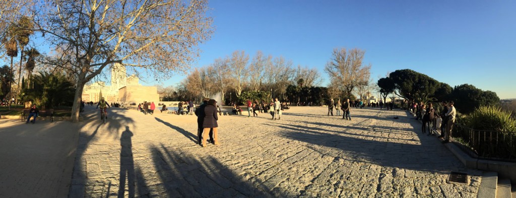
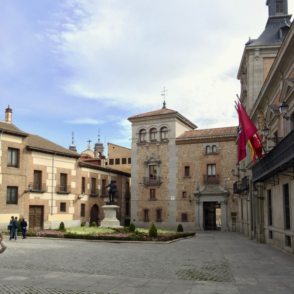
After a snoozy spell in the park, I decided to head back through the city on foot to take in some more of the Saturday afternoon ambience in the centre. Camera in tow, I visited one of what I think is the most interesting and beautiful spots in the city, a little plaza bordered by a smattering wildly differently styled buildings from Spain’s various eras of history. Here’s a (pretty bad) photo…

Part of the plaza

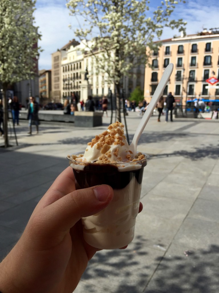
Hot weather calls for guilty pleasures.

I also stopped for a sundae

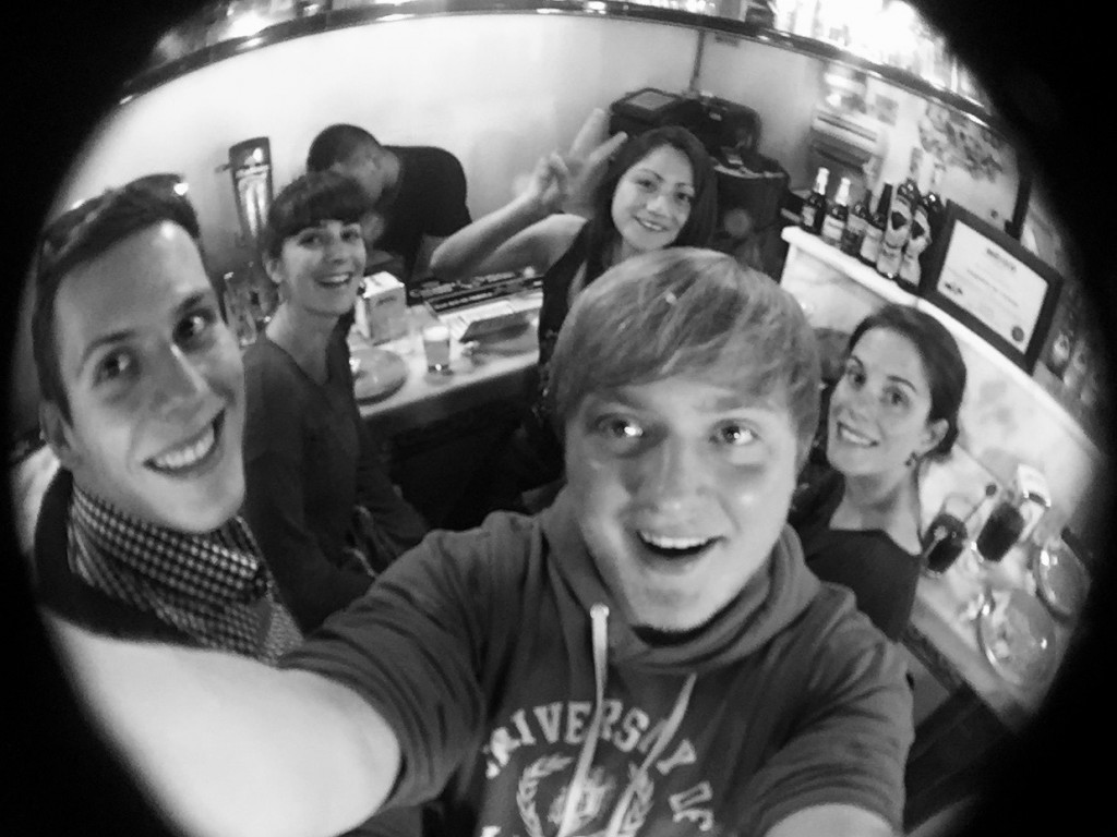
On Saturday night I met up with my ex-flatmates Vero and Levin, plus some of their friends, and we headed out for an evening of tacos and karaoke! We started at one of my favourite spots, Taquería Mi Ciudad, where many tacos and margaritas were consumed, and then we headed off to the Barrio de las Letras where we sang Robin Williams very loudly and ate a tonne of pizza. It was ace!

Tacos and tequila

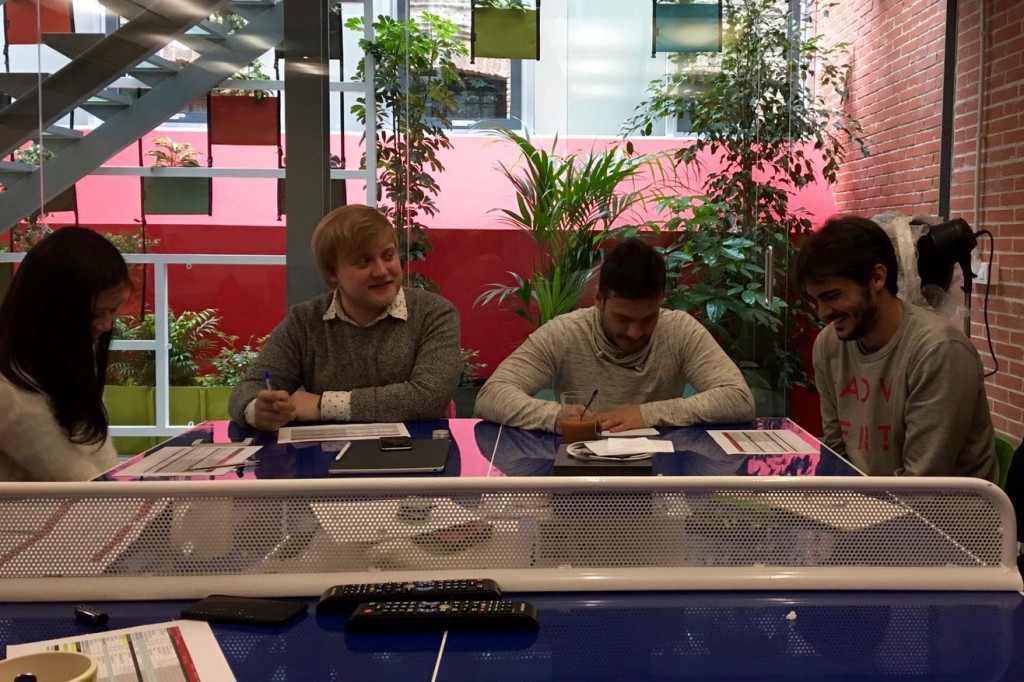
It’s back to work for now though, where I’m working on some really cool but still very confidential new projects. I thought I’d also take the opportunity to congratulate the team on their work on Natsuki, which just received a glowing review on one of my favourite design blogs, Brand New, which you can read here. I take no credit for this piece – it was all pretty much wrapped up before I showed up back in February!

You can keep up with what we’re up to in the studio on our Instagram and Facebook – I’ll even be posting the odd thing! Until then though it’s time to grab an early night and sleep off the tonne of fresh bread I just ate. I never learn.

03.04.16 — Design

Typesetting in Spanish

This is a very strange blog post I guess in some respects, mainly because most of the time I don’t post specialised pieces on design thinking, but also because even within the design community itself, typography in one specific language is a very niche subject to talk about.

My sudden feeling of need to explore the use the written in the Spanish language (I will be referring to Castilian Spanish throughout) without actually delving into the language itself (bear with me if you’re new to typography, you’ll get the hang of it soon) was spurred on by a sight I see every day on my way to and from working at Erretres, which is based near a beautiful plaza called Ópera in the centre of Madrid. At the entrance to the metro station for Ópera there sit two signs, a suspended one and one on the wall. Both are set in the standard Madrid Metro typeface, Helvetica, however one carries the accent as it should, Ópera, and the other has dropped the accent seemingly without a second thought, so the word has become Opera. As trivial as it may seem, it really got me thinking, so let’s explore…

The Spanish language makes use of the Latin alphabet, so there’s no surprising  shapes or forms to throw us off too much as English speakers, except the extra letter which is included in the official Spanish alphabet:

A B C D E F G H I J K L M N Ñ O P Q R S T U V W X Y Z

The Ñ, written eñe and pronounced “en-yay”, is not considered an N with an accent, but rather a letter in its own right, and hence it occupies a place in the official alphabet. The letter comes from a double N, and came about when people began to place a tilde over the N as shorthand to indicate doubling, a practice which was formally introduced in the 1700s. The introduction of a new letter and accompanying sound based on the doubling of an existing letter may same strange, but remember that the English W came about as a doubling up of the letter V!

An interesting tidbit to note on the subject of the Spanish alphabet is that up until quite recently in 2010 the combinations CH and LL were actually considered letters in their own right also. This is due to the fact that Spanish has a  near-perfect phonemic orthography, which is a fancy way of saying that each letter roughly corresponds to its own distinct sound when spoken. As CH and LL combine to form a different pair of sounds than their two letters would individually, it was seemingly felt they should be treated as separate, in order to maintain the phonemic orthography which the Spanish enjoy – they rarely have to spell words out for each other!

The other feature that Spanish possesses which English does not is the frequent and methodological use of accents. The acute accent (´) can be present on any vowel, and an umlaut (¨) is sometimes seen on the letter U, and so the complete set of accented letters is as follows:

Á É Í Ó Ú Ü

The most interesting problem brought on by these accents and extra letter is the issue of text colour. The colour of type does not describe the actual colour of the text itself, but the overall darkness of the text when it has been composed on a page or screen. This is primarily affected by the weight (boldness) of the font used, as can be seen in the example below.

Light, regular, and bold

As you probably agree, the central column is easiest to read as the contrast between the letters and the blank page is best balanced. The colour of text can also be affected by the space between the lines, or leading, as can be seen in the example below.

Little leading, regular leading, lots of leading

Here you probably agree again that the central piece of text is the most legible, as the lines flow together and your eye is able to quickly jump from the end of one line to the next. Too much leading and you will easily lose the line you were on, and too little and the lines and letters begin to mix into each other.

So how do the accents and Spanish Ñ affect the colour of the text? Well, as they consist of extra forms sat above the usually short lowercase letters, their presence makes the text ever so slightly darker in colour, as you can see in the example below.

Text left in English and accent use dramatised to demonstrate

It soon becomes obvious that with all this extra visual information making the text appear darker, it is necessary to compensate by adding extra leading. This also prevents the obvious issue of letterforms (the shapes of the letters) overlapping and running into each other, which is move likely with an accented language such as Spanish as you can see in the example below.

Accent use dramatised for demonstration

Another consideration with Spanish is the length of a piece of text itself. Something which maybe 10 characters in length in English may be 14 characters long in Spanish, as Spanish is on average around 140% as long as English text containing the same information. Although this may not affect how we actually typeset and handle text in Spanish, it is an important consideration when designing layouts which may be ultimately released in both Spanish and English, and something I had to consider for example when designing my portfolio (which is available in both languages).

The final peculiarities that arise when handling Spanish text arise with it’s punctuation. The Spanish language famously includes inverted exclamation and question marks (¡ and ¿) at the beginning of exclamatory or interrogatory clauses as well as the regular marks at the end. This is born of the fact that the Spanish sentence structure does not change to accommodate questions, and so “do you want?” and “you want” are written exactly the same. English uses the auxiliary word “do” to denote the start of a question, a feature Spanish lacks, and so the ¿ at the start of a question alerts a reader that it is a question rather than a simple statement, a signal which in spoken Spanish takes the form of a change in the voice’s pitch. The exclamation mark simply follows suit.

Another standout piece of punctuation is the Spanish treatment of quoted text and dialogue. Quote marks are sometimes used exactly as in English, for example “Hello”, however sometimes a pair of symbols akin to double chevrons are employed, for example «Hello». The third and perhaps most baffling method of denoting quoted text or a change in speaker is the use of a long dash, or em-dash to be precise. It can be used with line breaks (a new line for each speaker) or without line breaks, as you can see below.

—Voy a ver una película— él dijo, pero ella le dijo —No puedes ir—

—Voy a ver una película
—No puedes ir
—¿Por qué no?
—Tienes que lavar los platos

Although the Spanish use of punctuation may not have any real consequences for a typographer or anybody handling the text, it is important to understand the grammatical quirks of the language in order to avoid errors when trying to work with text not set in your native language.

And so concludes my quick overview of typographic considerations when using Castilian Spanish. Although not intended to be a fully researched and thorough exploration of the subject, hopefully it has been of some interest to anyone inquisitive about the world of typography, graphic design and the Spanish language!