Monthly Archives: February 2018

23.02.18 — Journal

Atléti, Atléti, Atlético de Madrid

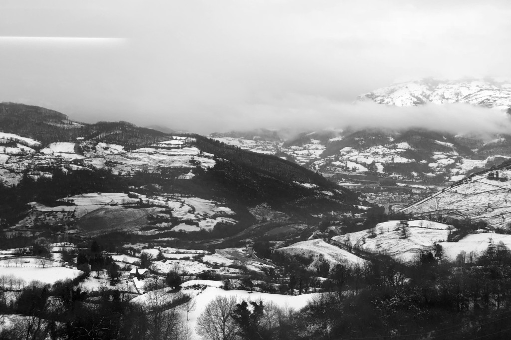
Since returning to Madrid from Asturias (again) I have been busy at work (again) – I feel I don’t really need to go through all that with you, so lets move swiftly on to the more interesting stuff which I’ve been up to recently, including something I never thought I’d wind up attending… Let’s get stuck in!

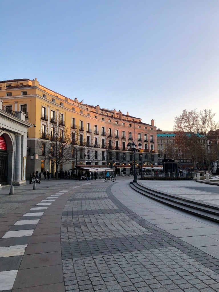
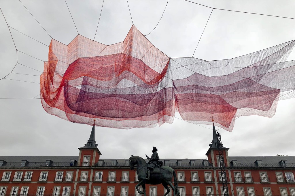
First up I headed out to spend a day in the city with my friend Loredana, and we’d agreed to meet to watch a performance of the Catalan tradition of building castells, which are basically human towers to the top of which usually clambers a small child. Figuring it sounded safe and all I agreed to go along, but with me being the person I am I managed to sleep though my alarm and arrived at the plaza literally just as they finished disassembling their last creation.

A cool sign nearby:
“A childhood without borders”

I wasn’t to be deflated however, and so in earnest we hopped on the Metro and embarked on a mini tour of some of our favourite spots in the city, including having pinchos at the Matadero and fooling around in the city centre.

Came across a cool sculpture in Plaza Mayor
Some delicious pastries

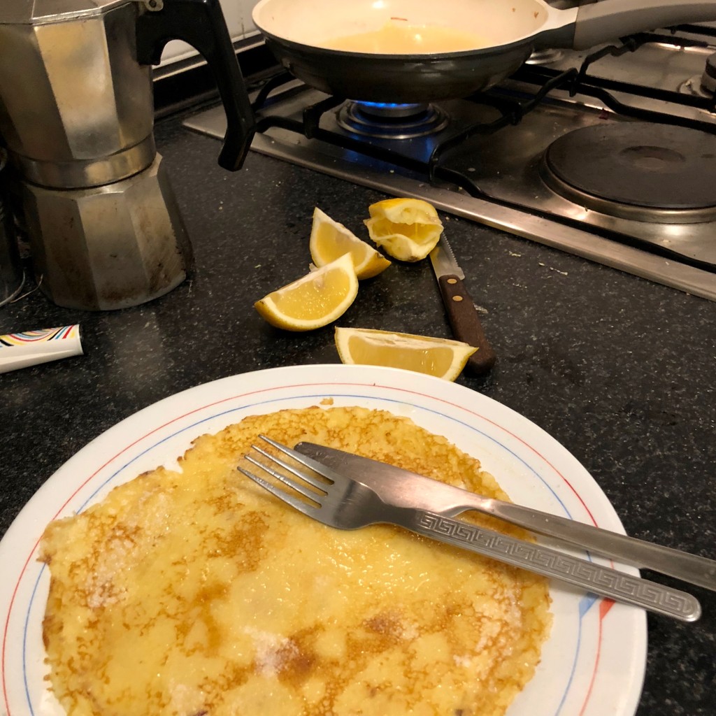
Also last week came one of my favourite days on the British calendar: pancake day. After the distressing realisation that it’s not something which is celebrated here in Spain, I marched myself down to my local supermarket, determined as hell that I would make my own pancakes by myself even if it killed me – the lack of electric whisk nearly did, mind you. Anyway, one dead arm, one pancake on the floor and one hot oil spilling incident later, I had made the first of my batch.

Not too shabby if I say so myself

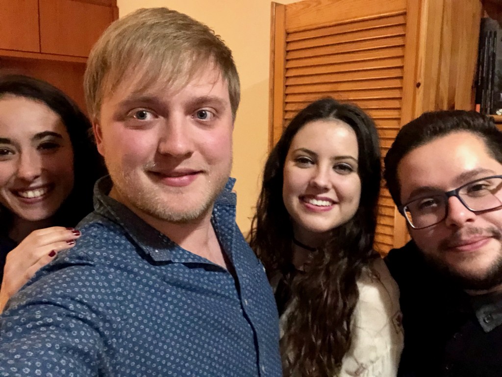
Once the pancake flipping fun was all over it was time to clean up the oily mess which was the kitchen, as my ex-flatmate Giorgia was returning from Italy for the weekend to sit a couple of exams. Once those were done the two of us hit the town once more, heading out for another lovely evening of drinks and tapas and the world’s biggest plate of huevos rotos.

Heading out in my neighbourhood

That weekend I also made a trip across the city to check out one of the events which was going on as part of the Madrid Design Festival, an exhibition run by IKEA which intrigued me seeing as I seem to spend half of my waking life there. I headed to La Neomudejár and spent a good while poking around the cool exhibits, including up-and-coming IKEA products which have yet to be released – I felt like I had been accepted into some secret IKEA society. I was buzzing.

Heading into the exhibition

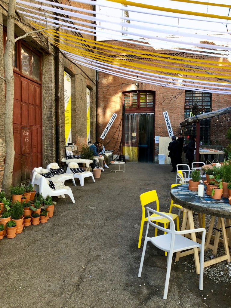
It turns out that La Neomudejár is a cool abandoned warehouse space, and a location which contrasted perfectly with IKEA’s modern aesthetic and the colour scheme of white and vibrant yellow which they’d opted to plaster the place with.

IKEA Labs
Looking over Atocha

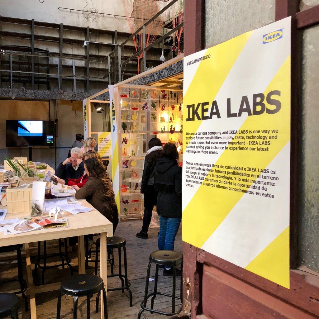
Although I didn’t really understand what some of the installations were trying to convey, it was nice to explore the space and tinker with the products, and I found a room full of neon lights so I was happier than a pig in…

Anyway, moving on, and to something I never thought I’d find myself doing again: I went to watch a football match! Not a huge fan of football, I’ve only even been to one game, but my friends found some cheap tickets and so I agreed to tag along and see what all the fuss is about.

This time however it wasn’t just a friendly game in Burnley, it was Atlético de Madrid! Once I’d discovered that they’d moved out of the infamous Vicente Calderón stadium at the end of last season, I hopped on the packed Metro and zoomed across to their new Wanda Metropolitano stadium in the far west of Madrid.

Arriving at the stadium
Some pretty wicked architecture

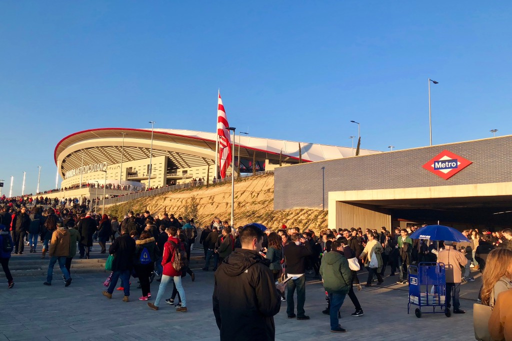
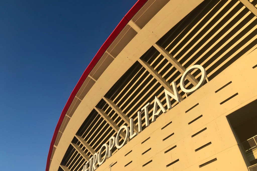
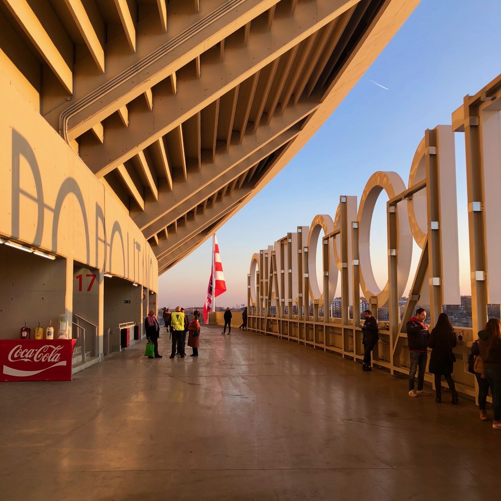
Of course being more designer than I am football fan, I spent so much time gawking at the architecture that I forgot I should probably hurry up and find my friends so we could get seated, but we eventually made it inside. I headed straight to the bar for a hotdog and a beer, so you can imagine how frustrated I was once I was told that they only sold non alcoholic beer. I opted instead for a bottle of water because at least that could be reused later, but then they took the lid from that too for safety reasons – needless to say at this point I was super vexed.

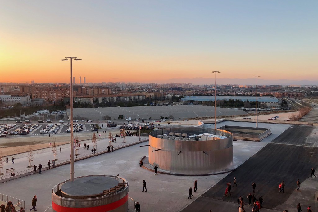
Eating some of my hotdog calmed me down, and so we then had a gawk out from the top of the stadium before taking a group selfie (which I look horrible in so I shan’t be sharing). Once we found our seats I started asking questions about the basic rules of football, which probably annoyed everyone, especially as we didn’t realise the match had started because we were so deeply into the Q&A session which had ensued.

Up in the heights of the stadium
Looking back out to the centre

The Atlético de Madrid vs. Copenhagen game had begun, and just six minutes in Atlético managed to land a pretty decent goal, prompting the stadium to erupt with this rather catchy Atléti, Atléti, Atlético de Madrid chant. The rest of the game was just some people in neon shoes kicking a ball around some grass as far as I was concerned, and it was explained to me that as the outcome of the game didn’t really matter and so it seemed as though Atlético were just killing time.

Just before it all kicked off

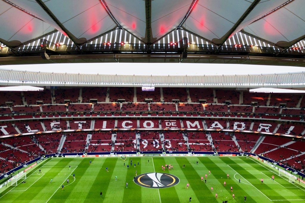
Despite this it did serve me well, as I learned some of the rules of play: for example I now know that “off side” doesn’t just mean someone kicked the ball into the crowd. My favourite moment of the match was when the ball rolled into a microphone on the side of the pitch and it fell over, but that will probably upset any football fans amongst you so we’ll move swiftly on.

Just this evening I left work a little later after a meeting with a client, and instead of heading home to do my washing like I should have done as a responsible adult, I headed off to have coffee with my friend Napo. After a catch up we spontaneously decided to have a wander through the north of the city, visiting two museums which I’ve been meaning to visit since I first landed in Madrid over two years ago.

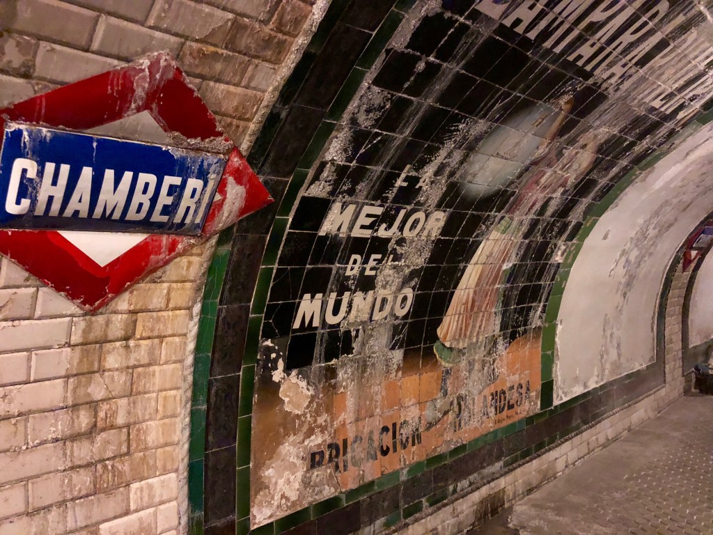
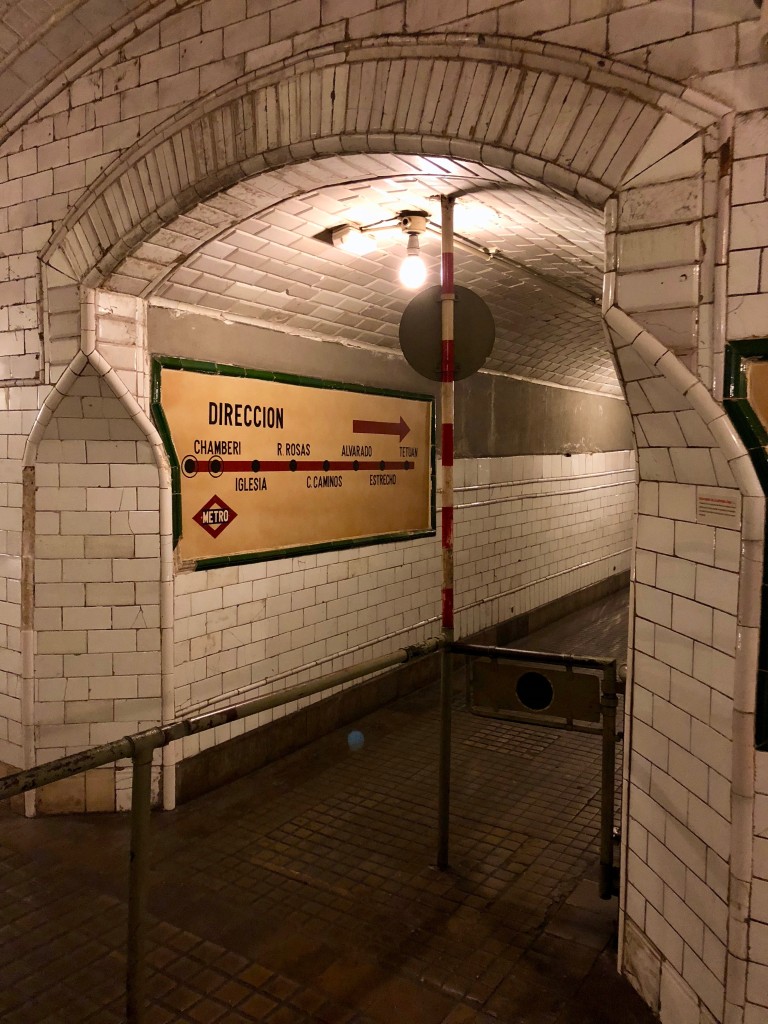
The first was the abandoned Metro station of Chamberí, which opened in 1919 and closed in 1966 when the length of the stations of Line 1 (the oldest) were being extended. Technical restrictions and its proximity to neighbouring stations meant that it was easier to just close the station, and so it laid disused until 2008 when the city council made it safe to visit and opened the Andén Cero (Platform Zero) museum.

Walking into a time machine

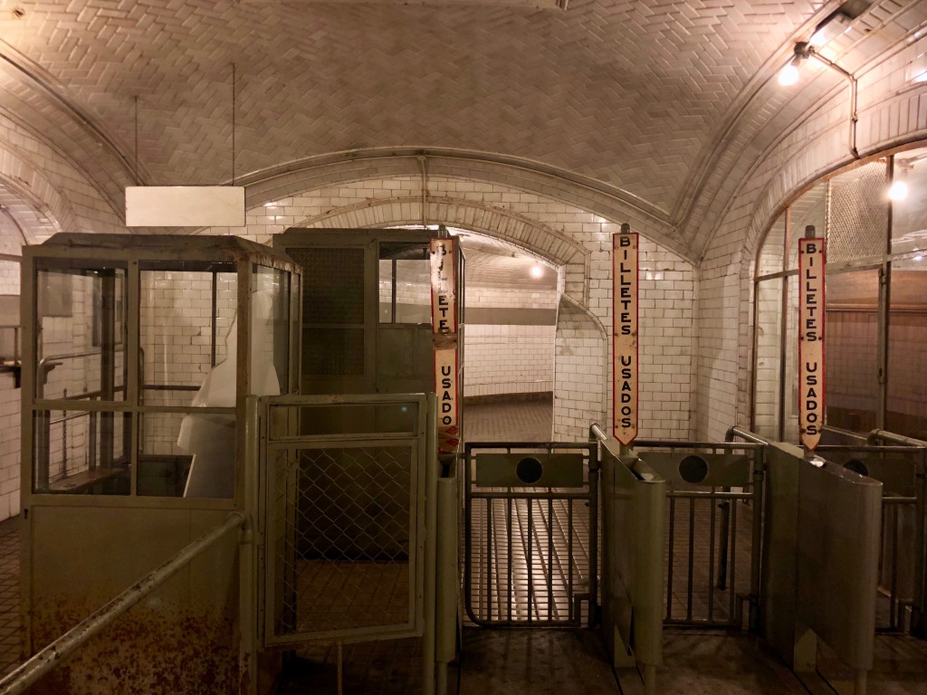
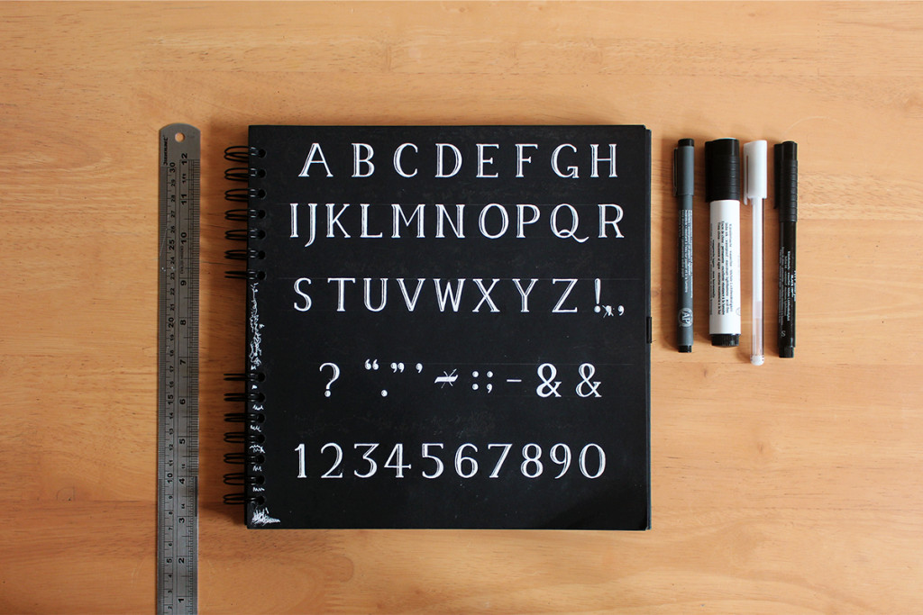
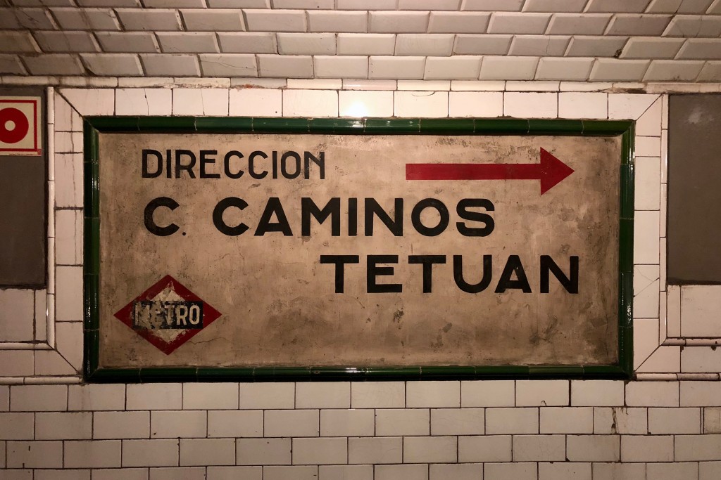
Walking down was quite the experience, as the tunnels and platforms have been perfectly preserved as if frozen in time. I was particularly enamoured with the hand-drawn lettering on the old signage, which harks back to the typography blog I wrote a few weeks ago, as well as the tile designs in the tunnels and on the platform.

Some gorgeous typography
A platform frozen in time

The trains still run along the platform as it remains to this day an active section of the line, and so we watched a few zoom past just inches behind the glass screens which separated us from the track. I’d like to visit this place again really soon and take some better photos, but as it was closing at 7pm we had to head out before we’d done all the poking around we wanted to. If you’re in Madrid, it’s free to go and well worth the short walk from any of the stations nearby!

Heading out of Chamberí

There was lovely old typography to be found throughout the station.

After this we headed back towards the centre and to the Madrid History Museum, and spent almost an hour meandering through its zany array of exhibits. From ancient maps and artefacts to lavish baroque pottery and paintings, it proved to be really well thought out experience detailing Madrid’s past, and definitely worthy of a second visit – which will be necessary as we were kicked out of here also as closing time approached! The two of us aren’t to great at timing it would seem.

This brings me to the here and now, as I’m back in my room preparing to start moving my things over to my new flat this weekend. I’ll have to wrap it up there though I’m afraid, as I ordered a burger and it’s just arriving. Hey, leave me be – it’s my last night so I have no food in.

Or maybe I do have some food in the fridge but it’s healthy and unappetising. Either way, none of your business. I’ll be back soon with more ramblings!

14.02.18 — Writing

Landing a Design Internship or Maybe Even a Job

For this my latest post I’m going to have to send you elsewhere, as recently I was enlisted to write an entry for our company’s blog on Medium. As someone quite new to this whole world of professional design and such, I figured the most useful topic which I’m relatively knowledgeable in would be the transition from student to working life!

Today we’ve just got round to posting the post on the Erretres Medium profile, so please feel free to head on over and give it a read by clicking right here. It’s mainly directed at design students trying to find an internship or graduating and looking for a job, so if that’s you and you have any questions then please be sure to drop me an email – I’m always happy to chat!

Also if you have a Medium account and enjoyed what I had to say, feel free to give me a little bit of applause. I’ll be back again very soon with the usual programme of nonsense on my blog here, but until then I’m heading out for the evening for Valentines Day burgers with all my single friends. Here’s to another year with my by myself!

10.02.18 — Journal

Bringing the North to the South

So my last post may have been a little heavy for some of you all, and thus here I return to the usual programme of day-to-day wittering, starting with the really boring news that my new pair of shoes finally came. Okay, I shall try to make the rest of this post somewhat more interesting…

Things really took off as I quite literally took off on the train from the northern station of Chamartín, heading further north once again to visit my second Spanish home of Oviedo. Kevin was once again so gracious as to host me for a few days, but with the weather promising to be pretty shocking and me being tired from a few busy weeks, we decided to take it easy for the weekend and spent most of our time lazying around, eating and chatting into the early hours.

Wandering to the train station
Leaving the city

Once I arrived we set off to have dinner at our friend’s house, where we were treated to a dish she called Mexican lasagne, which turned out to be a delicious cheesy concotion. Once we’d had our fill and had chatted away into the night, we headed back and were up bright and early the next day to get some breakfast in the city!

Okay that’s a total lie, we slept in until the early afternoon and then had to grab pasties on our way to the second bus after missing the first, winding up in the city in time for Spanish lunchtime (around 2:30pm, they’re crazy). We booked a table at an amazing spot and we were soon gorging ourselves on an array of delicious Asturias dishes, including a plateful of pork and more delicious chorizo cooked in cider like the one I had up in the Basque Country.

Once we were bursting and fit to pop we headed back towards the city centre, making a surprise stop along the way when Kevin noticed that the nunnery had opened its doors and was selling some of the infamous biscuits.

Walking through a cold Oviedo

If you haven’t before heard the tale of the nuns’ biscuits, I shall explain based on what I was told when I discovered the legend during my first ever trip to Madrid. Basically a lot of the nunneries in Spain produce their own selection of delicious sweet biscuits, especially seeing as some nuns take a vow of silence and so dedicate any spare time to carefully perfecting their baking craft. They are renowned for being crumbly and delicious, and also extremely hard to get your hands on, as they’re made in small batches and you have to persevere in order to arrive at a time when a nunnery is open for business.

Anyway, Kevin was super sweet and bought me them as a gift to take back to Madrid (I have since managed to eat them all, oops) and we headed home for the evening. Once there we were joined by Sara and Rocío, and began having drinks and chatting away into the night, putting the world to rights and reminiscing about all the fun we had whilst in Leeds together. It was a lovely evening, and we managed to remember to snap a selfie to remind us of the occasion…

The four of us

The next day we stayed true to form and didn’t rouse from our beds until at least midday, whereupon we chatted and ate leftover pizza until it was sadly time for me to head to the station and grab my train back down to Madrid. Once I’d passed through the mountain range separating Asturias from the rest of Spain, I was in for a shock – Spain had turned white.

A snowy vision of Spain

I was particularly taken aback as I’d never seen snow here, and I didn’t even manage to take a half decent photo in the area where the snow was thickest and most complete – I was obviously too busy straining my neck and admiring the frosty downpour to take a photo. I’d seen on everybody’s (literally everybody’s) Instagram stories that it had been snowing somewhat in Madrid, but it didn’t look nearly as dense as the coverage which we were passing through on the train.

Sure enough then I wasn’t too shocked when the snow began to disappear as Madrid drew closer, and I didn’t see a single snowflake as I trudged back to my flat late on Sunday evening – but Monday morning was a different matter.

Mercilessly the snow didn’t start until I was comfortably inside the heated paradise of the office, but when it did come, it came down at a surprisingly rapid speed. Soon the skylight windows of the office were completely covered, and heading out for lunch with Dani became a perilous journey as we waded through some pretty slippy slush on the way down to the food court in the train station.

The train station is topped with snow

By the following day however all the snow had been cleared away by the reliable Madrid sun, but another surprise lay in store for us all as Dani arrived at the office with a box full of churros and porras (like a thicker version of a churro) as it was his birthday! Having devoured most of them for breakfast, it was back to the grind with lots of new projects coming in and plenty of interesting work to get stuck into.

Although last weekend was a lovely chance to relax with fabulous company, this weekend I have decided to have a little me time, opting to have a glass of Baileys and embark on a Pirates of the Caribbean marathon instead of heading into the city. I’ve been admiring the view from here too, as in just two weeks I’m excited to be moving flats – but more on that when the time comes!

The city from my flat

For now it’s currently 10:30pm, I’m two Pirates of the Caribbean films in, and I reckon I can squeeze another one in before I turn in for the night. Time to light my vanilla IKEA candles, pour a glass of coke and tuck myself in for some swashbuckling entertainment – drink up me hearties yo ho!

08.02.18 — Design

Down a Typographic Rabbit Hole

It’s been a good few years since I unwittingly began my tumble into the world of typeface design, as way back in 2012 I began to wonder why even the most geometric of fonts I could think of (at that time Avant Garde) wasn’t actually geometrically perfect.

Artboard 1
Geometry overlaid on Avant Garde

After a frantic web search for any fonts which fit the style I had in mind – perfect circles and zero contrast (meaning all lines would be the same width) – I gave up and decided to make my own.

The resultant typeface was pretty basic, with only capital letters, numbers and some basic punctuation included, but it did come in two weights – light and chunky. I only ever had the patience to male the bold variant into a font file, as my mastery of the software was at that time somewhat nonexistent. I named the resultant typeface “Fries”, and you can check out a sample of it in all its glory below.

Artboard 2
Fries Chunky and Light

At the time I was quite pleased with it, as it adhered to my then purist principles of perfect shapes and minimal styling – and I even used it on a website prototype I was building. Looking back at it now though, I see that it’s only real use is as an example of why nobody makes fonts which are geometrically perfect – they look awful.

I shan’t go wittering on in great detail about the intricacies of typeface design, as there’s already plenty of brilliant articles and books which have all that covered, buy what I shall go over however is how the two features I insisted on including – perfectly geometric shapes and a uniform line width – are actually the ultimate downfall of the typeface.

Firstly there’s the use of perfectly geometric shapes, most notably how I used perfectly round circles for letters like O and C, something which is very rarely done by type designers – and for a good reason. Perfect circles in text look like they’re wider than they are tall, and so the majority of typefaces use slightly oblong shapes to counter this optical illusion. You can see the slight offset when I compare Fries to Avant Garde below:

Artboard 3
Fries in blue, Avant Garde in pink

Secondly there’s the use of the consistent stroke width, which is also avoided by designers as another optical trick causes certain lines to look thicker and others to look thinner even though they are all actually equal. Take a V for example, where the lines become thinner where they join in order to avoid the point of intersection looking too heavy. Then there’s also the effect of horizontal lines seeming thicker than vertical ones (some people think this is because of the shape of the human eyeball), and so the horizontal lines of letters such as E have to be slightly narrower than any vertical ones.

Artboard 5
Fries in blue, Avant Garde in pink

Needless to say that after this, and with college and university to be completed, I didn’t exactly rush into trying to make another font.

An interest in typography still hung around at the back of my mind though, and so whilst completing an optional university module on typographic theory in 2015, one evening I had the idea to just sit and draw the entire alphabet, numbers and some essential punctuation entirely from memory. This was scanned and converted into the free experimental typeface which I eventually released as Memory, which is still available to download today.

The original master sketch of Memory

Soon I was whisked away to Spain for my year in industry, soon I was back for my final year of university and I had realised that I could be more playful with design, and thus decided to incorporate experimental typography into my final year projects.

My third attempt at a typeface came as part of my Pearson project, where quite late on I decided to develop a quick geometric typeface which I could use for the project. I called it Celebration to fit the project’s concept, and although it was built on a geometric grid a bit like Fries was, it was much more carefully considered. Circular elements are slightly taller to account for visual trickery, there’s no entirely round circles, and the equal line width is justified by an “inline” style which can be layered on top.

Some letters from Celebration

Once the project was over and submitted I began to tinker with Celebration once again, seeing the opportunity for another experimental typeface release. I changed the style of a couple of the letters from the original, added a fill and shadow variant, and then wrangled with my font software to align everything and release it as a separate project on my website. It’s now available for free for personal use, and if you fancy using it for something else then feel free to get in touch.

With this project wrapped up I found myself in the early stages of preparing my new portfolio for graduate job applications, and I decided that I’d use the opportunity to develop my own font for my personal brand. Inspired by the sketches of the famous (sometimes for the wrong reasons) type designer Eric Gill, I set about sketching a typeface called Goddess in earnest – I was so confident that I’d get it done that I even wrote a blog post on it.

The long and short of that story is that I digitised it, it looked a lot worse on screen than it did on paper, I got mad, I had a sulk about it, and then I shelved it indefinitely.

I was busy back then and I am only human so I can forgive myself for giving up so easily, but at the end of the day I still needed a typeface to use for my personal branding. I’d fallen quite in love with Maison Neue around that time, and so a quick fix solution was to simply add the sharpened angles of the ascenders and descenders (the key feature of Goddess) to Maison Neue.

A few hours of tinkering in my font software later and I had my custom copy of it ready, which I named Liv, a name which my friends and family often call me by. You can see how I made some adjustments to the original font in the letters below.

Artboard 6
Maison Neue versus Liv

Things really started to pick up once I had finished all my university work but was still living in Leeds, and so had the time and space to do some design for pleasure. I had been wanting to try something with cut sponges for a while, and once I’d had the idea to experiment with the typographic “weights” (usually referring to how bold the font is) to mean the amount of ink used, I began stamping in earnest.

Creating Kitchen Sink
Creating the sponge font

With a fully fledged character set and two variations of each letter for each of the three weights, this typeface was eventually released as Kitchen Sink. It’s original name was much more fun – Spongefont Sanspants – but I didn’t want to be landed with a lawsuit from Nickelodeon…

A sample of Kitchen Sink in action

It’s proven to be the most popular experimental font I’ve done thus far, having been featured on various design blogs, acquired plenty of attention on Behance, and even been licensed multiple times for commercial use – not bad for an afternoon of painting with sponges like a three year old! It’s also available free for personal use, and if you want to license it for commercial use feel free to get in touch.

After university I had all the stress of job hunting to get through, and eventfully the task of moving my life over to Madrid and settling into a new job. After returning from a Christmas spent at home and now pretty settled into my routine, in my spare time I have recently fallen further down the typographic rabbit hole.

As someone interested in visual communication, I’ve always been intrigued by other writing systems and codes, and so one day for an experiment I turned east and studied the letters of the Cyrillic alphabet. This alphabet is most well known for being used as for the Russian language, and although there are similarities to the Latin alphabet (i.e. the one used for English), most of its letters don’t mean anything to an English speaker.

I combined this study of Cyrillic with a love for ultra-condensed typefaces, and created a silly experimental typeface which I called Responsive Cyrillic. In separating each letter into three sections, I was able to expand or contract the midsection of each at will, changing the height of each letter without distorting any curves or lines.

Russian-Responsive
A sample of Responsive Cyrillic

Although for my next stop along my journey I’ll be sticking with the theme of alternative alphabets, I have to preface this next one with a bit of a backstory…

A few years ago I was writing down some thoughts in my notebook whilst on a train, but I could feel the guy sat next to me was cheekily reading every word I wrote over my shoulder. At that very moment I decided to create my own code, a very simple letter-for-letter substitution, which was easy to remember as it was based on the absolute simplification of the shapes of each letter of the Latin alphabet. I invented it as I wrote, and since then I’ve been gradually adjusting it. As such I am now able to write it pretty quickly, although reading it with any speed is still quite a challenge.

IMG_3680
An example of written Simplified Latin

In order to get myself quicker at reading the system, I decided to create a typeface so that I can quickly “translate” typed text into the coded system. Adding small serifs to the otherwise simple straight-line symbols aims to help me distinguish between similar shapes as I begin to read faster.

Artboard 7
Simplified Latin font

As I’m keeping the coded system just for my own personal use for now, the text above is just jibberish, a random jumble of symbols. I say this so that you don’t waste any time trying to read what it says – not that anyone would bother…

This all leads me to where I am currently tumbling deeper into a typographic obsession, and that’s my attempt to create my first viable ‘standard’ typeface, with ‘standard’ here meaning not experimental or overly decorative like all the previous.

Once again it’s an attempt to create a font which somehow captures an essence of my identity, much like I attempted with Goddess, and so for now its working title is the rather unimaginative “Goddess Version 2.” Please try to not pass judgement on the messiness or terrible curves just yet, it is very much an early work in process!

Early design sketches of Goddess V2

With this font I am attempting to create a nicely legible typeface inspired by my rather illegible handwriting. Often mocked for its pointless extravagance, my handwriting can be distinguished by lengthy curls on the end of most letters. As I work over my initial sketches, I’m trying to incorporate these fancy flicks in a more subtle manner, adding a slight curved ear to the letters which feature such a curl in my handwriting.

It’s still very much a work in progress as I struggle to find the ideal shapes for certain letters, a good balance of minimalism and decorativeness, and the visual balance of the letters and the spacing between them, but I’m hoping to get a first version done over the coming months. I am well aware that it won’t be anywhere near the standard of work done by the many amazing type foundries out there, but typography is something I’d like to get more involved in – and I know that there’s plenty more of that metaphorical rabbit hole to fall down after this…