03.04.16 — Design
Typesetting in Spanish
This is a very strange blog post I guess in some respects, mainly because most of the time I don’t post specialised pieces on design thinking, but also because even within the design community itself, typography in one specific language is a very niche subject to talk about.
My sudden feeling of need to explore the use the written in the Spanish language (I will be referring to Castilian Spanish throughout) without actually delving into the language itself (bear with me if you’re new to typography, you’ll get the hang of it soon) was spurred on by a sight I see every day on my way to and from working at Erretres, which is based near a beautiful plaza called Ópera in the centre of Madrid. At the entrance to the metro station for Ópera there sit two signs, a suspended one and one on the wall. Both are set in the standard Madrid Metro typeface, Helvetica, however one carries the accent as it should, Ópera, and the other has dropped the accent seemingly without a second thought, so the word has become Opera. As trivial as it may seem, it really got me thinking, so let’s explore…
The Spanish language makes use of the Latin alphabet, so there’s no surprising shapes or forms to throw us off too much as English speakers, except the extra letter which is included in the official Spanish alphabet:
A B C D E F G H I J K L M N Ñ O P Q R S T U V W X Y Z
The Ñ, written eñe and pronounced “en-yay”, is not considered an N with an accent, but rather a letter in its own right, and hence it occupies a place in the official alphabet. The letter comes from a double N, and came about when people began to place a tilde over the N as shorthand to indicate doubling, a practice which was formally introduced in the 1700s. The introduction of a new letter and accompanying sound based on the doubling of an existing letter may same strange, but remember that the English W came about as a doubling up of the letter V!
An interesting tidbit to note on the subject of the Spanish alphabet is that up until quite recently in 2010 the combinations CH and LL were actually considered letters in their own right also. This is due to the fact that Spanish has a near-perfect phonemic orthography, which is a fancy way of saying that each letter roughly corresponds to its own distinct sound when spoken. As CH and LL combine to form a different pair of sounds than their two letters would individually, it was seemingly felt they should be treated as separate, in order to maintain the phonemic orthography which the Spanish enjoy – they rarely have to spell words out for each other!
The other feature that Spanish possesses which English does not is the frequent and methodological use of accents. The acute accent (´) can be present on any vowel, and an umlaut (¨) is sometimes seen on the letter U, and so the complete set of accented letters is as follows:
Á É Í Ó Ú Ü
The most interesting problem brought on by these accents and extra letter is the issue of text colour. The colour of type does not describe the actual colour of the text itself, but the overall darkness of the text when it has been composed on a page or screen. This is primarily affected by the weight (boldness) of the font used, as can be seen in the example below.
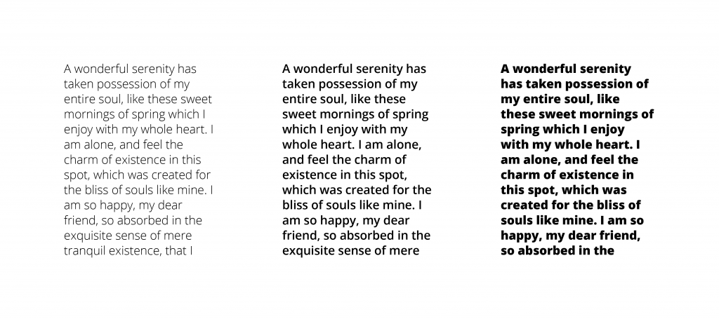
As you probably agree, the central column is easiest to read as the contrast between the letters and the blank page is best balanced. The colour of text can also be affected by the space between the lines, or leading, as can be seen in the example below.
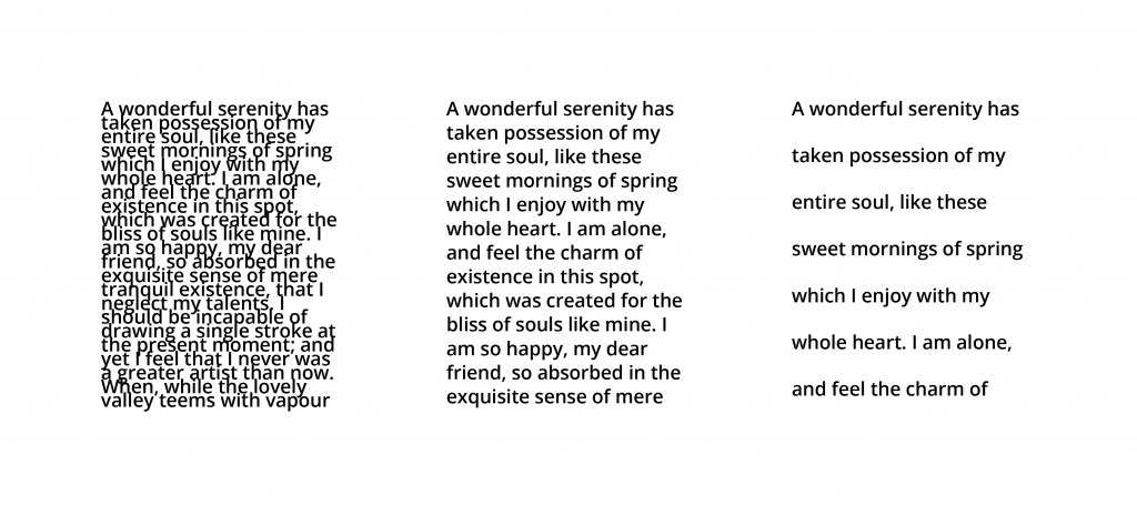
Here you probably agree again that the central piece of text is the most legible, as the lines flow together and your eye is able to quickly jump from the end of one line to the next. Too much leading and you will easily lose the line you were on, and too little and the lines and letters begin to mix into each other.
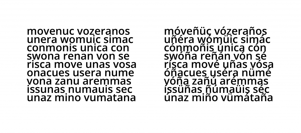
So how do the accents and Spanish Ñ affect the colour of the text? Well, as they consist of extra forms sat above the usually short lowercase letters, their presence makes the text ever so slightly darker in colour, as you can see in the example below.
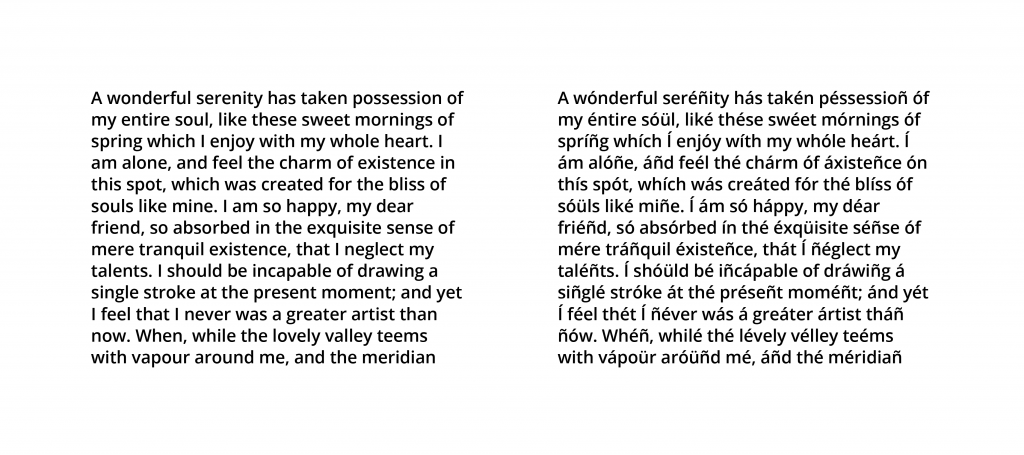
It soon becomes obvious that with all this extra visual information making the text appear darker, it is necessary to compensate by adding extra leading. This also prevents the obvious issue of letterforms (the shapes of the letters) overlapping and running into each other, which is move likely with an accented language such as Spanish as you can see in the example below.
Another consideration with Spanish is the length of a piece of text itself. Something which maybe 10 characters in length in English may be 14 characters long in Spanish, as Spanish is on average around 140% as long as English text containing the same information. Although this may not affect how we actually typeset and handle text in Spanish, it is an important consideration when designing layouts which may be ultimately released in both Spanish and English, and something I had to consider for example when designing my portfolio (which is available in both languages).
The final peculiarities that arise when handling Spanish text arise with it’s punctuation. The Spanish language famously includes inverted exclamation and question marks (¡ and ¿) at the beginning of exclamatory or interrogatory clauses as well as the regular marks at the end. This is born of the fact that the Spanish sentence structure does not change to accommodate questions, and so “do you want?” and “you want” are written exactly the same. English uses the auxiliary word “do” to denote the start of a question, a feature Spanish lacks, and so the ¿ at the start of a question alerts a reader that it is a question rather than a simple statement, a signal which in spoken Spanish takes the form of a change in the voice’s pitch. The exclamation mark simply follows suit.
Another standout piece of punctuation is the Spanish treatment of quoted text and dialogue. Quote marks are sometimes used exactly as in English, for example “Hello”, however sometimes a pair of symbols akin to double chevrons are employed, for example «Hello». The third and perhaps most baffling method of denoting quoted text or a change in speaker is the use of a long dash, or em-dash to be precise. It can be used with line breaks (a new line for each speaker) or without line breaks, as you can see below.
—Voy a ver una película— él dijo, pero ella le dijo —No puedes ir—
—Voy a ver una película
—No puedes ir
—¿Por qué no?
—Tienes que lavar los platos
Although the Spanish use of punctuation may not have any real consequences for a typographer or anybody handling the text, it is important to understand the grammatical quirks of the language in order to avoid errors when trying to work with text not set in your native language.
And so concludes my quick overview of typographic considerations when using Castilian Spanish. Although not intended to be a fully researched and thorough exploration of the subject, hopefully it has been of some interest to anyone inquisitive about the world of typography, graphic design and the Spanish language!