21.09.17 — Design
Future Iconography
The other day my mum’s friend and her young daughter came to visit, and we all wound up in my room having a snoop around the decor. If you’ve ever seen how my room looks, you’ll know that I have a set of shelving which showcases a photo frame, a green phone and two clocks in sequence. The phone handset is actually connected to an old MP3 player which makes it ring loudly once every 15-20 minutes, and when you pick the phone up there’s quiet hold music playing 24/7.
This is relevant to this blog post on iconography, I promise…
Whilst all gathered in my room, the phone happened to ring, and my mum’s friend went to pick it up. She made a comment about the old-style phone, and then said something which got me thinking: that her daughter of 11 years probably wouldn’t know what the old-style phone actually was.
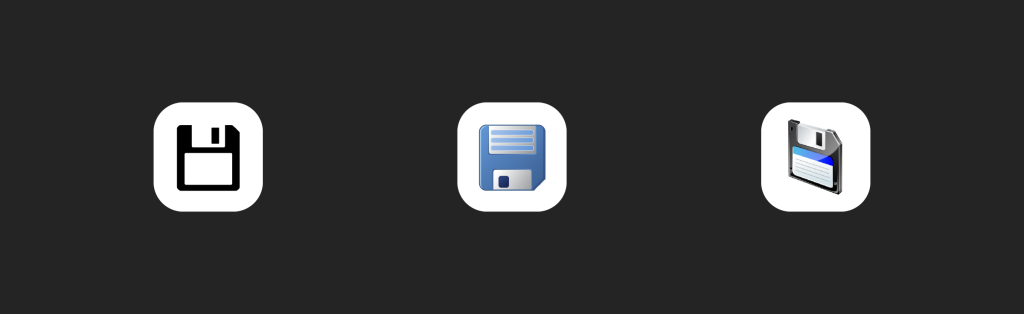
I’m dubious about how much truth is in the idea that an 11 year old wouldn’t know what an old phone receiver looked like, but it certainly took me back to the debate about the infamous floppy disk save icon. We’ve heard stories about younger people being presented with floppy disks and wondering why somebody had made a physical copy of the save icon, and I profess that when I see the icon I relate it in no way back to a floppy disk.
What I have noticed however, is that there seems to be a separate group of icons which may one day fall victim to quite a distinct problem. I’ll take some of icons on my iPhone as examples below: namely the phone, camera, and video icons. These are all perfectly understandable for all users at present; but consider something: all these icons rely on mental associations to real-world physical counterparts in order to make sense.
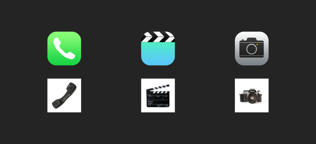
The camera icon relies on a user knowing the shape and form of an old-style phone receiver (like the one in my room), the camera icon relies on the user being familiar with the shape of a traditional camera, and the video app icon requires they know what a clapboard is. This is all well and good in a world in which the majority of us have had experience with these objects, but what about those being born into an increasingly digital world where exposure to these kinds of objects (especially defunct ones such as floppy disks and large old phone receivers) is increasingly limited?
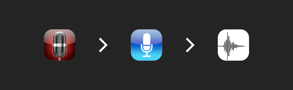
Apple themselves seem to be aware of this paradigm, having changed their voice notes icon from a rendering of an old-style microphone to a more graphic sound wave. It could be said that this was just a move aligned with Apple’s big push to ditch skeuomorphism which occurred with the release of iOS7, but the skeuomorphic elements of the design were actually removed prior to iOS7’s release.
Skeuomorphism, for those unaware, refers to the act of “making stuff look as if it is made of something else” – see how the old Mac Calendar application used to resemble the leather cover of an actual diary. Yuck.

This rather seems then to be a move towards making an icon which is more easily understood in the 21st century, where large recording microphones are uncommon, today more a reserve of audio recording specialists. The sound wave would be recognisable to those living a near exclusively digital lifestyle, as the UI of the application clearly presents this graphical interpretation of sound when it is used – it has become more ubiquitous than an actual physical microphone for this purpose.
Of course I am not saying that a new generation will suddenly cease to understand the meaning of such icons, as the meanings will continue to be known through what Microsoft describe in their blog post as “ubiquitous meaning”, or something which is “universally accepted as a true representation regardless of its symbolic meaning”. As an example they present the octagonal red road sign which is accepted as representing “stop” even though as a symbol it is not (when you think about it) actually related to the physical act of stopping.
It could be argued that the save icon is a modern day example of an icon which has moved from being a physical representation of an act, i.e. saving a file to a floppy disk in days gone by, to one of these more ubiquitous meanings. Nowadays everybody simply uses the floppy disk icon to represent the act of saving, and so it has become universally accepted as the save symbol, with hardly anybody who sees the symbol actually considering the actual physical object it represents.
Will the same happen to the phone symbol, the movie symbol, and the camera symbol? Has it happened already? It would be interesting to carry out an experiment to see if users, particularly younger users, are able to explain just why they know, for example, that the music symbol represents music. Would it be because they recognise it as a musical note from a bar of sheet music?
It would be very interesting to peer into the icons used in the future and see how and if they adapt to a world in which the objects which they once literally represented in order to be understood have now become defunct. I predict that it will be especially poignant with the internet connecting more and more people of different cultures and languages. It does indeed seem that the same digitalization which necessitates pictorial communication is also beginning to change how the meaning is conveyed, moving from symbolic meanings towards more ubiquitous meanings.
With the digital challenge of having different users speaking different languages, it seems that designers will have to increasingly rely on universally understood icons to be understood rather than the perils of specifying a word for each language – it’s much easier to put an icon of a bin than try to translate the word “delete” into every language in the world. Emojis (which are basically a form of icon) are now often used between two people speaking between different languages, as it aids understanding where words fail.
It seems ;that icons are now having to graduate from being merely decorative accompanying elements into a vital part of communication, and it’ll be interesting to see how they change with the times.