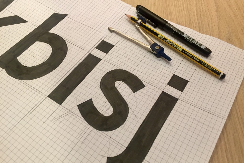
Okay so this post has a weird title, but I shall proceed to explain. About a week or so ago, whilst on my placement with Elmwood, I began to sketch some initial ideas for a new typeface which I’ve had as an idea at the back of my mind for a while now. The typeface’s working title is Goddess (hence the title of the blog post), and the current plan is that it will become the new typeface which I use for all my personal projects – including my website!

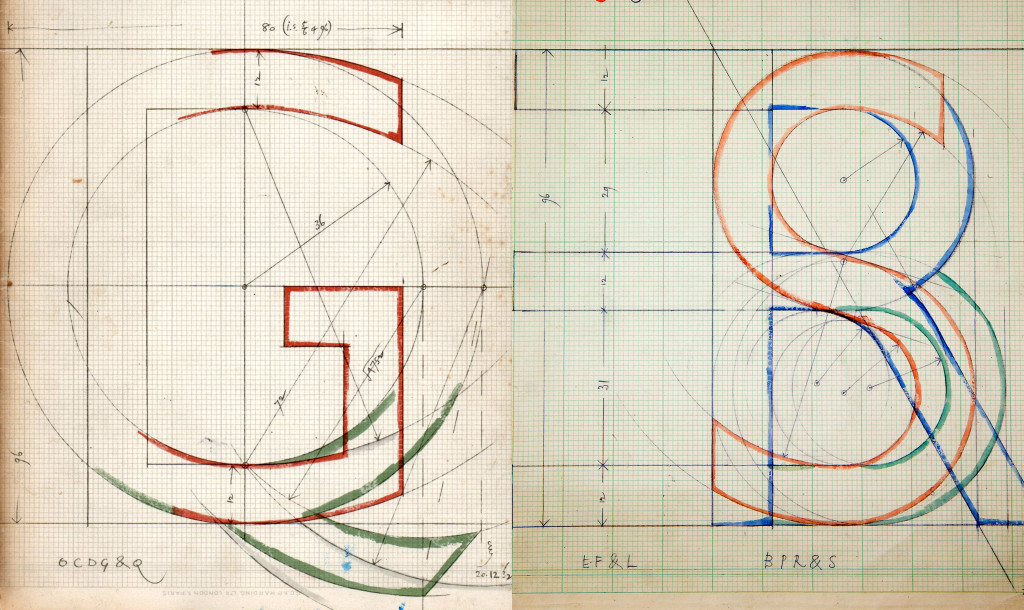
As you can see from the photo, I have been building the letters (which are all non-final at present) using simple shapes with a compass and pencil. This process was inspired by one of the greats of typography design, Eric Gill. The sketches below were used to build the typeface which bears his name, Gill Sans, and to me they are objects of exceptional beauty (which may be a little bit sad, but I can deal with that).

For those unfamiliar with the design of typefaces I should explain from where comes the trouble I have been having with the rounded letters, which I can simplify down to two reasons. Firstly, they have to extend slightly above and below the line due to the way the human eye perceives the height of rounded shapes compared to straight-edges ones, and that’s been a nightmare to account for. Secondly, round letters like o should not ever be perfectly circular as they otherwise appear too wide – however if you just simply try to squash a circle a little it begins to look deformed, so I have spent quite some time working on how to make letters like c, d, o, and e look just right.

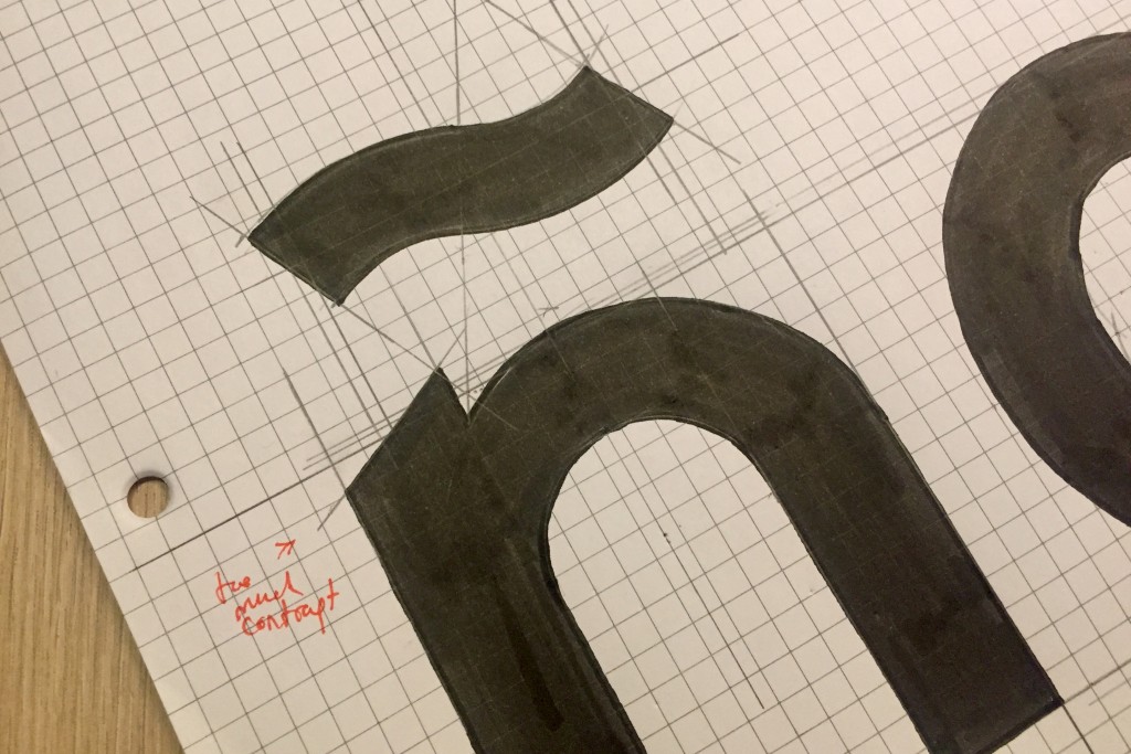
As you can see with my red pen I am making minor changes as I go, as typeface design takes a good while – just imagine you have 26 letters, double that for capitals, then add numbers, punctuation, an array of special characters (such as the Ñ for Spanish above) for other languages, and much more – all of which has to be designed carefully to flow properly. A right royal nightmare.
I’ll keep you up to date as I begin to make more progress on the typeface as the weeks go by, especially once I begin to start digitising copies – thus far all the work has been done on pen and paper. I love working like this as it makes me much less precious about finer details, and I can adjust and connect curves in a way which just isn’t possible on a screen.
Long live the paper, pencil and compass – even if I have stabbed myself inadvertently a few times with it. Blood, sweat, and tears will have indeed gone into creating this damn font.