I recently looked back on a blog entry from two years ago, a post which discussed the process of creating what was to be the new-look design for my website, by now rather familiar as the design you are currently looking at. Although novel at the time, I did recognise that it wouldn’t be a design which stuck around forever, as I did end this post with: “here’s to the next two and a half years!”
I may have been somewhat optimistic in making said statement, as I’m here today just two years later discussing the impending launch of a new design. If you take a moment to re-read, you’ll see that I outlined how I had learned a lot since the previous design had been launched, and I have to repeat myself heren as I say that the same is true once again.
I might lose some of you here in the boredom of wittering on about design, and so if you do find yourself dozing off, scroll down a little further in order to pore over some rough previews of what the new site will look like. If you’ve decided to stay with me, let’s have a quick look over the past two iterations of my website’s design.
The first I like to call “the green design” because quite literally everything was green. Titles were green, links were green, and even the preview images for projects had been run through a green filter. The layout was also very square and rigid, making the whole design great for ensuring optimum text legibility and cementing my personal brand, but not much else. The single-column structure didn’t allow for any kind of dynamic layout, and the green smothered the unique look of each individual project.
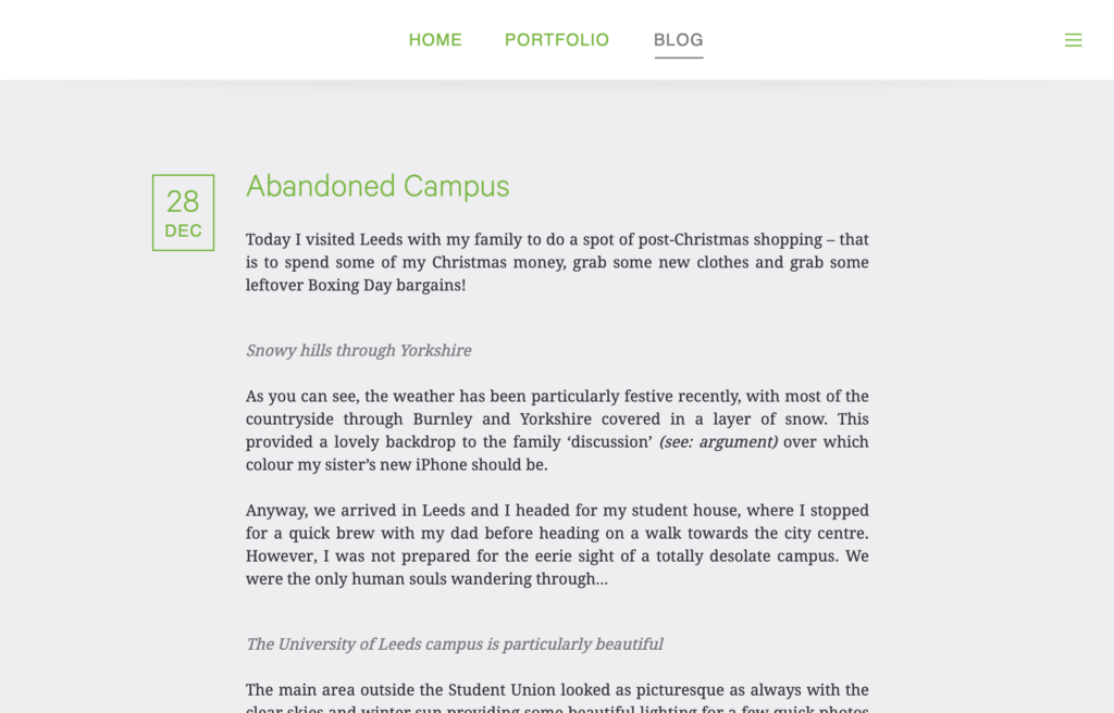
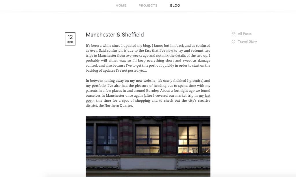
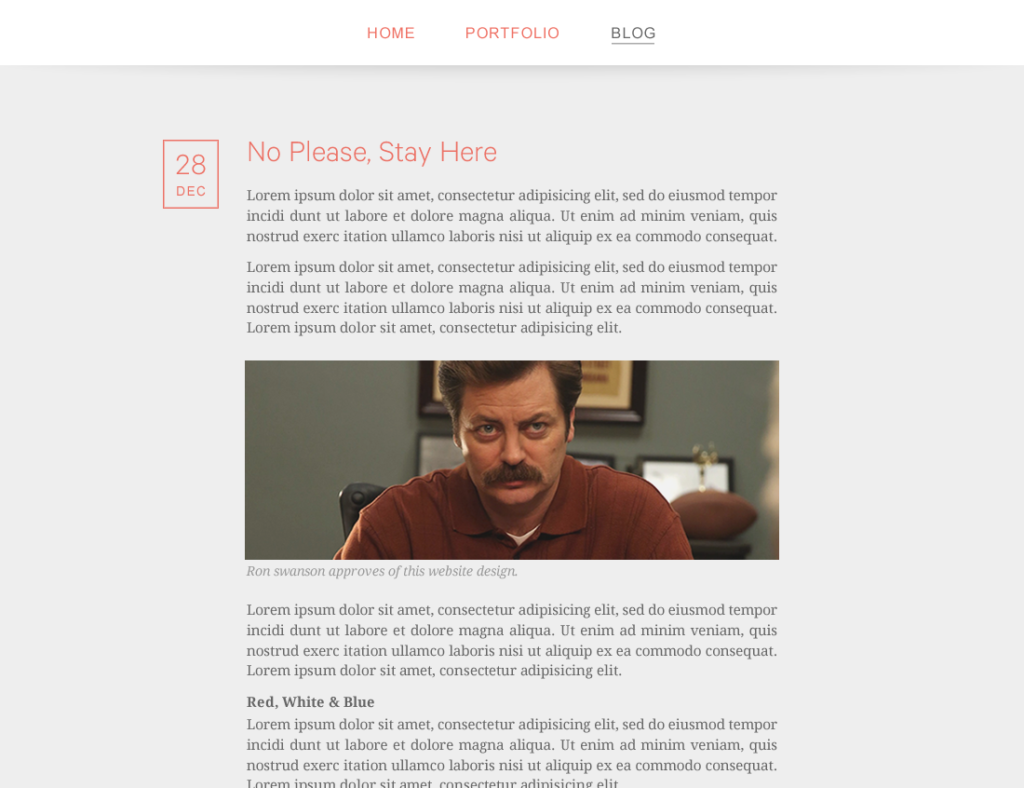
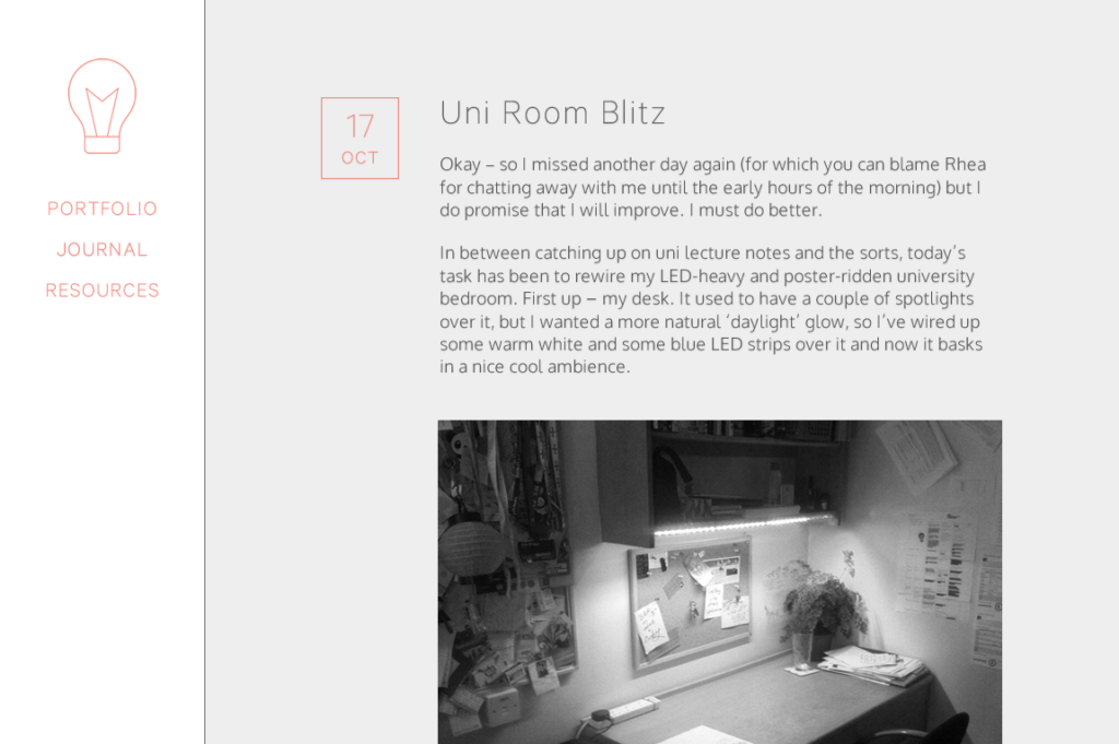
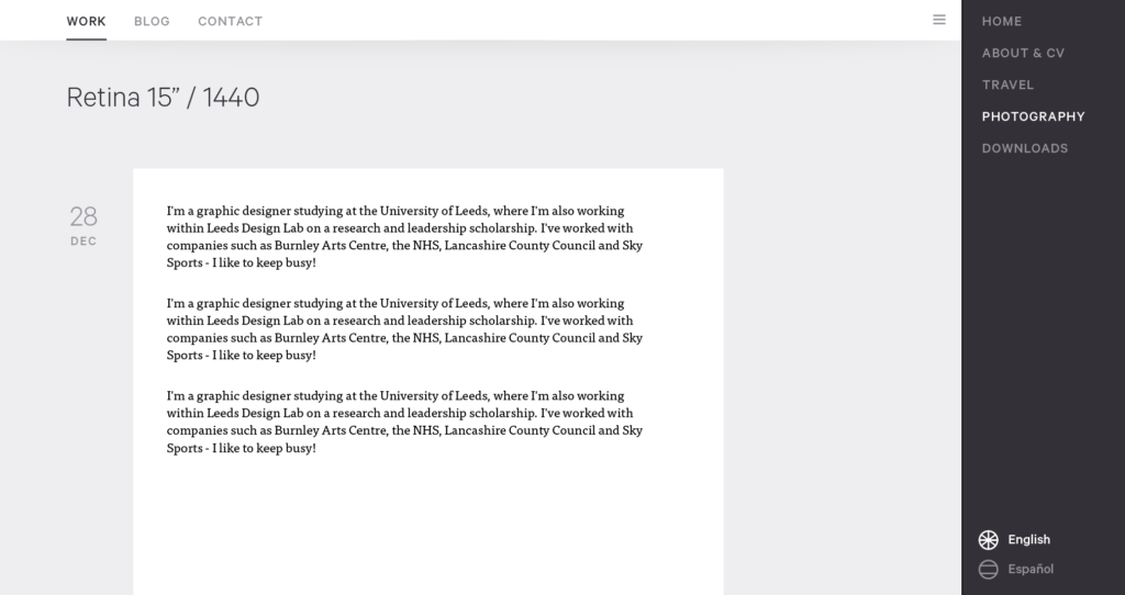
The second and current iteration, then, was a much-needed improvement over the first, and I call it the “grey design” due to – you guessed it – an overuse of grey. The green was relegated to the ‘Home’ and ‘About’ pages of the site, and there were opportunities to have wider and even full-width images peppered in amongst the text.
With time, however, I begun to realise that the new design had been merely a lick of paint instead of the more thorough re-thinking that the site really needed. I had tinkered with typefaces, image widths, and colours, but I hadn’t really made any significant layout or functionality changes. I was still using the same basic ideas which date back to ancient sketches I made way back in 2012, which you can see as you compare the old design files below.
So what’s next for my site?
This time I have started from the ground up, trying my best to not default to doing things as I have done them in the past, but rather fully examining whether they should be changed. It just so happens that the structure, the first step in developing how the site will work, did not end up getting modified all that much. The familiar three menu items have been joined by a new one, even though it is not actually a new page – just one that has always existed but has had to be accessed from elsewhere. All four options will now be quickly accessible from the redesigned menu bar:
- Home
- Work
- Blog
- About
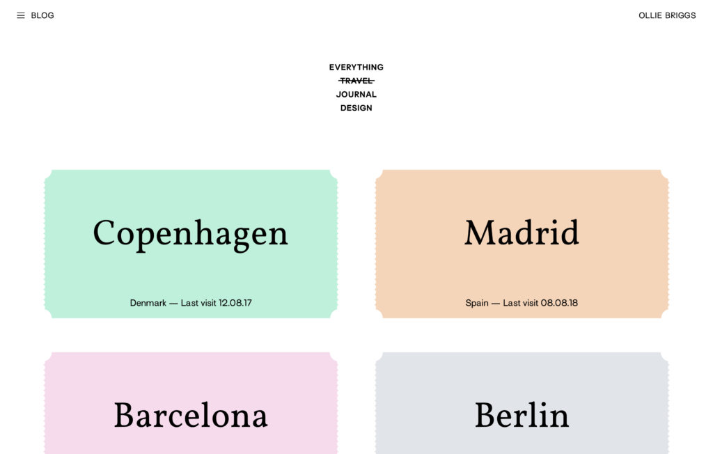
The main structural change comes in the breaking down of the content of the ‘Work’ and ‘Blog’ areas of the site. An attempt has already been made at doing this on my current blog, with an easily-missable link to the travel section barely visible in a column to the right of the content. This puny content-sorting menu will be replaced by a much more visible one in the new design, with the two areas now to be broken down as such:
- Work
- Featured
- Typefaces
- Miscellaneous
- Blog
- Everything
- Travel
- Design Writing
The minimal and bold style is one I’ve always tried to maintain, and the new design should advance it even further. Gone are the shadows and shades of grey, they’ve given way to a simple black and white colour scheme which should let the content shine through. Of course my trademark green hasn’t been lost, but I’ve changed it to a full neon green – I thought that if I’m going to do green, I might as well go all in! Don’t fear for your retinas just yet, though, as it will be reserved as an accent colour for smaller elements and highlights.
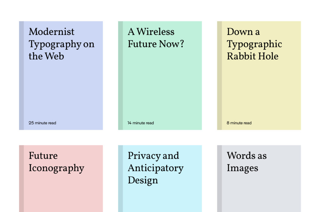

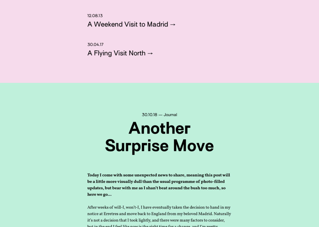

If you’re reading this then I’ll go and assume that you’re most concerned about what will become of my blog, as it will be undergoing some major design changes. Let’s cut straight to the chase and see what’s going to happen:
Larger images
Images will now take up even more space, with captions hidden away unless they’re particularly useful.
A more varied layout
It’ll be possible to place these larger images in different layouts and at different widths, so I’ll be able to tailor the look of each post as I go.
Highlighted quotes
To break up monotonous text, or as an overview for those of who you prefer to look at the photos and skim read, interesting quotes will now be blown up much larger.
Background colours
A subtle detail, but each post will now have a pastel background colour derived from the colours of the images it contains.
Mobile optimisation
Usage data shows that lots of you read my blog on your phone, so the new mobile version has been especially considered. Full width images, clearer text, and a more spacious layout should make for much easier reading on the go.
You’ll notice that I haven’t posted any full screenshots, and that’s because I’m still fussing over final details and the text hasn’t been written yet. I’ll soon have the completed designs soon, but I think I’ll wait for it to be coded and launched live for you all to check it out in full!
If you’d like to be a beta tester, though, please do get in touch! I’ll need some people to check out the code once I start the development. Cheers!