Now that I’ve finally bought myself a proper camera, I thought I’d try out some photography whilst listing a few of the items that I just cannot leave home without. And so, without further ado, on with my list…
iPad Mini
My trusty companion for when my laptop is just too much bulk to lug around. Mainly used for Spotify, catch-up TV on the go, and the occasional doodle on 53’s Paper app.
53 Pencil
Wherever my iPad goes, so does this little beauty. Paired with the companion Paper app, offers a hi-tech replacement for my standard notebook. Speak of my notebook…
Waldo Pancake Notebook
Not only are these notebooks quirky and fun, the double spreads including both plain and ruled decent weighted paper make for a lovely day-in, day-out working notebook.
Lush Lip Service
Especially relevant with the current winter winds, I am always sure to carry a pot of this in my left pocket to keep on top of my terrible skin.
iPhone 6
My trusty phone, kept in sync with my iPad and MacBook with the beautiful service that is iCloud. Most frequently used for photography on-the-go and enjoying my latest Spotify playlists.
Bento Box
For lunching in style and keeping portion sizes down, my newly acquired Bento Box from MoMA is perfect. Usually found thrown in the bottom of my bag holding mackerel salad or tuna sandwiches.
Water
I drink a lot of water, so you’ll always catch me in a bottle. I don’t know what else to say about this one.
Apple Keyboard
A perfect companion for my iPad for on-the-go working, I chose this over any iPad case as it’s the same size as the keyboard I am used to on my Mac.
Lush Dream Cream
A lovely moisturiser for my uncooperative skin, which I tend to decant into smaller containers for portability. I am not afraid to smother my lips in this stuff too should I lose my Lip Service.
Mifa Bluetooth Speaker
Small but powerful, this is useful for broadcasting my Spotify playlists as loud as possible to anyone in the vicinity. Being a thoughtful person, however, this is mainly reserved for car and private use.
Comb
Cheaper than getting my hair cut as often as I probably should.
During my traversing of the internet in search of the latest in design research and semiotics, I stumbled across a recently published finding by the Georgetown University Medical Centre in the Journal of Neuroscience, whose principal discovery was that the brain recognises whole words as images rather than processing each individual letter.
For me, this latest discovery challenges many areas within graphic design and typography. Erik Spiekermann recently very publicly denounced Apple’s decision to switch OSX’s system font from Lucida Grande to Helvetica, however with Helvetica’s widespread popularity, maybe this change is actually a move in the right direction? For if our brain is used to processing words as particular forms (arguably most likely set in Helvetica with it’s adoption for iOS), surely it makes sense for other systems to copy the style, so that our brains may quicker recognise a given word in Helvetica’s distinctive form?
I do understand that the above hypothesis completely disregards typographic considerations such as distinguishability between different glyphs (see Spiekermann’s analysis using the word “millimetre” here) and issues regarding the reproduction of lighter fonts on lower screen resolutions, but it’s just a suggestion.
It also pulls Microsoft’s choice of all-uppercase and all-lowercase typesetting for it’s latest office products and Windows Phone OS (respectively) into question. If our minds are accustomed to recognising text set with standard English capitalisation, it makes little sense to make them work harder, especially when we are subconsciously trying to select menu items such as is the case with the menu bar in Microsoft Office 2013…
The all-caps menu bar in Office 2013
The recent trend of bloating the screen sizes and pixel densities of devices also presents interesting arguments for and against the avoidance of older typefaces which have not been designed for screen use. With screen resolutions edging ever closer to the point by which pixel screens are undistinguishable from printed material, is (or will) the production of typefaces constructed specifically for on-screen use even be necessitated any more?
Here I am reminded of Susan Kare’s “Graphical User Interface Icons”, completed for Apple in 1982, which I saw at MoMA in New York last week, and am hence reminded how far we have come since the boxy restrictions of the low-resolution screens of yore. Will modern day pixel-fitting, an art reserved for perfectionist designers such as myself, be necessary for much longer in a world of HiDPI (high pixel density) displays?
And then, with the ever-expending screen sizes of both portable devices (see: mobiles) and fixed devices (see: TVs/desktop PCs), must we worry anymore about typefaces having to work at such small sizes? Some of the most beautiful examples of typesetting I have stumbled across on the web, such as Medium, embrace much larger font sizes, in the case of Medium’s Article Pages (example here) almost doubling from the standard paragraph font size of 12pt (unformatted HTML) up to 22pt.
And so as years pass and larger, HiDPI displays become the norm, will we be waving goodbye to the need for screen optimised typefaces? And with this latest discovery questioning what we know about semiotics and typography, will it even matter? Can Apple be justified in it’s thorough and liberal implementation of Helvetica everywhere, and can we all now be justified in using our favourite print typefaces on screen?
Feeling as I did on Saturday en route home, I assumed that this post would never see the light of day due to jet lag, but here it is, in all it’s American glory. For the less observant amongst you, I have just returned from a four day stay in the great city that is New York, and I bring back a host of anecdotes and photos for your pleasure. It’s garuanteed to be a long one, so grab some popcorn or sweetscandy and have a jolly old scroll down.
Our trip started with us (myself, Luisa, Izzy and Em) landing (precariously due to some feisty turbulence) in New York JFK. Pumped up on orange juice and tea courtesy of BA, we boarded a coach and passed through Queens to land at our hotel in the centre of Manhattan – just across the road from Maddison Square Garden!
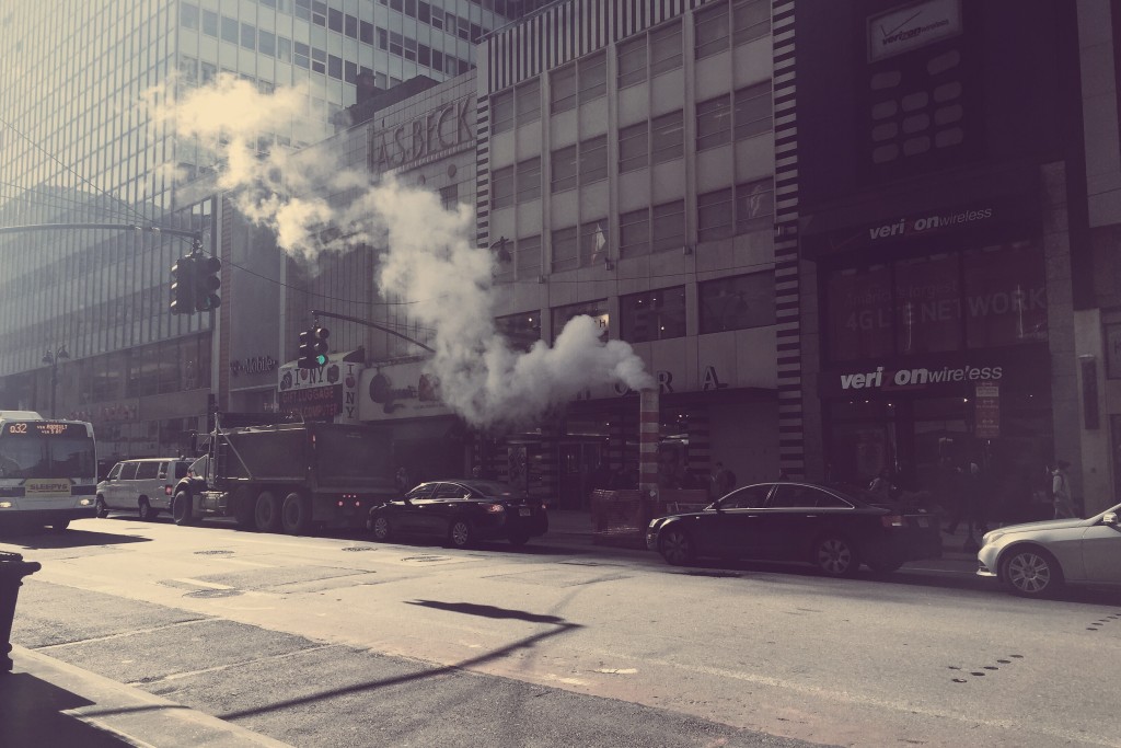
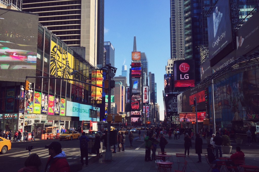
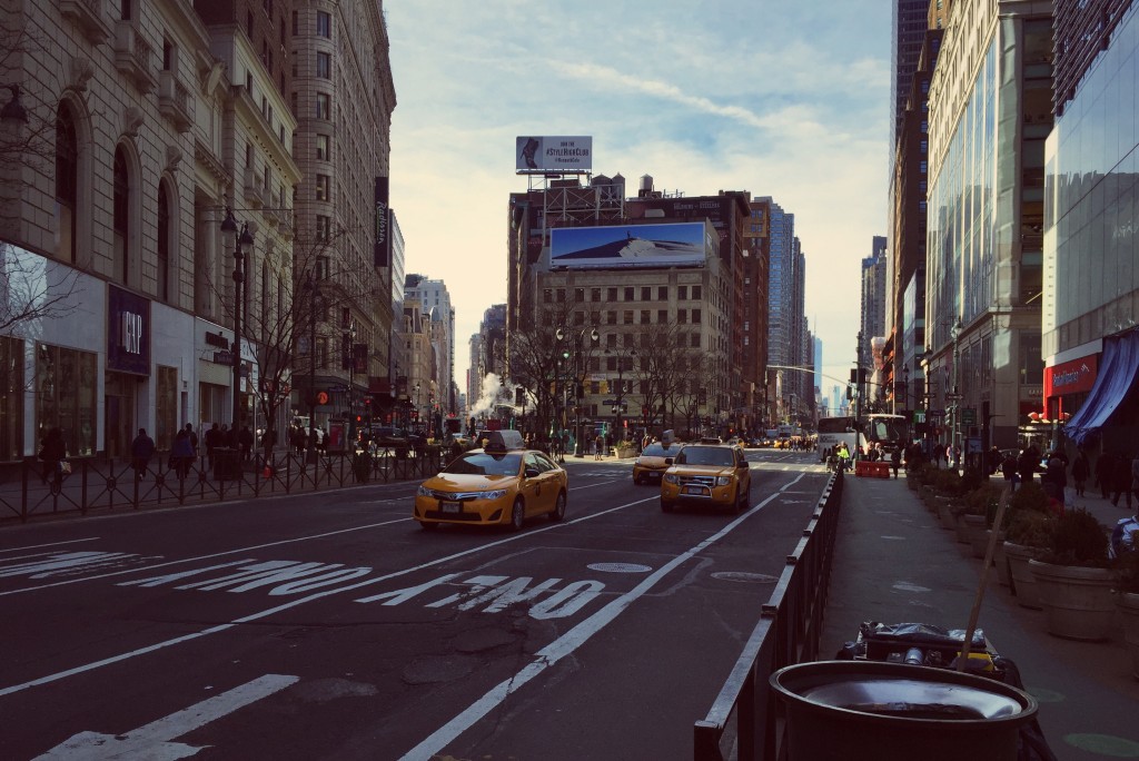
New York was initially all I expected it to be – busy streets stretching traffic police to breaking point, pedestrians treading on each others’ toes and unidentified smoke billowing from every other manhole cover. Wasting no time, we dropped our bags in the hotel and headed north up 7th Street to the infamous Times Square.
Hungry and tired, we headed to Ruby Tuesday and enjoyed a delicious dinner accompanied by bottomless raspberry flat lemonade. It was heaven. Anyway, after our very filling American-sized meal, we decided to dance it off as we headed back to the hotel…
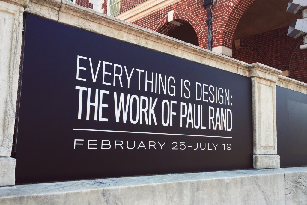
The next day we decided to dedicate to a whirlwind tour of all the good ol’ tourist traps, and so we headed off with a plan to visit the top of the Empire State Building, the infamous NY Apple Store, Central Park, Paul Rand’s “Everything is Design” exhibition, and even brave a ride on the city’s infamous subway system.
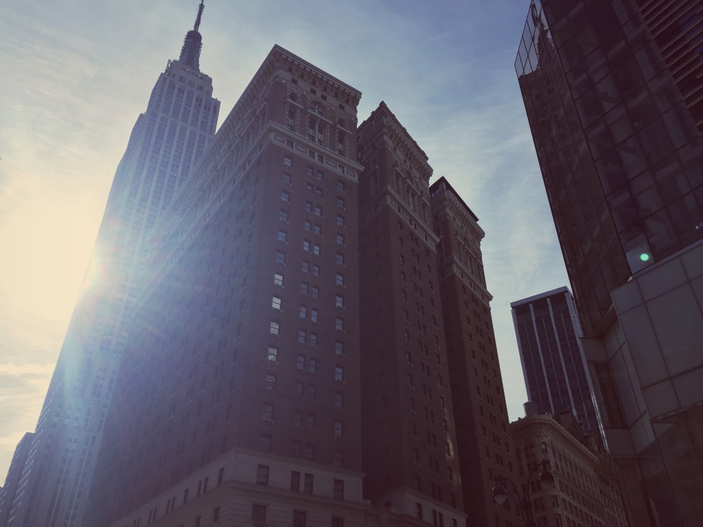
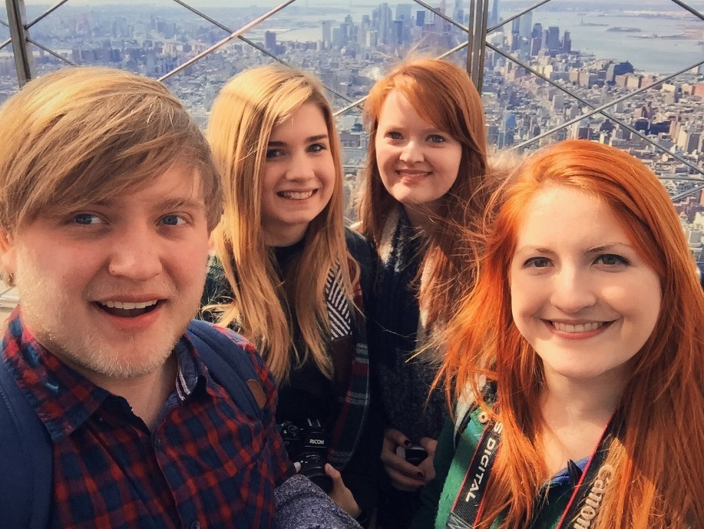
First up, then, we visited the 84th floor of the Empire State Building, which was located just around the back of our hotel after crossing Broadway. Here are a few photos of our journey…
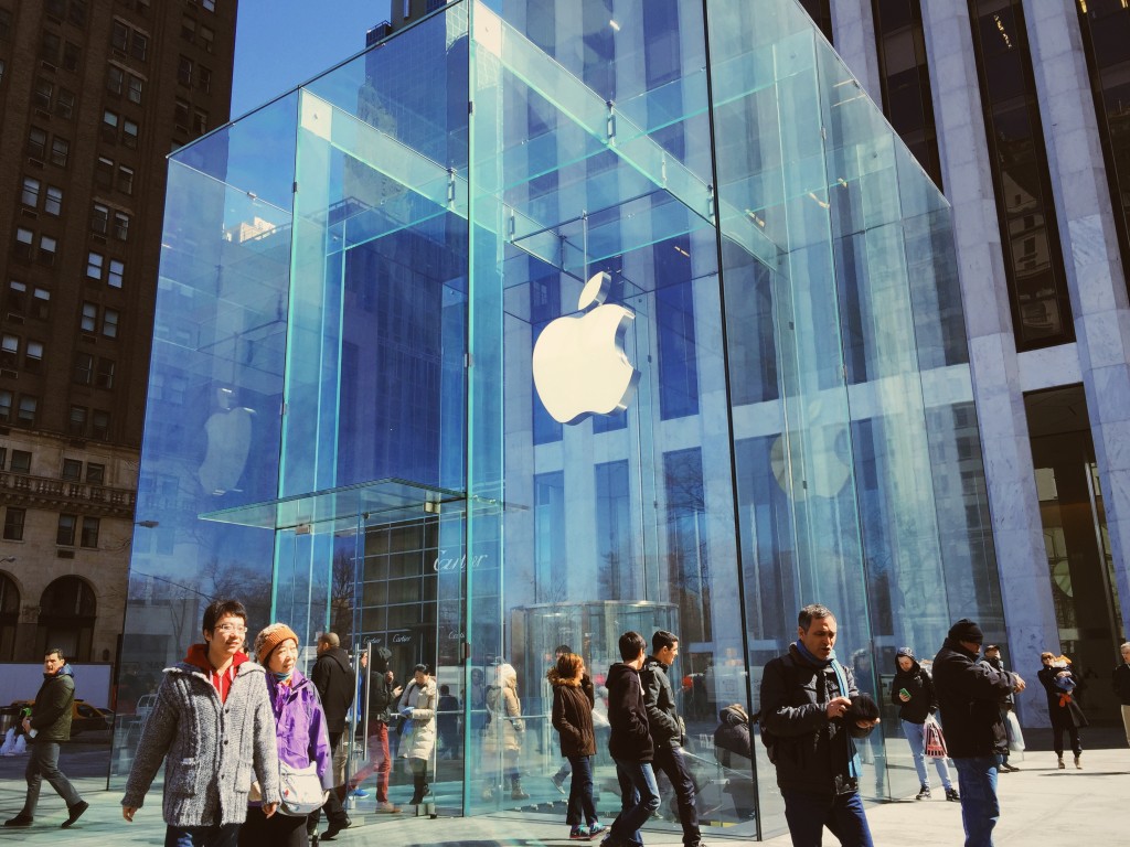
After soaking in the breathtaking views, we headed uptown along 5th Avenue and soon arrived at the corner of Central Park to see the infamous glass cube of the Apple Store. I spent a while admiring the architecture, the girls spent a while making good and proper use of the free WiFi, and then we headed on our way once more…
Once we’d crossed to another corner of Central Park, we grabbed the northbound Subway to further north along the edge of the park. I have to admit that I felt a lot safer down in the Subway than I would have thought, however the NY Subway map ain’t got nothing on Harry Beck’s masterpiece that is the London Underground Map.
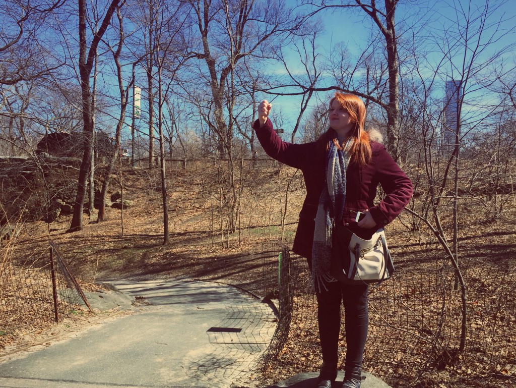
Once we’d resurfaced we headed into the depths of Central Park, where I found a strange looking seed-type thing, and Em assumed role of Statue of Liberty as we knew we’d have no time to grab a boat out to see her in person. I think she did an astounding job. Felt like the real thing. You go, Em.
After a leisurely stroll through a rather barren Central Park we arrived at the other side, and wasted no time in heading into the Museum of the City of New York to see the Paul Rand (yes, the Paul Rand) “Everything is Design” exhibition. I leave you with this teaser photo, as I shall soon upload a blog post dedicated solely to the exhibitions we encountered in New York and link it back here. Watch this space…
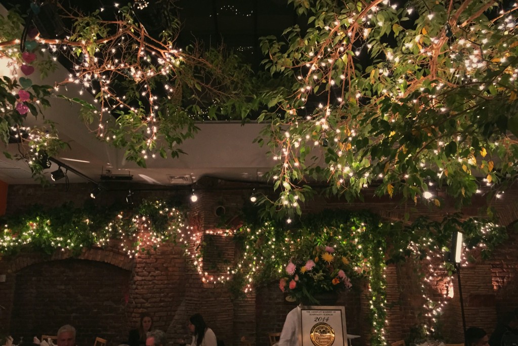
After an inspiring few hours spent in the museum, we headed back downtown once more and then headed out for an evening meal, for which we’d decided to head to Little Italy or Chinatown. We ended up in Little Italy, where we darted into a lovely little family-run Italian with a gorgeous garden room, and nearly ended up as extras in a film which was being shot there!
The next day we had two design studio visits lined up, firstly Vault49 and then Exposure – however before we headed downtown for these, we headed east and climbed up onto the High Line, a once-abandoned stretch of arial train line which has been converted into a beautiful urban garden-cum-walkway which winds its way down the east side of Manhattan.
After this we headed back west and encountered another landmark, the Flatiron building, before heading up a manually operated lift to the Vault49 studio. Here was held a presentation and talk from an ex-Leeds student from our very course, who talked about Vault49’s culture and work, all of which inspired many ideas for my placement search for my Year In Industry!
After this, and a huge burrito and a play in the LEGO store, we headed further downtown and onto south Broadway to find Exposure’s studio and offices. Here we were delivered another talk and engaged in a discussion, in which the Creative Director Tom sat down with us for a while and gave us some top tips on how best to approach studios when looking for placements. It was another great visit, tainted only by the fact that Steven (an Exposure employee and ex Leeds student) supports Blackburn FC. You win some, you lose some I guess.
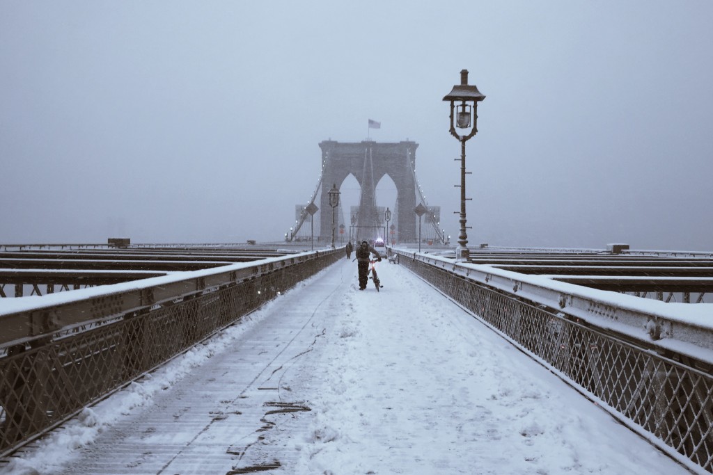
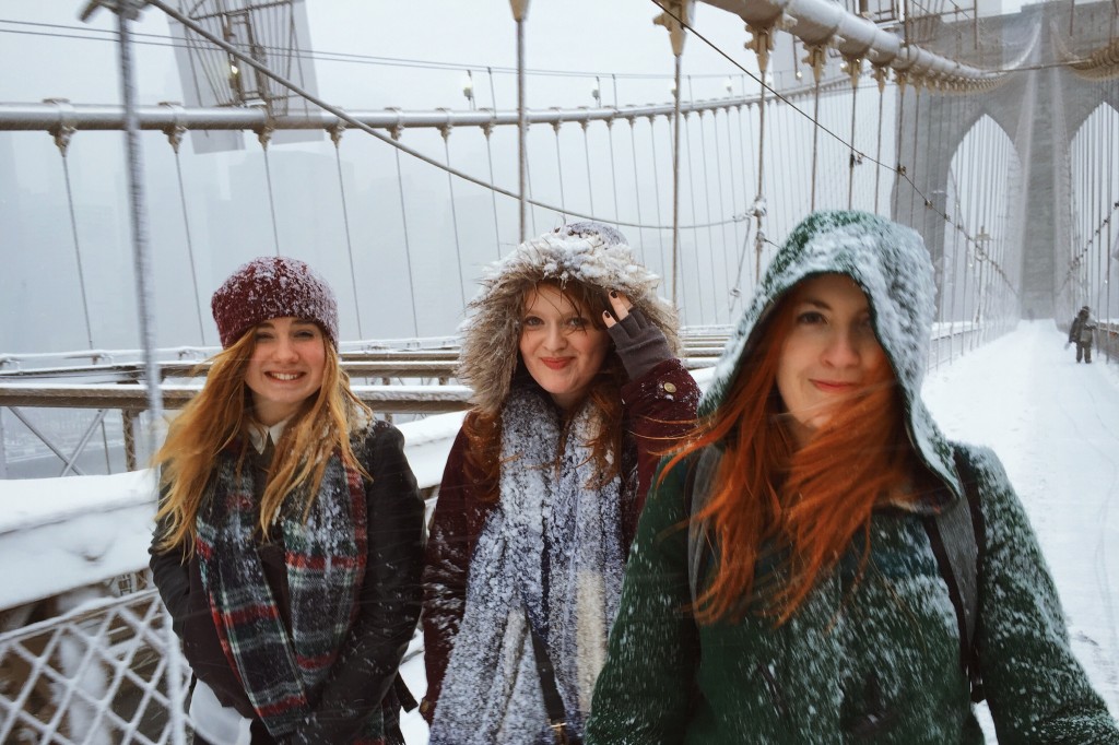
At this point in the day it had begun to snow quite heavily across New York, but we, undeterred, soldiered on with our plan to cross the Brooklyn Bridge and sit down for tea in Brooklyn. As we (eventually) found our way up onto the famed bridge, however, the blizzard picked up and we had to battle through one rather treacherous crossing…
We eventually made it in one piece, however the freezing weather and our lack of local knowledge meant that we struggled to find even a place to grab a coffee, and so we eventually had to admit defeat and took the subway back under the river and towards the centre of Manhattan. There were smiles, though!
On our final day in NYC, we headed out to the Museum of Modern Art (MoMA), where we saw many of the greats (to be detailed in the aforementioned and forthcoming exhibitions blog post) before spending a good long stint browsing round their two gift shops. I ended up spending $100+ on a new phone case, lunch box (a beautiful Bento Box) and a present for Danni… oops! I was, however, pleased to find that Dan Flavin had a piece in MoMA!
A Dan Flavin installation in MoMA
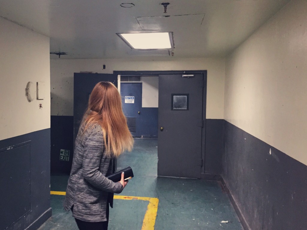
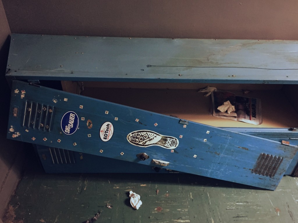
In the morning me and Izzy had also found a secret hidden within the floors of our hotel – two completely abandoned floors between the lobby and the working floors above! We headed down a stairway and went exploring the eerily still-lit corridors.
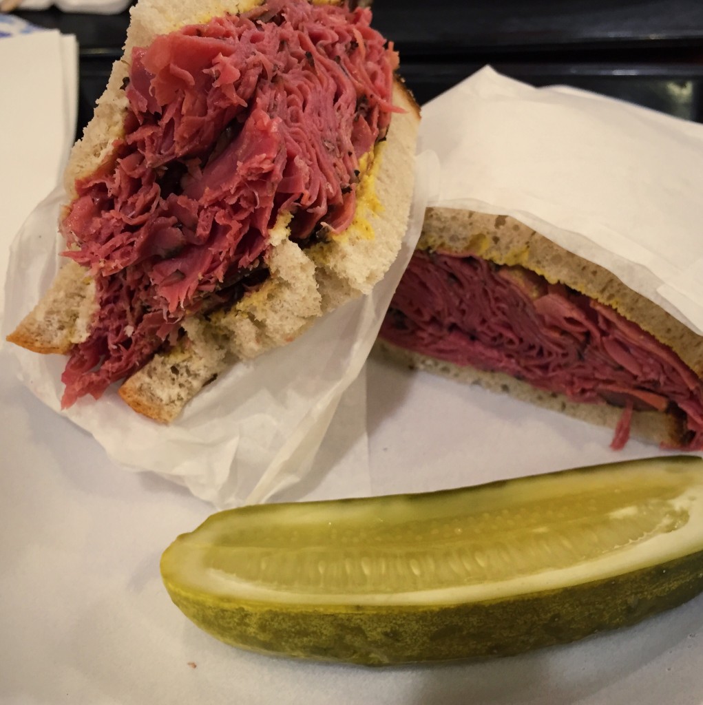
And then, what trip to New York would be complete without a huge-ass pastrami deli sandwich with customary huge-ass pickle?
In brief, New York for me was huge portions of food, darting between rushed pedestrians along the overcrowded footpathssidewalks and generally wandering around and soaking up the lively atmosphere and culture. I had set off with the belief that I’d hate the place, being a bit of a country bumpkin and claustrophobe, but I found the city surprisingly fresh and pleasant.
I have many other trips lined up for this summer, including both Berlin and Barcelona (bank account permitting), but I have a feeling that me and New York will be meeting again someday…
Given Apple’s history of pushing new trends forward, in particularly the drive to remove physical interfaces from their laptops (remember the sharp intake of air when the Retina MacBook came out without a CD drive?), today’s announcement of a MacBook with only one port wasn’t exactly a complete surprise.
I have never been naïve to the eventual downfall of physical transfers: be it data transfer/synchronisation, physical drive storage or wired charging – however some reflex in my gut seems to be telling me that the reduction of everything to one single port is too much too soon. With a retina display and other promoted features of importance only to tech-savvy users, such as fan-less operation, it begs the question – exactly who is Apple trying to target with it’s latest MacBook?
Power users will struggle, that’s for sure – how can one be expected to transfer HD imagery, connect an external monitor and charge the laptop simultaneously? Sure, a range of (expensive)adaptors will be available to accompany the machine, but surely power users do not want to carry an array of adaptors which they will have to swap out depending on the task at hand? And it cannot be argued that the new MacBook is geared towards light use – the hi-spec display and accompanying £1,050 (minimum) price tag make sure of that.
The leap to a MacBook Pro without a CD drive was wholly justifiable I believe, a sleeker profile coupled with the decline of disk media made it an obvious evolution – however to do away with USB Type A (the standard USB we all know) ports completely seems like a pointless and frankly idiotic sacrifice for a frivolous means: a wafer thin laptop.
Lighting and Thunderbolt are two recent port standards that Apple have developed, being promoted for their unrivalled speeds of transfer and multi-functionality (think the Lightening port being used as a headphone jack). How could Apple eschew these technologies so readily and so soon after their introduction and typical overzealous justification? It’s hardly surprising, though – their standardised MiniDisplay port and FireWire ports have been unceremoniously ripped from their product ranges in the past, always to an initial uproar.
The addition of an extra 2mm or so of bulk to the new MacBook’s profile, or the removal of the taper altogether, would have allowed Apple not only more space for battery capacity, but also to include more than one USB C ports, as well as retaining one or two USB A ports. I believe that a number (4 or 5) of USB C ports spread across the two sides of the MacBook’s body would have been a brilliant addition – allowing a user the same flexibility of using the ports for whatever they may desire (charging, data transfer or video/audio output) whilst still allowing users to complete multiple tasks simultaneously.
So with Apple’s latest MacBook I feel a frustration similar to that I experienced upon the release of the iPhone 6, a frustration that a company like Apple would sacrifice function (power in the MacBook and battery life in the iPhone) for form. I would even argue that such devices are now getting too thin, the race for thinness exercising an overpowering grip on tech companies, meaning important factors such as ergonomics and strength mostly overlooked. And how long is it until ‘bendgate’ grips the MacBook?
But all this said, maybe this MacBook is just another Apple Watch. Maybe it is just another way of coercing users into buying more of Apple’s infrastructure. The reveal presentation showed a new MacBook user streaming content to their Apple TV, which coincides rather nicely with the price reduction of their TV product. Much like the Apple Watch necessitates the purchase of an iPhone, it would seem the new MacBook necessitates the need for an Apple TV, an array of adaptors, and lord knows what else.
So a beautifully thin wireless laptop of the future, or a tactical marketing concoction? You decide.
Another quick and strange hybrid blog post now, which will outline two events in the space of a weekend on the opposite sides of the country but which happened in two consecutive days. I’ve been on a lot of trains recently…
But do disregard my moaning, because I’ve actually had a great weekend.
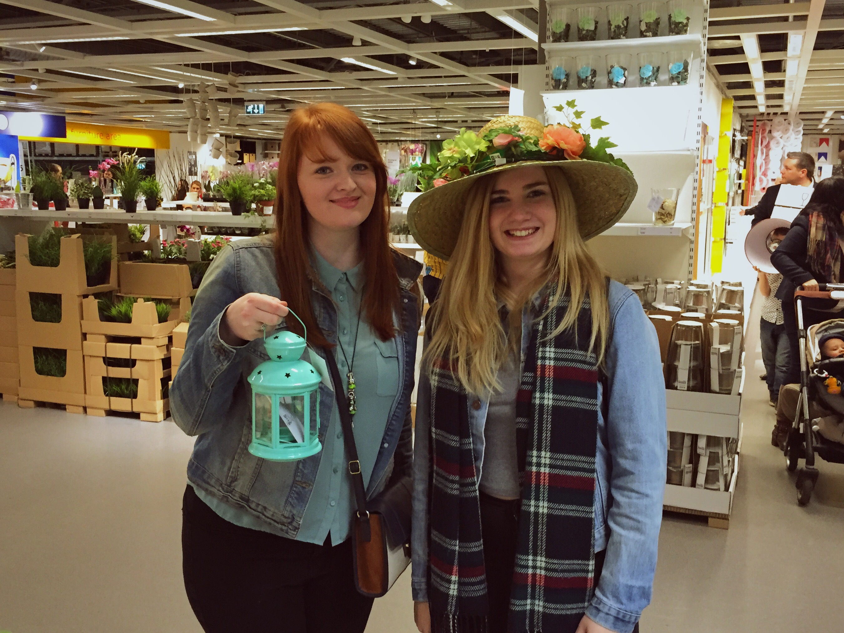
Firstly, me and the usual design gang grouped up and, after a last minute rush to get everyone fed and out the door, rolled up at IKEA in Leeds. Nothing says ‘design student’ like an organised day trip to IKEA which was not initiated in any way by anyone actually needing to buy anything; however it was a shame that Izzy opted not to purchase this delightful seasonal bonnet…
After a long day on our feet, we returned home and everyone scattered and wandered back to their respective houses. However, there’s no rest for the wicked! I quickly made myself a smoked salmon salad and then headed back off out again, Burnley bound and ready for an early start.
Why, You may ask? Because it’s that time of year again: the time when me and Danni spend the day eating hot dogs, riding coasters and generally making a nuisance of ourselves at Blackpool Pleasure Beach! (See last year’s trip here.)
The weather wasn’t in our favour unfortunately, with near-zero temperatures and some nasty rain plaguing the day and causing the Big One to shut down (aww) – but a bit of water never stopped Ollie and Danni. We trekked around the park, which after six years worth of annual trips we know like the back of our hand, and rode everything we could.
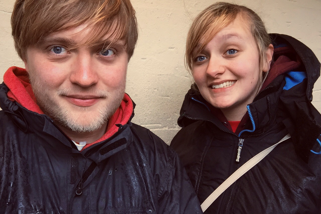
The weather and our busy schedule meant I only managed to snap one single photo from the day, so here it is, in all its vain selfie glory!
So what am I up to now? Well I’ve just this afternoon been in the School of Design, assisting with an open day and taking prospective students and their families on a guided tour of the campus. It’s great to speak to all the attendees and spread the word about how great Leeds is, not only as a university but as a place to spend three or more years of your life!
After this I met up with Kishore, my scholarship tutor, and we discussed how I am to develop and share my research so far with the public. This will be realised via the Leeds Design Lab website, which I’m currently working on updating, and will be published pretty soon. I’ll be back with updates and a link to my own little corner of the University of Leeds website – exciting!
That’s it for now I believe. I leave you with this song. I’m not sure why. Just enjoy.