Yesterday evening myself, along with Izzy and Luisa, headed off to Leeds University Union to see our good friend Emily perform in LUU Opera Society’s performance of the French opera “Carmen” – and what a night it was! As is customary when I write a post about a performance, you are obliged to click here and play the official soundtrack to this blog entry.
Having seen Emily last year in another Opera Society performance, Gilbert & Sullivan’s “Ruddigore“, we were apprehensive as to weather Carmen would be as good, and as funny – seeing as Carmen is not a comedy like Ruddigore.
We were not disappointed! Although Emily had a smaller role than her main part in Ruddigore, it was great to see (and hear) her up on stage alongside what turned out to be another fabulous and incredibly strong cast – Carmen herself really stole the show (and not just because of her amazing outfits!)
The ending of the show in particular had us all in stitches – maybe rather strangely. I won’t reveal all on here, you’ll have to go and see it yourself!
Once again it was a really lovely evening, and a great opportunity to do something different with all my colleagues from the graphics course. I urge anyone who has not yet done so to go and see it, tickets are only a fiver for students from LUU and the show is running every nigh at 7:30pm until this Saturday evening.
PS:Sorry that this post has no images – I was so caught up in the action that I forgot to take any!
So yesterday, somewhat inspired by the talks at Leeds Print Festival, I decided to try my hand at a spot of printing! As this was a spontaneous decision, and because I was confined to working in my student house, I had to get a bit creative with my techniques and materials…
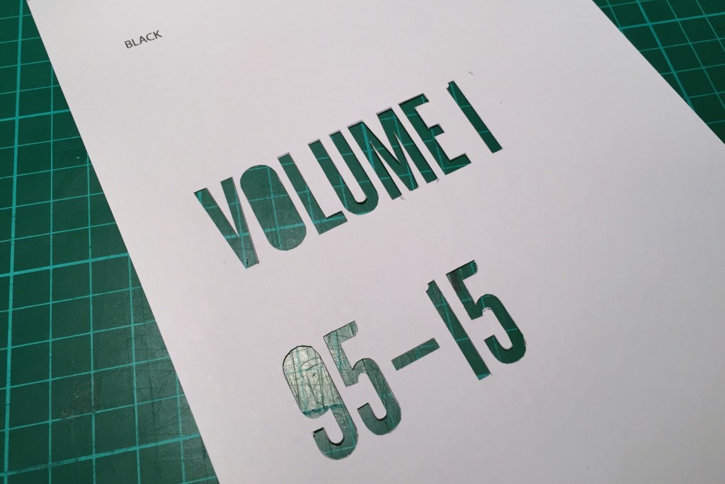
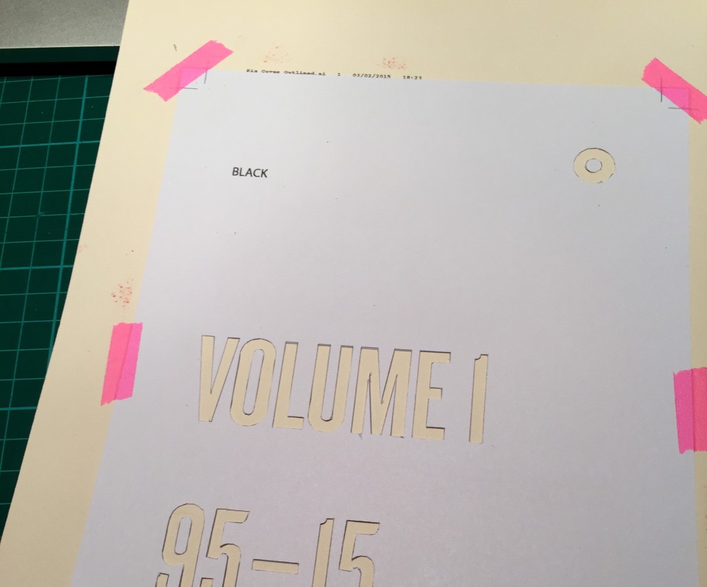
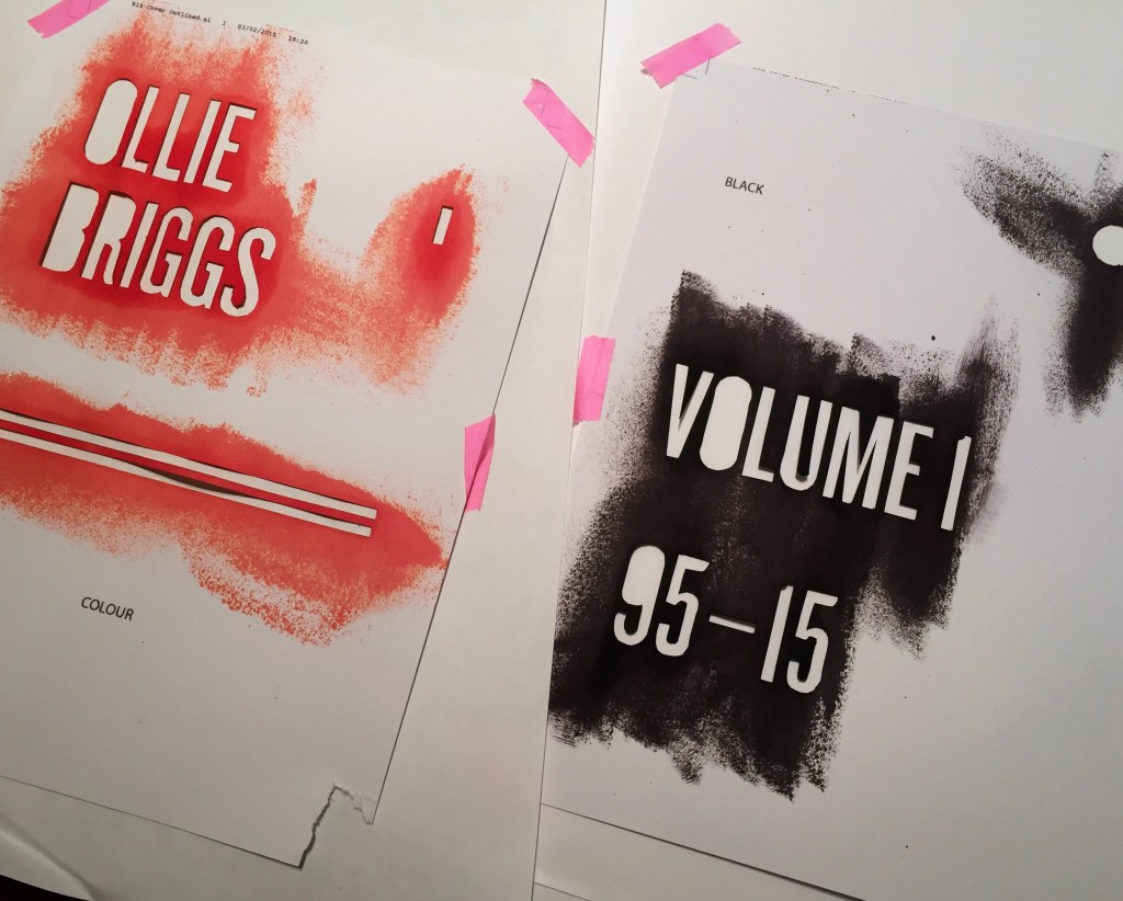
I decided to create a two-colour print using a rudimentary stencil technique. I firstly drew up my design (for a project I am working on in my spare time) and then split the document into a black layer and a colour layer. I then printed these two layers on two separate pieces of card before rather tediously cutting them out with a craft knife.
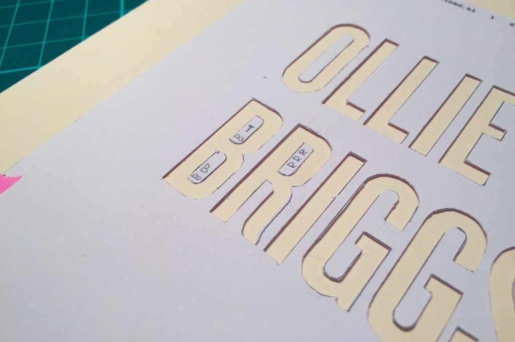
I had decided from the off to abandon my usual purist attitude and embrace any imperfections, so I wasn’t too bothered that the cutting was dodgy in certain areas. I did, however, want to retain the counters in the letterforms, so I cut those out also and then used some temporary glue to adhere them to the surface to be printed on before I put down the ink. I used crop marks printed on both the card to be printed on and the stencils themselves to align the stencils.
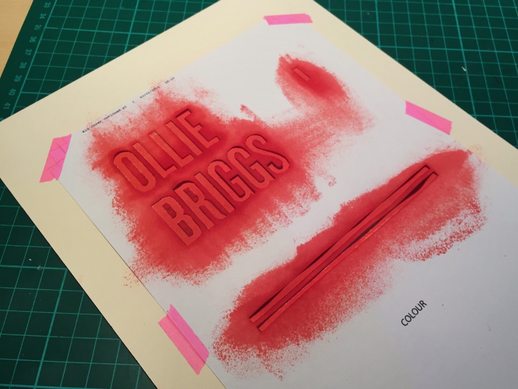
I then had to get creative all over again. I had no proper acrylic print medium, so I rooted through my drawers to see what I could find. I winded up making use of a set of inkjet printer cartridge refill pots which had been laying dormant in my drawer. Using the sponge end of a scourer from my kitchen cupboard, I doused it with the ink and then brushed the excess off on some spare paper before dabbing it repeatedly over the stencil.
Again, I was aware that this kind of low viscosity ink wasn’t ideal for this method of printing, however I thought it’d add to the handmade appeal of the final outcome – and it was the only stuff I had lying around! I may rename this post “Stencil Type On A Shoestring.”
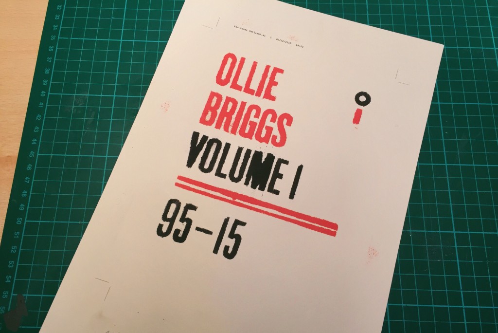
Anyway, those familiar with printing will know that there is no such thing as red inkjet ink, so the vibrant shade of red you see above is actually a custom mix of magenta and yellow ink.
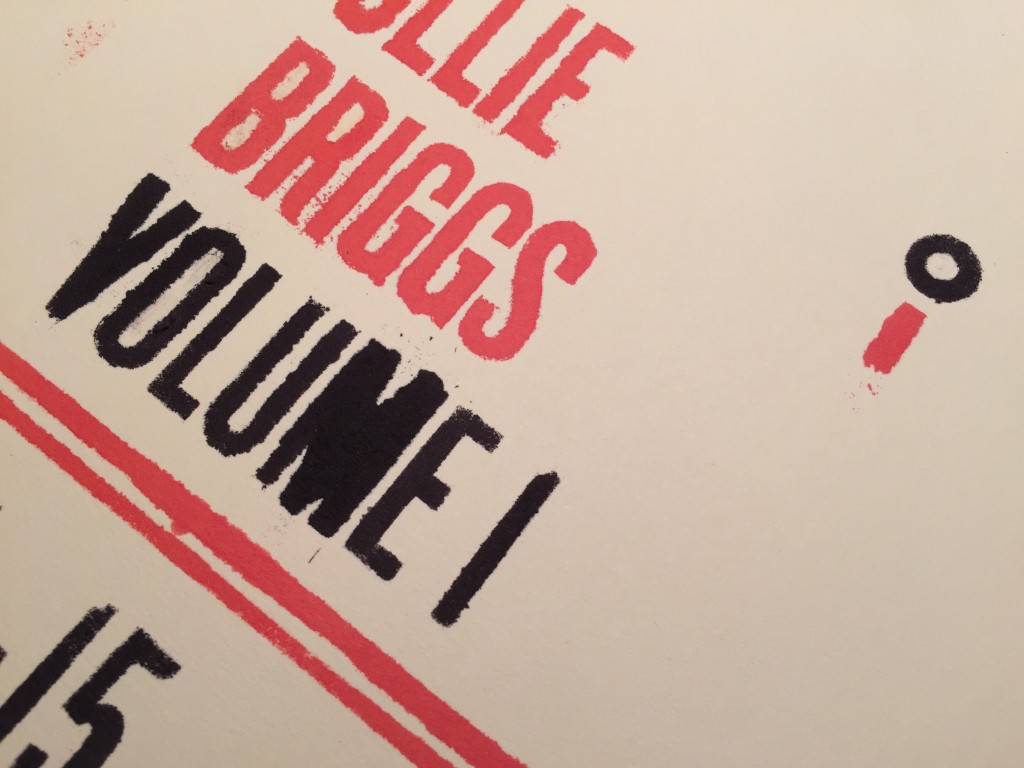
After applying the two colour prints and picking off the counters, I was presented with the final product! As I say, it’s not in any way perfect, but I do like how the ink has seeped beyond the boundaries of the stencils, most noticeably around sharp angles like those of the ‘V’ and the ‘M’.
So there you have it – an unconventional technique using unconventional materials which resulted in quite a messy but interesting outcome. I am unable to photograph this, but the absorption of the ink by the paper has actually raised it slightly on the letterforms, giving the print a slightly embossed feel. I didn’t plan this but it’s an intriguing side effect of using such a watery ink.
The messy process took about two hours (most of which was spent cutting the letters out by hand), but it was great fun to do some typographic work without being sat behind a computer. Moan as I do about cutting each of the letters by hand, it was actually a great learning curve, as it instilled a newfound appreciation for the delicate forms of even the simplest typefaces.
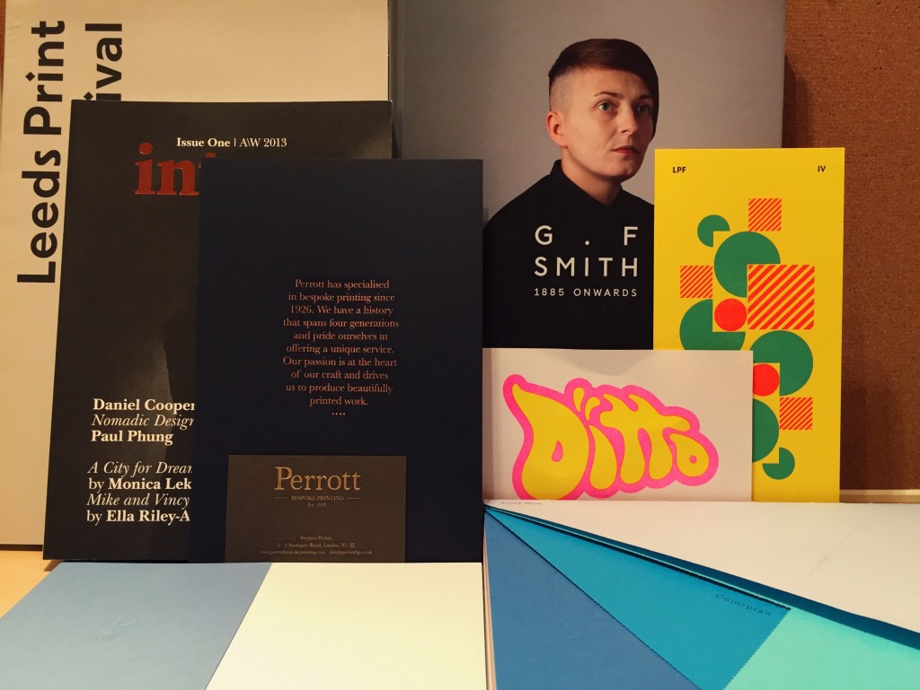
So after being stranded in Leeds on Thursday after planning to go to Burnley to conduct some research for my Pantone D&AD Brief, which is to “reimagine your hometown through the language of colour”, myself and a bunch of other designer friends headed down to Leeds College of Music for the Leeds Print Festival (#LPF2015) talks.
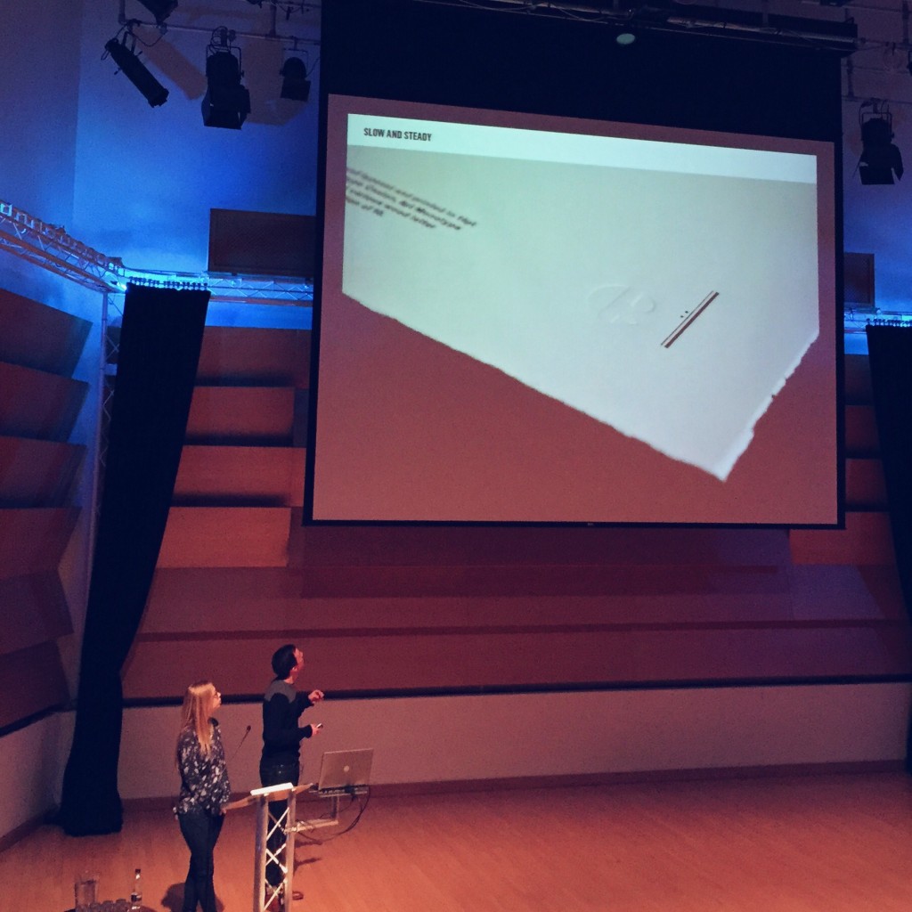
After wandering round the foyer and picking up my invite and a tonne of free print goodies, we took our seats and the first speaker was up: Alec Dudson, editor and creator of Intern magazine. He made a strong case for the retention of print as a medium and also as a craft, with points such as:
Print presents a unique method of discovery, free of algorithms and associations as found online.
Print is an art form, as you are creating and working with physical materials.
Print is permanent.
Print forces you to consider ideas more carefully, as mistakes cannot be rectified later on.
You can interact with print, it is an object that you can take, lend and want back.
The points he made (which were more numerous than the select few above) really made me consider focusing more on print in my work, and treating the process as more of a fine craft, rather than just taking for granted my handy little inkjet. The talks continued with two speakers from Counterpress, a letterpress studio in East London.
They also made further compelling points – noting how that print, rather than dying out, is just becoming more of a specialised process. This idea that print is becoming a specialist craft, rather than just a standard method of mass-producing environmentally unfriendly copies of something, was an optimistic new take on print’s seeming decline which I agree with.
After a quick break,Paul Heys, a senior lecturer of Graphic Design at Sheffield Hallam University took the stage. He had an interesting story to share on a project he embarked on with the Stanley Kubrick Archive at UAL, and also some other wisdom, my personal favourite being “find what you love and let it kill you.”
We then took some time for lunch, where we headed just across the street to Café 164 for a delicious chicken and chilli sandwich. Situated just next to Colours May Vary, it’s a lovely spot to stop by for a snack and a coffee if you’ve treated yourself to a lovely new book.
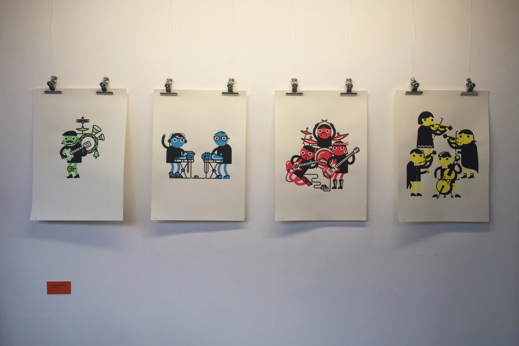
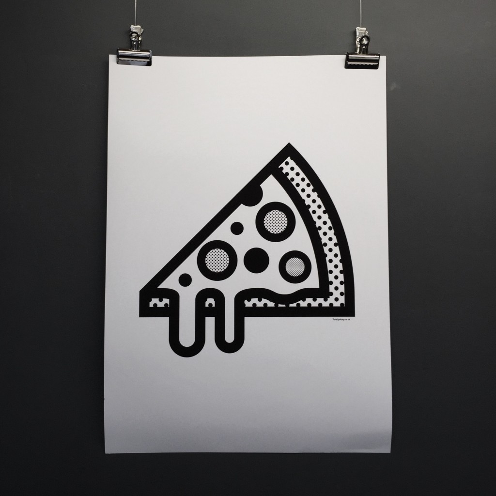
As part of the Print Festival events, the exhibition space by the café was housing a selection of beautiful prints from a variety of designers and artists. Two of my favourites are below…
Before too long it was time to head back to the auditorium to recommence with the talks. Patrick Burgoyne, editor of Creative Review was there to greet us (as he did last year), and he introduced the next two specialists to deliver their talk: a father and daughter duo who run Perrot Bespoke Printing, a print studio down in London.
Having been featured in a video during last year’s festival, it was great to have them there to deliver a speech, which they began by reshowing the original video. It’s a beautiful piece of filmmaking showing the equally beautiful work that the workshop produces, and you should definitely go and give it a watch.
Next up we had Ben Freeman from Ditto Press on stage to give a talk on the work he does at his London studio, where he seemingly pioneered the introduction of the risograph printing process for decorative work rather than simply batch copying of boring ol’ documents. One of there most famous pieces of print work is the Ninja Turtle Porn Museum (check it out here, it’s quite obviously NSFW, however).
To finish of a long day of talks, a design legend Ken Garland took the stage, to present a talk entitled “Protest Graphics: Professional & Amateur”. Ken had us all in stitches as he talked us through some gabel end art in Derry, the use of amateur and professional designs in signage used during protests, and other pieces of famous graphic designs protesting against issues such as nuclear war (including some of his own!).
The talks ended with a panel discussion, where the audience were invited to ask questions of a panel including Ken, Patrick Burgoyne, Paul Heys and the guys from Counterpress. It was here where Ken dropped another pearl of wisdom, which I am very much tempted to print out and stick on my wall: “What we need is less graphics. Graphics can be a pain in the ass. There are too many signs everywhere. I love it here. I don’t see a single sign. Lovely. Wonderful.”
I have since made it home from the festival and unpacked my backpack full of delicious print loot, including a copy of Intern Magazine which I picked up for just £5. I had another amazing day at the Print Festival and would strongly urge that anyone with any interest in graphic design, art or just the medium in general heads down there next year for what I am sure will be another wonderfully informative day!
To kick off my new module option, Principles of Typography, I thought I’d make a quick overview of some reading I’m currently working my way through which has sparked and advanced an interest in typography thus far. For anyone who is interested in type, this may provide some useful recommendations for some reading to get you started!
1 The Elements of Typographic Style by Robert Binghurst
I treat this as my typographic Bible, which means that it’s not really ideal for people with a passive interest, however it does deal with nearly every single possible detail and area within typography. Making a lot of recommendations throughout, but also leaving much down to a reader’s personal preference, Bringhurst strikes the delicate balance of advice giving without being too forceful.
2 Just My Type by Simon Garfield
A lovely light-hearted look at typography and fonts, great for a bit of light reading and humour or some basic background history on specific typefaces for those interested.
3 Die Neue Typographie by Jan Tschichold
Quite an interesting document outlining the early thoughts and ideology of the revolutionary German typographer. Leans heavily towards ideological indoctrination with it’s advice and ideas, so should be approached with a neutral passive stance (Tschichold himself later condemned it as too extreme), however it does provide a very interesting insight into some of Tschichold’s earlier ideas.
4 An Essay on Typography by Eric Gill
Another interesting essay which I have (admittedly) not finished reading yet, but which came in a really nifty small Penguin edition so I just had to buy it.
5 Typography Sketchbooks by Steven Heller & Lita Talari
A stunning book to flick through and engage with how others progress through the type design process. Not very text-heavy or informative in a tradition sense, but a lovely addition to my bookshelf nonetheless!
6 The Hand Job by Michael Perry
Another catalogue of hand drawn type which spans an array of designers and styles, a great source of inspiration for any design project, with its array of styles, colours and ideas. To be enjoyed as another piece of visual indulgence.
There are countless many more books out there on type, many of which feature in the module’s reading lists, but here’s a few that I already own and my quick thoughts on them. At the moment I have my sights set on acquiring Jason Santa Maria’s “On Web Typography“, as this intersection of typography and digital design is somewhere I am very interested in exploring.
A mere day after landing back in England from Copenhagen and Stockholm, I found myself back on a train with Izzy to Leeds for a marketing exam. A few days later, I’m now back in Leeds permanently once again!
Once again, as with the beginning of last semester, I was amused by the decorations which adorn Hyde Park. This ironic piece of graffiti, which I found a few blocks from my house, made me laugh.
When my dad kindly drove me over with a car full of my stuff, we picked up Luisa from our house and decided to grab some food from Five Guys after a quick shop around Aldi. Having seen many Five Guys outlets dotted around America during my trip to Florida, I had’t thought much of them, with their pretty bland red and white colour scheme and industrial.
But the food we had their was delicious! Luisa got a hamburger, my dad a cheeseburger, and I went very over-the-top in true American style and ordered a bacon cheeseburger. What we didn’t realise was that every burger they sell is a double!
With unlimited peanuts, a huge cup of chips fried in peanut oil and a soft drinks machine which dispensed approximately a million different drinks, we were well fed! Also, as the reviews adorning the walls of the eatery testified, it was all delicious.
But as of today we are all back to the grindstone that is daily uni life. Bring on afternoons spent in the design school, curly fries in Old Bar and hours spent lost in the maze that is the Roger Stevens building.
Today we all sat in the Design Common Room to begin some light work, and our programme leader came over and dropped us a copy of the D&AD Winners Annual from last year (2014). This semester we will all be completing D&AD briefs for our core graphic design module, and it was great to have a look over past successful entries.
Today I also began my elective module for this semester – ‘Principles of Typography’. For this module I will be researching, analysing and comparing examples of typography, and I will be keeping my blog updated with my findings and outcomes, which I will also collate on this page of my site.
For now it is time to do some work on my Behance, read over my chosen D&AD brief (all to be revealed soon), and get an early night in ready for the first workshop of the year tomorrow. Ah – it’s good to be back!